
Professional Tips and Guides for Good Logo Sketching
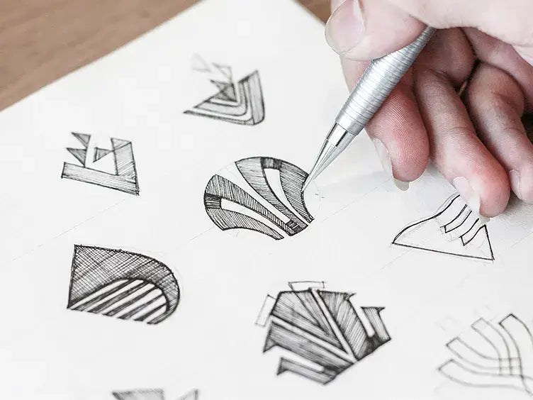
Source: Bratus, Vitrapex Logo Sketch, Dribbble, https://dribbble.com/shots/3728390-Vitrapex-Logo-Sketch
Logo sketching is a useful stage in the logo design process because it allows ideas to develop before software begins to shape them. A rough sketch can reveal a strong direction, expose a weak concept, and help you compare approaches without refining details too early. Good logo sketches do not need to look polished. Their purpose is to capture ideas, test relationships, and solve visual problems. A simple pencil drawing can be more valuable than a polished digital mark when it communicates the brand clearly and supports further development. Sketching also creates distance from technical tools. Instead of thinking about anchor points, effects, or exact measurements, you can focus on meaning, form, balance, and originality. The following professional tips will help you approach logo sketching with greater purpose, structure, and confidence.
Understand the Purpose of Logo Sketching
Logo sketching is not simply a warm-up before digital design. It is a visual thinking method that turns research, strategy, and brand ideas into possible symbols. The goal is not to produce one perfect drawing immediately, but to explore enough directions to understand what the logo could become.
Explore Ideas Without Technical Restrictions
Working on paper removes decisions that can slow you down in design software. You do not need to choose fonts, adjust paths, or perfect alignment. This freedom lets you test ideas quickly and follow unexpected visual connections. A page of rough symbols, letters, and shapes may reveal possibilities that precise digital construction would hide. Sketching keeps your attention on the concept rather than the finish.
Identify Strong Visual Directions Early
Some ideas sound promising in words but become confusing when drawn. Others appear simple and reveal strong visual potential. Sketching helps you recognize the difference before investing time in digital refinement.
Prepare a Focused Sketching Brief
A productive logo sketching session begins with a clear brief. Without one, it is easy to draw attractive icons that have little connection to the brand. A focused brief gives every idea a purpose and provides useful criteria for evaluating it later.
Define the Brand’s Core Message
Identify the main idea the logo should communicate, such as trust, speed, creativity, heritage, simplicity, or precision. Avoid trying to represent every brand value in one mark. Choose one central message to guide your visual decisions. When each sketch relates to that idea, the results are more likely to feel relevant rather than decorative.
Review the Intended Audience
Consider who will see and use the logo. A children’s learning brand may need a different visual tone from a legal consultancy or technology company. Consider how the audience may interpret shape, weight, and character. The purpose is to make informed visual choices, not copy familiar industry styles.
List Useful Keywords and Associations
Create a short word bank containing brand values, products, actions, emotions, and related objects. Then connect words that may lead to visual combinations. A brand associated with guidance, movement, and confidence might suggest paths, arrows, compasses, or rising forms. Use the list as inspiration, not a rigid checklist.
Generate Many Ideas Before Choosing a Direction
The early stage of logo sketching should focus on quantity. Producing many small ideas gives you more material to compare and reduces the risk of becoming attached to the first concept that appears successful.
Begin With Fast Thumbnail Sketches
Thumbnail sketches are small drawings that capture the basic form and arrangement of an idea. Work quickly and keep them simple. A few lines are often enough to test a symbol, monogram, or composition. Their limited size also prevents unnecessary detail, helping you focus on silhouette, proportion, and structure.
Combine Unrelated Visual Ideas
Distinctive logo concepts often come from combining ideas that are not usually connected. Try merging a letter with an object, a symbol with negative space, or two brand-related concepts into one form. The combination should feel meaningful rather than clever for its own sake. A strong idea should become understandable after a brief look.
Explore Literal and Conceptual Approaches
A literal sketch may show a recognizable object related to the business, while a conceptual sketch may represent a value, experience, or feeling. Testing both prevents the work from becoming too predictable or too abstract. The strongest direction may combine a familiar element with a less obvious idea.
Avoid Settling on the First Strong Idea
An early sketch can create false confidence. Continue developing alternatives before making a decision. A later concept may solve the same problem more clearly, simply, or originally. Generate enough variety to make a genuine comparison rather than accepting the first workable result.
Build Clear Forms and Recognizable Silhouettes
Once several ideas show promise, begin refining their structure. Focus on making each concept clearer without turning it into a finished digital logo. Shape, balance, simplicity, and recognition matter more than decorative detail at this stage.
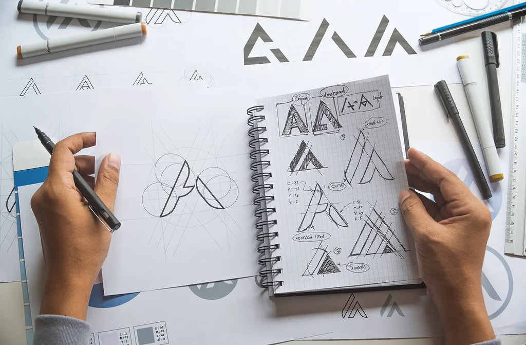
Start With Basic Geometric Forms
Circles, squares, triangles, lines, and curves can help organize a sketch. These forms provide a stable foundation and make proportions easier to control. Not every logo needs to look geometric, but underlying shapes can improve consistency and clarify how different parts relate.
Check the Overall Silhouette
Fill the sketch in as one solid shape or view it from a distance. A strong silhouette should remain recognizable when internal details disappear. This test is especially useful for logos that may appear at small sizes. An unclear outer form often indicates that the concept depends too heavily on detail.
Simplify Unnecessary Details
Remove lines, textures, and small shapes that do not add meaning. Every element should support recognition, structure, or personality. Simplification does not mean making the idea generic. It means preserving the features that give the mark character while removing visual noise.
Consider Positive and Negative Space
Examine the relationship between filled areas and empty spaces. Negative space can create a secondary image, improve balance, or make a symbol more memorable. Keep hidden shapes easy enough to notice. If the idea requires a long explanation, it may not communicate effectively.
Create Variations of the Strongest Concepts
A promising sketch should not be treated as final. Variations help you discover better proportions, stronger compositions, and more flexible versions of the same idea. This stage often turns a good concept into a more resolved one.
Adjust Shape and Proportion
Redraw the concept with different widths, heights, weights, and angles. Try rounded and angular versions, compact and open forms, or heavier and lighter structures. Small changes can alter personality significantly. A tall, narrow mark may feel elegant, while a wide, heavy version may appear stable and bold.
Explore Different Compositions
Test horizontal, vertical, stacked, enclosed, and freestanding arrangements. A symbol that feels weak in one layout may become more effective in another. Exploring several compositions also reveals which forms can adapt to different spaces.
Test Symbol and Letterform Relationships
When the logo includes a name or initials, explore how the symbol interacts with the lettering. It may sit beside, above, inside, or independently from the wordmark. You do not need a final typeface yet. Simple handwritten letterforms are enough to test scale, spacing, and hierarchy.
Evaluate and Refine Logo Sketches
Evaluation should be based on the brief, not personal attachment. A sketch may be enjoyable to draw and still communicate the wrong message. Reviewing concepts objectively helps you select ideas with real development potential.
Compare Concepts With the Brief
Return to the brand’s core message, audience, and visual goals. Ask whether each sketch supports those points and feels connected to the brand rather than merely fitting its industry. Remove ideas that rely on weak associations or require too much explanation.
Test Clarity at Small Sizes
Reduce the sketch or view it from farther away. Fine details, narrow gaps, and complex overlaps may disappear. If the concept loses its identity, simplify the form or increase the contrast between its main elements. A logo should remain understandable across different sizes.
Look for Unwanted Meanings
Rotate, mirror, and inspect the sketch from different angles. This may reveal accidental shapes, awkward letterforms, or inappropriate associations. Ask another person to review the concept when possible, as fresh eyes may notice issues you have overlooked.
Select Ideas With Development Potential
Choose sketches that are relevant, distinctive, adaptable, and simple enough to refine. Do not select a concept only because it is the neatest drawing. A rough sketch with a strong idea often has more potential than a polished sketch with weak meaning.
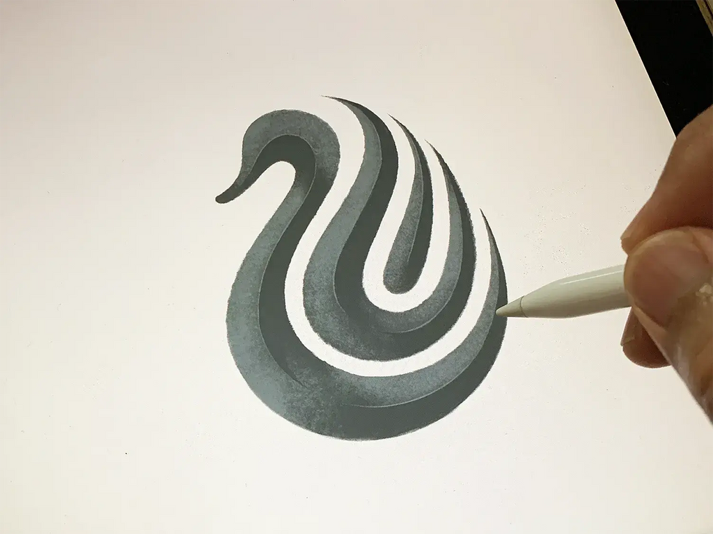
Source: Yoga Perdana, Swan Logo Sketch, Dribbble, https://dribbble.com/shots/21419607-Swan-Logo-Sketch
Prepare the Selected Sketch for Digital Development
The final sketch should provide a clear foundation for digital work. It does not need perfect lines, but its proportions, structure, and main relationships should be easy to understand.
Clean Up the Main Construction
Redraw the chosen concept more carefully. Clarify curves, spacing, alignment, and the relationship between major forms. This cleaner version helps preserve the original idea when you begin vector construction and highlights areas that still need adjustment.
Record Important Variations
Keep nearby versions that explore different details, layouts, or proportions. One variation may work better for a small icon, while another may suit a horizontal lockup. Saving these alternatives prevents useful ideas from being lost during digital refinement.
Scan or Photograph the Sketch Clearly
Capture the drawing from a straight angle with good lighting and clear contrast. Avoid shadows, distortion, or a tilted camera position. A clean reference makes tracing and comparison easier while preserving the character of the original concept.
Conclusion
Logo sketching is a professional method for exploring, testing, and improving ideas before digital production begins. It gives you the freedom to think visually, compare directions, and solve problems without becoming distracted by technical details. The strongest results usually come from a clear brief, many early ideas, careful variation, and objective evaluation. Drawing skill can help, but clear thinking matters more. Simple sketches can lead to powerful logos when their ideas are relevant and well developed. Approach each session as a process of discovery rather than a search for immediate perfection. Generate widely, refine selectively, and test every concept against the brand’s needs. When the sketch is strong, the transition to digital design becomes more focused, efficient, and confident.
Let Us Know What You Think!
Every information you read here are written and curated by Kreafolk's team, carefully pieced together with our creative community in mind. Did you enjoy our contents? Leave a comment below and share your thoughts. Cheers to more creative articles and inspirations!
Related Articles


Leave a Comment