Effective Logo Design Placement on T-Shirts

Source: TravisPietsch, Heartside Plbg. 3/3, Dribbble, https://dribbble.com/shots/17617958-Heartside-Plbg-3-3
Selecting the right spot for a logo on a t-shirt is crucial in enhancing brand visibility and conveying a message effectively. As designers, understanding the interplay between logo placement and shirt design not only helps in maintaining aesthetic appeal but also ensures that the logo remains prominent and engaging. Whether it's for promotional purposes, corporate branding, or fashion statements, the placement of a logo can significantly impact the perception of the brand.
Logo design placement on t-shirts must consider several factors, including the target audience, the purpose of the shirt, and the overall design. Each position, from the traditional chest area to the less conventional lower hem or sleeves, offers unique visibility and conveys distinct impressions. The goal is to make the logo easily noticeable at a glance, which can enhance brand recognition and loyalty.
This introduction guides you through various strategic placements that can help maximize the effectiveness of your logo, ensuring it resonates well with the desired audience while complementing the t-shirt's design.
Left Chest Placement for Professionalism
The left chest placement for logos on t-shirts is a classic and widely accepted standard in professional settings. This placement is particularly favored in corporate apparel because it aligns closely with the heart, symbolizing the wearer's connection to the brand or company. The left side is also naturally more visible during most interactions, as people's gaze typically drifts to this area during handshakes or conversation, ensuring the logo catches the eye quickly and effectively.
Opting for the left chest position also mirrors the layout seen in traditional business attire, such as suits and blazers, where name tags and pocket squares are commonly placed. This creates a sense of familiarity and professionalism that can be beneficial in environments where maintaining a professional image is crucial.
When designing for the left chest, it is important to consider the size and intricacy of the logo. The logo should be large enough to be recognizable without overpowering the garment's overall appearance. This placement works well for both simple and complex logos, but ensuring the logo is not obscured by outerwear or distorted by the fabric's movement is key to maintaining its visibility and effectiveness.
Center Chest for Maximum Impact
Placing a logo on the center chest of a t-shirt maximizes its impact by making it the focal point of the garment. This placement is ideal for situations where brand visibility is the primary goal, such as promotional events, team activities, or large gatherings where standing out is necessary.
The central placement benefits from being the most straightforward view, facing forward and unobscured during most interactions. This maximizes exposure as the logo is easily seen whether the wearer is standing or sitting. The central position is also symmetrical, which can be more aesthetically pleasing and offers a balanced look that is often appealing in casual and creative settings.
When designing a logo for center chest placement, consider the scale and color contrast. The logo should be bold and clear enough to catch attention from a distance, making use of vibrant colors against the t-shirt fabric to enhance visibility. This placement can accommodate larger designs compared to other areas, allowing more room for creativity and detailed messaging.
Ultimately, center chest placement is an effective strategy for ensuring a logo is not only seen but remembered, making it a popular choice for brands looking to make a strong visual statement.
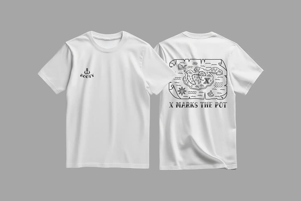
Right Chest for Unique Branding
Opting for right chest logo placement on t-shirts offers a distinctive twist to traditional left-side placements, setting a brand apart with a unique visual approach. This position is slightly less conventional, which can help capture attention and signal a modern, innovative brand personality. It's particularly effective in scenarios where companies want to differentiate themselves from competitors who might stick to more traditional placements.
The right chest is also an ideal location for brands associated with creativity and forward-thinking, as it subtly breaks norms and encourages people to see the logo—and by extension, the brand—in a new light. This area still allows for high visibility and is effective in maintaining a professional appearance but with a contemporary edge.
When designing for the right chest, it’s crucial to ensure that the logo is adjusted to maintain balance and visual harmony on the t-shirt. Since this placement is less common, the logo can stand out more, making it essential to consider the size and design to avoid overwhelming the shirt’s aesthetics.

Source: Studio 99, X Marks the Pot Map Cannabis 420 T-Shirt Design for Pirate Theme, Dribbble, https://dribbble.com/shots/25559321-X-Marks-the-Pot-Map-Cannabis-420-T-Shirt-Design-for-Pirate-Theme
Full Front for Bold Statements
Utilizing the full front of a t-shirt for logo placement makes a bold statement, ideal for maximizing brand exposure and impact. This expansive placement area allows for larger, more detailed logos and can be very effective for promotional or event t-shirts where immediate recognition from a distance is desirable.
This placement strategy leverages the largest possible canvas on a t-shirt, drawing all eyes directly to the branding. It's especially useful for designs that include additional elements like slogans, illustrations, or complex graphical elements that require more space to be effectively communicated and appreciated.
When employing full front placement, it's vital to balance the logo's dominance with its aesthetic appeal. The design should not only focus on size but also on how it integrates with the t-shirt's overall look. Color choice and design complexity should be managed to enhance, not overpower, the wearer's appearance.
Designers should also consider the wearability of such prominent designs, ensuring that the logo enhances the t-shirt's style rather than detracting from it. This approach is particularly popular in casual fashion, music merchandise, and sports apparel, where it can help create a strong, memorable brand association.
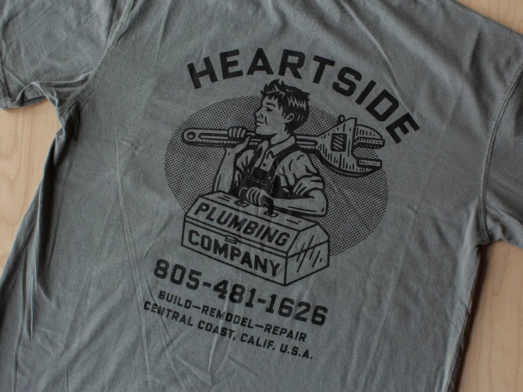
Upper Back for Brand Recognition
Placing a logo on the upper back of a t-shirt is a strategic choice for enhancing brand recognition, especially in environments where front placements are obscured, such as during events or in professional settings where outerwear may cover front logos. The upper back provides a broad, flat canvas that is ideal for displaying larger logos or additional information like websites or slogans.
This placement is highly visible in crowd situations or in scenarios where the front of the t-shirt is not always visible, such as during performances or competitions. It allows the brand to maintain visibility even from behind, ensuring continuous exposure. The upper back placement is particularly popular among sports teams and event organizers, where it is important that the logo is visible from all angles.
When designing for the upper back, ensure that the logo is positioned high enough to be seen over the top of low outer garments, like jackets or hoodies. The size of the logo should be large enough to be readable from a distance but balanced with the garment's overall aesthetics to avoid overwhelming the design.
Lower Back for Subtle Branding
Using the lower back of a t-shirt for logo placement offers a subtle, yet trendy option for branding. This position is less conventional and can serve as a discreet branding tool that catches attention when the wearer moves or bends. It's a stylish alternative that can appeal particularly to a younger, fashion-conscious audience.
The lower back placement is ideal for designs that are meant to be understated yet impactful. It works well for brands that want to convey a sense of exclusivity or insider knowledge, as the logo only becomes visible at certain angles or moments. This placement can be particularly effective in casual or urban clothing lines, where branding tends to be more subtle and integrated into the design.
When placing a logo on the lower back, it is important to consider the size and shape of the design to ensure that it complements the form and function of the t-shirt. The design should not interfere with the comfort of the wearer, particularly when sitting or leaning. Additionally, this area allows for creative expressions of the brand, using minimalistic logos or elegant typography to make a sophisticated statement.
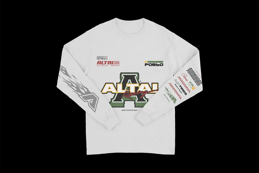
Sleeve Placement for Secondary Branding
Sleeve placement for logos on t-shirts serves as an excellent opportunity for secondary branding, providing a subtle yet effective way to display a brand without overshadowing the primary design on the front or back. This placement is particularly beneficial for brands that want to maintain a clean and uncluttered look on the main body of the t-shirt while still reinforcing brand identity.
Placing a logo on the sleeve can appeal to consumers who prefer minimalistic designs with a touch of branding detail. It is also an ideal location for co-branding purposes, where a secondary logo, such as a sponsor or partner logo, needs visibility without taking center stage. Sleeve logos are frequently used in professional sports apparel and corporate uniforms, where multiple brand representations are common.
When designing a sleeve logo, it's important to consider the size and placement to ensure it does not interfere with the wearer’s comfort. Typically, a small to medium-sized logo works best, placed either on the upper part near the shoulder or centered on the sleeve for maximum visibility. This placement also allows logos to be visible when front and back views are not, providing continuous brand exposure from all angles.

Source: Pedro H. Porto, Apparel Design Collection, Vol.05 [2023©], Behance,x https://www.behance.net/gallery/178964609/Apparel-Design-Collection-Vol05-2023
Shoulder Placement for a Modern Look
Shoulder placement of logos on t-shirts offers a contemporary and stylish approach to branding that stands out from more traditional placements. This modern twist is perfect for brands aiming to project a trendy or avant-garde image. The shoulder, being slightly unconventional for logo placement, draws attention and can make the design memorable.
This location works well for small to medium logos, which can be seen from the front and side, enhancing the visibility of the brand as the wearer moves. Shoulder logos are particularly effective for fashion labels, tech startups, or any brand looking to make a bold statement with their apparel.
Designers opting for shoulder placement should carefully consider the dimensions and shape of the logo to ensure it complements the garment's silhouette. The logo should not distort under the fabric's natural movements or interfere with the shirt's structural lines. Properly executed, shoulder logos can offer a unique branding opportunity that captures attention in a subtle yet impactful way, perfect for those looking to differentiate themselves in a crowded market.
Pocket Logo for a Classic Touch
Incorporating a logo at the pocket position on a t-shirt brings a classic and refined element to apparel branding. This traditional placement is ideal for companies seeking to project a professional, yet casual image. Pocket logos are not just for decoration; they signal an attention to detail and a nod to classic menswear, making them perfect for businesses that want to communicate reliability and a timeless style.
The pocket area provides a small but visible canvas that demands subtlety in logo design. Typically, these logos are smaller, refined, and less obtrusive, offering a hint of branding without overpowering the garment. This subtlety can be particularly appealing in corporate environments or in sectors like hospitality, where understated elegance is often a part of the brand identity.
When designing for a pocket logo, consider the interplay of logo size and pocket dimension. The logo should fit neatly within the pocket's bounds without spilling over, maintaining a clean and organized appearance. This placement is also an excellent opportunity for brands that prefer embroidery over print, as the texture adds a premium touch to the branding.
Hemline Logo for Minimalistic Branding
Hemline logo placement on t-shirts offers a subtle yet trendy approach to branding, ideal for brands that advocate simplicity and modernity. Positioned at the lower edge of the shirt, hemline logos serve as a minimalist branding tool that catches attention uniquely and discreetly.
This understated placement can be particularly effective for lifestyle brands, fashion labels, and tech companies that favor a clean and unobtrusive look. Hemline logos are often small and are placed at the front or back of the shirt, subtly enhancing the garment without dominating its design. This method allows the logo to peek out under layers of clothing, creating interest and promoting brand recognition in a sophisticated manner.
Designing for the hemline requires careful consideration of the logo’s size and placement to ensure visibility without compromising the shirt's style. The logo should be balanced and proportionate to the shirt's overall dimensions and should be placed high enough on the hem to be visible when the wearer is seated or moving. This strategic placement is perfect for brands looking to maintain a sleek, contemporary image with a focus on understated branding.
Conclusion
The strategic placement of logos on t-shirts can significantly influence brand perception and recognition. Whether opting for a classic touch with a pocket logo, making a bold statement with a full-front design, or choosing subtle placements like the hemline or sleeves, each option offers unique benefits. Understanding the impact of placement can help brands effectively communicate their identity and values. As you explore these varied options, consider the overall design, the target audience, and the intended message to ensure that your logo not only stands out but also resonates with your audience in meaningful ways.
Let Us Know What You Think!
Every information you read here are written and curated by Kreafolk's team, carefully pieced together with our creative community in mind. Did you enjoy our contents? Leave a comment below and share your thoughts. Cheers to more creative articles and inspirations!


Leave a Comment