
Finalizing Logo Design Top Techniques and Best Practices

A promising logo concept is not automatically ready for use. The final stage is where the design is refined, tested, corrected, and prepared for real applications. Finalizing logo design requires a review of visual balance, technical construction, scalability, color performance, typography, and file delivery. This stage should not turn into endless experimentation. The main concept has already been selected, so the goal is to strengthen it without changing its core idea. By checking the logo methodically, designers can protect the approved direction while improving clarity and consistency. A well-finalized logo gives clients confidence and creates a dependable foundation for the wider identity.
Revisit the Original Design Goals
Before making final adjustments, compare the selected logo with the project brief. This prevents late-stage decisions from relying only on personal taste. The final mark should still express the brand’s intended personality, speak to the right audience, and support the original positioning.
Compare the Logo With the Brand Brief
Review the key words, values, audience traits, and communication goals that shaped the project. Ask if the logo still feels relevant to the brand rather than simply attractive on its own. A refined design can still fail if it no longer reflects the agreed strategy.
Confirm That the Main Idea Is Still Clear
Look at the concept without presentation effects or explanatory text. The central idea should remain understandable and visually direct. If recent changes have made the logo more complicated, simplify the areas that distract from recognition.
Remove Unnecessary Elements
Every shape, line, and detail should contribute something useful. Remove decorative parts that add noise, weaken the silhouette, or make the logo harder to reproduce. Simplicity at this stage often improves clarity and flexibility.
Refine the Logo’s Shape and Construction
The selected design should now be inspected at the vector level. Clean construction makes the logo easier to scale, export, animate, print, and modify later.
Clean Up Paths and Anchor Points
Reduce unnecessary anchor points and correct uneven curves. Excess points can create bumps, distortions, and awkward transitions. Closed shapes should connect cleanly, and overlapping objects should be merged or separated with intention.
Correct Alignment and Spacing
Check the relationships between symbols, letterforms, borders, and supporting elements. Use guides to identify inconsistencies, then judge the result visually. Equal spacing is not always the goal; balanced spacing is more important.
Standardize Repeated Forms
Repeated corners, angles, stroke widths, and circular forms should follow a consistent logic. Small differences can make the design feel unfinished, especially when similar shapes appear close together.
Check Visual Weight
Zoom out and study the overall silhouette. One side should not feel heavier unless the imbalance supports the concept. Adjust thickness, scale, or spacing so the mark feels stable without becoming rigid.
Apply Optical Adjustments for Better Balance
Geometric accuracy does not always produce visual balance. Curves, pointed shapes, and irregular forms can appear misaligned even when their measurements are correct. Optical correction matters when finalizing logo design because people judge what they see, not the coordinates behind it.
Adjust Elements That Appear Off-Center
A symbol with more visual mass on one side may need to sit slightly away from the mathematical center. Make small adjustments until the composition appears balanced at normal viewing size.
Correct Curves and Pointed Shapes
Circles and curved letters often need to extend slightly beyond flat alignment lines. Sharp forms such as triangles may also require overshoot so they appear equal in height.
Review Negative Space
Study the empty areas inside and around the logo. Tight gaps can close at small sizes, while oversized spaces can make connected elements feel unrelated. Negative space should remain clear and intentional.
Compare the Logo in Normal and Mirrored Views
Flipping the logo horizontally can reveal imbalance that becomes difficult to notice after prolonged work. The mirrored view creates enough distance to expose weak spacing or awkward direction.
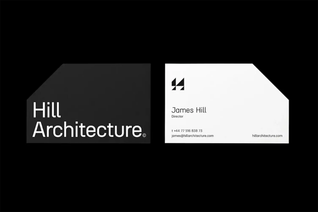
Source: Paul Wilson, Hill Architecture, Behance, https://www.behance.net/gallery/146677423/Hill-Architecture
Test the Logo at Different Sizes
A logo must remain effective beyond the presentation board. Testing it at realistic sizes shows which details are dependable and which only work when enlarged.
Examine the Logo at Small Sizes
Reduce the design to favicon, app icon, label, and social avatar dimensions. Look for disappearing strokes, crowded letters, closed counters, and shapes that merge together. The logo should remain identifiable without close inspection.
Inspect the Logo at Large Sizes
Enlarge the mark for signage or display use. Large-scale viewing exposes rough curves, weak joins, inconsistent geometry, and uneven spacing that may be invisible at standard size.
Create a Simplified Small-Scale Version
Some logos need a responsive variation for limited spaces. Remove fine details, simplify internal shapes, or use the symbol alone when the full version becomes unclear. This works better than forcing one complex version into every application.
Test Common Brand Applications
Place the logo on realistic mockups such as packaging, business cards, website headers, uniforms, storefronts, and mobile screens. These tests reveal problems that a blank artboard cannot show.
Review Color and Typography Carefully
Color and typography require a final technical and visual check before the design is locked. The aim is to confirm that the approved choices remain consistent, readable, and suitable for production.
Confirm the Final Color Palette
Verify the exact color values and check how they appear on screen and in print simulations. Similar tones should remain distinguishable, and the palette should support the brand’s intended character.
Test One-Color and Grayscale Versions
A strong logo should still work without its primary colors. Review black, white, and grayscale versions to confirm that the structure and hierarchy remain clear. If the design loses meaning, strengthen the form instead of relying on color alone.
Refine Custom Lettering and Kerning
Inspect letter spacing, baseline alignment, modified characters, and the relationship between the wordmark and symbol. Uneven kerning can make an otherwise polished logo feel amateurish.
Check Font Licensing
Confirm that the chosen typeface allows the intended commercial use, modification, and client delivery. Keep licensing records when necessary, especially for customized font-based lettering.
Evaluate Contrast and Background Performance
A logo should not be approved only on a white background. Real applications include dark surfaces, photographs, textures, materials, and changing digital environments. Testing these conditions helps define reliable logo variations.
Test Light and Dark Backgrounds
Prepare positive and reversed versions with enough contrast for clear recognition. Avoid assuming that one color treatment will work on every surface.
Check Busy Images and Textured Surfaces
Place the mark over photographs, patterns, and textured materials. A solid container, alternate color, or simplified version may be needed when the background competes with the logo.
Define Clear Space
Set a minimum amount of empty space around the mark so nearby text or graphics do not reduce its impact. The rule should be easy for clients and production teams to follow.
Avoid Unapproved Effects
The logo should not depend on shadows, glow, outlines, or transparency for visibility. These treatments may suit specific layouts, but the core logo should remain strong without them.
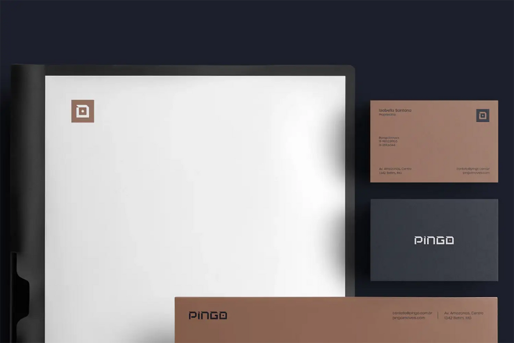
Source: Gabriel Eich, Pingo, Behance, https://www.behance.net/gallery/134193817/Pingo
Gather Focused Final Feedback
Final feedback should confirm performance, not restart the design process. Present the refined logo clearly and guide reviewers toward useful observations about readability, accuracy, and brand fit.
Present the Logo in Relevant Contexts
Use a small set of realistic applications that match the client’s actual needs. Context helps reviewers understand scale, contrast, and usability without distracting them with excessive mockups.
Ask Specific Review Questions
Request comments on clarity, balance, legibility, color use, and alignment with the brief. Focused questions produce more useful feedback than general opinions.
Separate Essential Revisions From Personal Preferences
Some comments reveal genuine problems, while others reflect individual taste. Prioritize changes that improve recognition, consistency, or function. Avoid weakening the approved concept to satisfy every minor preference.
Secure Written Approval
Confirm the final design, versions, and color direction in writing before preparing the complete package. This creates a clear record and prevents confusion during delivery.
Prepare the Final Logo File Package
The final stage is not complete until the client receives accurate, organized, and usable files. Good delivery makes the logo easier to apply correctly and reduces future requests for missing formats.
Export Vector and Raster Formats
Provide vector files such as AI, EPS, SVG, and PDF, along with PNG and JPG versions for everyday use. Test each format after export to confirm that shapes, colors, and transparency remain correct.
Provide Multiple Logo Variations
Include full-color, one-color, reversed, horizontal, vertical, symbol-only, and wordmark versions where relevant. Do not create unnecessary variations that could confuse the client.
Use Clear File Names and Folders
Organize files by color mode, layout, background treatment, or intended use. Clear naming helps non-designers choose the correct asset without opening every file.
Verify Color Modes and Resolution
Prepare RGB files for digital use and CMYK files for print. Check raster dimensions, transparent backgrounds, embedded profiles, and export quality before delivery.
Include Basic Usage Guidance
Add a short guide covering approved colors, clear space, minimum size, background use, and common mistakes to avoid. Simple instructions can protect the design from inconsistent application.
Conclusion
Finalizing logo design brings together visual refinement, practical testing, technical accuracy, and organized delivery. The process is not about adding more decoration or reopening approved decisions. It is about protecting the strongest idea and removing weaknesses that could cause problems later. A careful final review helps the logo remain clear at different sizes, balanced across applications, and consistent in print and digital settings. Clean files and simple usage guidance also make the identity easier for clients, printers, developers, and marketing teams to use correctly. When each final detail is handled with purpose, the finished logo becomes more than a polished image. It becomes a reliable brand asset built for long-term use.
Let Us Know What You Think!
Every information you read here are written and curated by Kreafolk's team, carefully pieced together with our creative community in mind. Did you enjoy our contents? Leave a comment below and share your thoughts. Cheers to more creative articles and inspirations!
Related Articles


Leave a Comment