
How to Create A Logo Design from Scratch
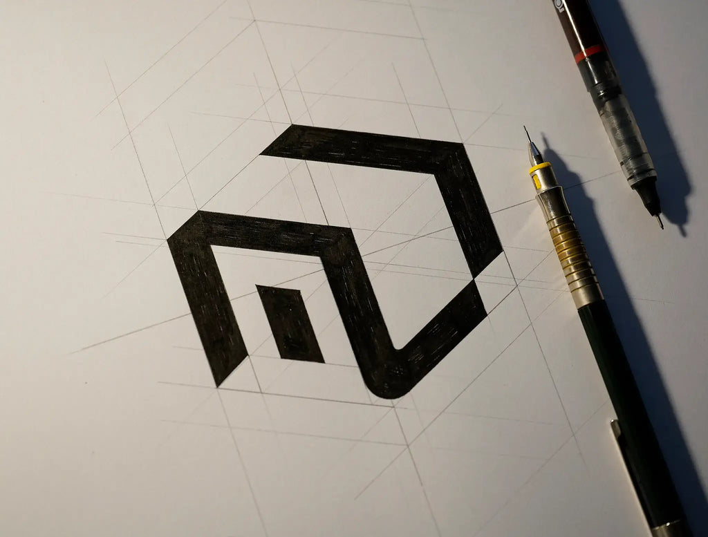
Source: Mateusz Witczak, Unikat Real Estate, Dribbble, https://dribbble.com/shots/19557185-Unikat-Real-Estate
Creating a logo from a blank page can feel difficult because there is no existing style, symbol, or direction to build from. The process becomes easier when it is divided into clear stages. Instead of trying to produce a polished mark immediately, you begin by understanding the brand, gathering references, exploring ideas, and refining the strongest concept. Learning how to create logo design from scratch is not only about drawing an attractive symbol. A good logo must communicate something meaningful, stay recognizable at different sizes, and work across real applications. A structured process helps you make each decision with greater confidence.
Define the Brand Before Designing the Logo
A logo should reflect the brand it represents, so begin by understanding what the brand stands for. Starting with colors or symbols too early can produce a design that looks appealing but lacks direction.
Clarify the Brand’s Purpose
Write a simple description of what the brand does, what problem it solves, and what makes it different. A few direct sentences can reveal the ideas that deserve visual emphasis.
A local bakery focused on handmade recipes may need a warm, personal identity, while a financial technology company may need to communicate efficiency and trust. Those differences should shape the logo from the beginning.
Understand the Intended Audience
Consider the people who will see the brand and what they expect from its industry. A playful identity may suit a children’s product but feel inappropriate for a legal service.
Choose the Desired Brand Personality
Select three to five traits that describe how the brand should feel, such as bold, calm, refined, approachable, or energetic. These words provide a useful filter for later design choices.
Research the Market and Visual Context
Research helps you understand the visual environment around the brand. The aim is not to copy competitors, but to recognize patterns, avoid overused solutions, and find opportunities for distinction.
Review Competing Logos
Collect examples from direct competitors and examine their typography, symbols, colors, and layouts. Notice repeated ideas. If nearly every competitor uses the same icon or color family, a different approach may help the brand become easier to recognize.
Some conventions still serve a purpose because they help audiences understand the business quickly. The challenge is to respect useful expectations without creating something predictable.
Identify Familiar Industry Signals
List the shapes, objects, and themes associated with the field. Decide which ones are relevant, which feel too obvious, and which could be reinterpreted.
Look Beyond Direct Competitors
Inspiration can come from packaging, architecture, signage, nature, editorial design, or unrelated industries. These references often encourage fresher combinations.
Write a Clear Logo Design Brief
A short design brief turns research into practical direction. It gives you a standard for judging ideas and keeps the project from drifting toward whatever looks interesting in the moment.
Define the Main Communication Goal
Write one sentence explaining what the logo should communicate. The goal might be to present a service as dependable and modern or make a handmade product feel premium without losing its personal character.
List Essential Requirements
Record the exact brand name, tagline, main applications, and restrictions. Note if the design must work in one color, fit inside a small icon, or remain readable on packaging.
Establish Useful Design Criteria
Create a checklist covering relevance, simplicity, originality, flexibility, and memorability. Use it later to compare concepts more objectively.
Source: Mateusz Witczak, Unikat Real Estate, Dribbble, https://dribbble.com/shots/19557185-Unikat-Real-Estate
Brainstorm Logo Ideas Without Judging Them Too Early
Strong concepts rarely appear from the first idea. Brainstorming gives you room to explore before deciding which direction deserves further development.
Build a Keyword Map
Place the brand name or central idea in the middle of a page. Around it, write related objects, actions, emotions, materials, and values. Continue connecting words until several visual themes appear.
A coffee brand may lead to beans, warmth, conversation, steam, morning routines, craft, and community. Each term can become a starting point for a symbol or metaphor.
Explore Different Logo Categories
Test the brand as a wordmark, lettermark, pictorial mark, abstract symbol, emblem, or combination mark. The same identity can feel very different in each category.
Connect Unrelated Ideas
Combine two relevant concepts to create less obvious solutions. A mark built from a letter and an object, or from a product feature and a brand value, may feel more distinctive than a literal illustration.
Sketch Multiple Logo Concepts
Sketching turns abstract ideas into visible forms quickly. The drawings do not need to look polished. Their purpose is to test composition, shape, and meaning before you build precise digital artwork.
Start with Simple Shapes
Use basic forms, letters, silhouettes, and lines. Simple sketches make it easier to identify strong structures. Avoid decorative details until the main concept works.
Create Several Distinct Directions
Aim for variety rather than drawing minor versions of one idea. Try different symbols, layouts, proportions, and logo categories. One concept might focus on the name, another on a recognizable object, and another on an abstract relationship.
Test Each Sketch at a Small Size
Shrink the drawings or view them from a distance. Concepts that depend on tiny details often lose clarity quickly.
Select and Develop the Strongest Direction
Compare promising sketches against the design brief. The best concept is not always the most decorative. It should communicate clearly, suit the brand, and remain useful across different settings.
Evaluate Meaning and Relevance
Ask what each concept suggests at first glance. Does it support the brand’s purpose and personality? Does it feel appropriate for the intended audience? Remove ideas that require too much explanation.
Remove Unnecessary Details
Simplify the strongest concept by reducing extra lines, effects, and decorative elements. Every part should contribute to recognition or meaning.
Refine Proportion and Balance
Adjust spacing, alignment, symmetry, and visual weight. Pay attention to the relationship between the symbol and the brand name. Small changes in scale and placement can make the design feel more stable.
Choose Typography and Color Carefully
Typography and color shape the mood of the logo, but they should support the concept rather than distract from it.
Match the Typeface to the Brand
Compare typefaces based on the brand personality. Serif styles can feel established or editorial, while sans serif styles often feel clean and direct. Script and display faces can add character, but they must remain readable.
Adjust Letterforms and Spacing
Refine kerning, capitalization, weight, and alignment instead of relying on default settings. You may also modify selected letters to create a more distinctive wordmark.
Build a Focused Color Palette
Choose a limited palette that fits the intended tone and works in the brand’s main applications. Too many colors can make the logo harder to reproduce.
Confirm the Logo Works in One Color
A one-color test reveals whether the structure is strong. If the design becomes unclear without color, simplify it further.
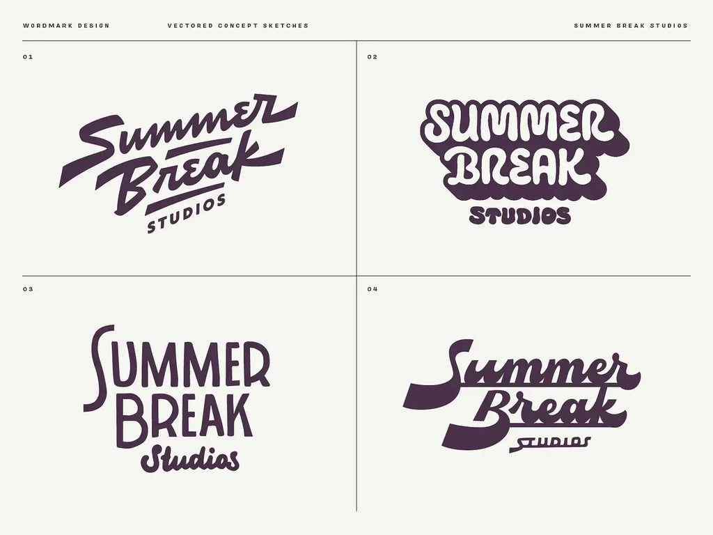
Source: Wells Collins, Summer Break Wordmark Logo Concept, Dribbble, https://dribbble.com/shots/19807402-Summer-Break-Wordmark-Logo-Concepts
Build and Refine the Logo Digitally
Move the chosen sketch into vector software so you can construct clean, scalable artwork. This stage is about precision rather than adding complexity.
Construct Clean Vector Shapes
Use guides, grids, shape tools, and path operations to improve alignment and geometry. Keep anchor points under control and smooth uneven curves.
Compare Several Digital Variations
Test changes in line weight, symbol size, type placement, and spacing. Small variations can reveal a noticeably stronger version.
Review the Design at Multiple Scales
Check the logo at favicon size, standard screen size, and large-format scale. This exposes details that disappear when reduced or shapes that feel awkward when enlarged.
Test the Logo in Realistic Applications
A logo can look convincing on an empty artboard but fail in context. Testing shows how it behaves around photographs, text, packaging, screens, and physical materials.
Place the Logo on Common Brand Materials
Apply it to likely uses, such as a website header, social profile, business card, package, sign, or shirt. Focus on practical evaluation rather than decorative presentation.
Check Different Backgrounds
Review the logo on light, dark, photographic, and limited-color backgrounds. Prepare a suitable version for each setting.
Gather Focused Feedback
Ask if the logo feels relevant, readable, recognizable, and consistent with the intended personality. Specific questions produce more useful feedback than broad requests for opinions.
Prepare the Final Logo System
Finishing the main design is only part of the process. A useful logo system includes the variations and files needed for consistent application.
Create Essential Logo Variations
Prepare horizontal, stacked, symbol-only, full-color, black, and white versions when relevant. A simplified mark may also be useful for small spaces.
Export the Correct File Formats
Save editable vector files for production and common image formats for everyday digital use. Organize them with clear names so each version is easy to identify.
Document Basic Usage Rules
Record minimum size, spacing, approved colors, and incorrect uses. Even a one-page guide can prevent stretching, recoloring, and unsuitable placement.
Conclusion
To create logo design from scratch, move through the project in a deliberate order. Begin with the brand, study its visual context, define the brief, generate ideas, sketch widely, and refine the most suitable concept. Then develop the design digitally, choose typography and color carefully, and test it in realistic settings. A strong logo usually results from several rounds of thinking and revision rather than one perfect first attempt. By giving each stage proper attention, you can produce a mark that feels purposeful, recognizable, and ready to support the brand across different applications.
Let Us Know What You Think!
Every information you read here are written and curated by Kreafolk's team, carefully pieced together with our creative community in mind. Did you enjoy our contents? Leave a comment below and share your thoughts. Cheers to more creative articles and inspirations!
Related Articles


Leave a Comment