
The Most Updated Logo Design Trends & Ideas in 2026
Source: George Bokhua, M, Dribbble, https://dribbble.com/shots/22685793-M
A logo may still be the most recognizable part of a brand, but its role has become far more complex. Today, the same identity must work on a website header, social media profile, mobile app, product label, animated video, storefront, and countless other touchpoints. This shift is influencing the most important logo design trends of 2026.
Rather than moving toward one dominant visual style, logo design is developing in several directions at once. Some brands are building flexible identity systems that adapt to different formats. Others are embracing expressive typography, handmade details, dimensional effects, heritage references, organic shapes, or playful characters. At the same time, artificial intelligence is changing how designers research, generate, and refine ideas.
Together, these developments reflect a desire for brands to feel technologically capable yet recognizably human, emphasizing adaptability, playfulness, culture, and emotional connection over polish alone.
Source: Vadim Korotkov, Bird Mark, Dribbble, https://dribbble.com/shots/19842356-Bird-mark
What Is Shaping Logo Design Trends in 2026?
Many logo design trends are responses to changing technology, audience expectations, and the growing range of environments where brands appear.
The Expansion of Digital Brand Touchpoints
A logo is no longer designed primarily for a storefront, letterhead, or printed advertisement. It may appear as a tiny browser icon one moment and fill a digital display the next. It may also need to move, react, change color, or fit inside a vertical video.
This variety encourages designers to build broader systems with multiple sizes, arrangements, symbols, and motion behaviors.
The Search for Human Connection
Audiences are surrounded by polished content, automated layouts, and AI-generated imagery. As technically perfect visuals become easier to produce, perfection itself becomes less distinctive.
Brands are therefore placing greater value on personality, trust, recognizable human choices, and the relevance reflected in cultural logo design ideas as automated visual production becomes more accessible.
The Influence of AI on Visual Culture
Artificial intelligence has made it faster to explore visual ideas, generate references, and test creative possibilities. However, it has also contributed to a growing amount of repetitive and generic design.
Strong creative judgment is therefore essential for avoiding predictable solutions and turning early concepts into distinctive identity systems.
Responsive Logos and Flexible Identity Systems
Responsive logo systems are among the most practical developments shaping branding in 2026. Instead of expecting one logo to perform equally well everywhere, designers create a connected family of logo variations.
Logos That Adapt to Different Formats
A complete responsive system may include a full wordmark, horizontal lockup, stacked version, simplified symbol, monogram, favicon, and monochrome alternative. The detailed version can appear on packaging or a website, while reduced icon logo design ideas can remain recognizable inside a small profile image.
This improves clarity while giving designers greater control across different spaces.
Dynamic and Unfixed Identities
Some brands are moving beyond basic logo variations by creating identities that change according to context. A logo might shift its colors for different product categories, rearrange its elements for different screen sizes, or respond to motion and user interaction.
These identities retain consistent features—such as typeface, shape, proportion, or behavior—so the brand remains familiar across changing applications.
Why Adaptability Matters
Flexible systems support consistency across digital and physical spaces, especially when developing large company logo design ideas for brands with several products, platforms, or audiences.
A modern identity need not constantly change; it simply must adapt without losing its most recognizable qualities.
Source: Vadim Carazan, G for #36daysoftype (for sale), Dribbble, https://dribbble.com/shots/21213215-G-for-36daysoftype-for-sale
Expressive Typography and Custom Lettering
Typography is becoming a more visible source of brand personality. After years of similar geometric sans-serif wordmarks, many businesses are looking for letterforms that feel more ownable and emotionally expressive.
Custom Wordmarks
A custom wordmark may include modified characters, unusual ligatures, exaggerated curves, unexpected cuts, or distinctive spacing. Even a small adjustment can make familiar lettering easier to recognize.
Character-Rich Serif Typography
High-contrast serifs, editorial typefaces, decorative details, and historically influenced letterforms are also appearing across fashion, hospitality, food, cultural branding, and beauty logo design ideas. These styles can communicate elegance, confidence, craftsmanship, or literary character.
Experimental Yet Readable Lettering
Other identities use stretched letters, irregular baselines, oversized forms, or unconventional spacing. These techniques can make a logo feel energetic and contemporary, but readability must remain a priority.
Experimental lettering becomes a barrier when audiences cannot read the name quickly. The strongest wordmarks balance personality with recognition.
Source: Lucas Fields, RUBO Logotype, Dribbble, https://dribbble.com/shots/20876412-RUBO-Logotype
Handmade Imperfection and Tactile Authenticity
As digital tools become more efficient, handmade qualities are becoming more desirable. Uneven lines, natural textures, and visible imperfections can give a brand an identity that feels personal rather than mechanically assembled.
Imperfect Lines and Organic Shapes
Hand-drawn logos may feature loose illustrations, irregular outlines, brush lettering, carved symbols, or intentionally unbalanced forms. These details can communicate creativity, independence, friendliness, and craftsmanship.
Effective handmade design still requires thoughtful composition, recognizable silhouettes, and controlled reproduction.
Analog Materials in Digital Branding
When developing art logo design ideas, designers may borrow visual qualities from ink, paint, stamps, embroidery, engraving, screen printing, collage, and textured paper. These references can be recreated digitally while preserving an analog feeling.
Texture may appear in the logo or supporting illustrations, patterns, and graphic elements.
When Handmade Logos Work Best
Handmade approaches work particularly well for F&B logo design ideas, craft businesses, independent fashion labels, wellness brands, creative studios, and locally produced goods. However, they can also bring warmth to an otherwise technical identity.
The style should express a genuine brand quality; fashionable effects alone can feel artificial.

Source: Damjan Coric, Old Tam Venture Club Brand Identity, Behance, https://www.behance.net/gallery/156884519/Old-Tom-Venture-Club-Brand-Identity
Dimensional, Tactile, and Motion-Ready Logos
Logos increasingly extend beyond flat applications, using motion, depth, light, and material effects to engage digital audiences.
Soft Three-Dimensional Forms
Dimensional logos may resemble inflated lettering, molded plastic, polished metal, glass, fabric, clay, or soft rubber. Designers use shadows, highlights, transparency, and layered depth to give familiar shapes a more physical presence.
Logos Designed to Move
Motion-ready logos can transform, rotate, stretch, assemble, or react to sound and interaction. In entertainment logo design ideas, a symbol may gradually reveal itself during a video introduction, while a wordmark may shift between different widths or configurations.
Balancing Impact With Practicality
A logo should not depend entirely on animation or three-dimensional effects. Beneath the treatment, there still needs to be a clear mark that works in one color, at a small size, and in static formats.
Depth and motion should extend a strong core identity, with flat and simplified alternatives created before elaborate effects.

Source: Afroman, 10 Logo Motion, Dribbble, https://dribbble.com/shots/6271915-10-logo-motion
Nostalgia, Heritage, and the Return of Familiar Styles
Not every forward-looking identity needs to appear futuristic. Many brands are revisiting the past to create a stronger sense of familiarity, history, and cultural meaning.
Archival Brand References
Established businesses can return to former emblems, typefaces, package designs, monograms, or color combinations. These references remind audiences that the brand has a history while providing material that can be simplified for modern use.
A heritage redesign may preserve one memorable historical detail while building a more flexible system around it.
Retro Styles Reinterpreted for Modern Audiences
Designers are drawing from mid-century corporate identities, 1970s scripts, 1980s graphics, vintage sports emblems, traditional sign painting, early internet aesthetics, and printed ephemera.
These styles work best when they support the brand story rather than merely looking nostalgic.
Why Nostalgia Feels Relevant
Familiar references create emotional recognition, helping younger brands feel grounded and established businesses reconnect with long-term audiences.
The most successful heritage identities combine historical character with modern spacing, responsive formats, accessible contrast, and consistent digital application.
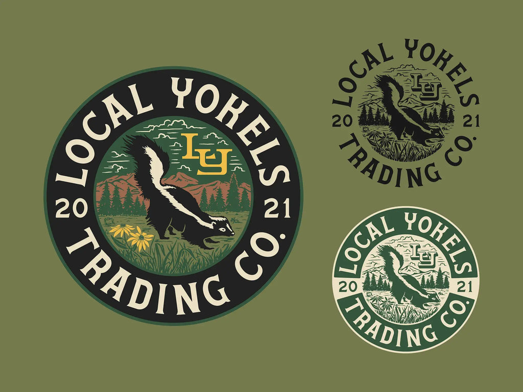
Source: Chelsea Bunn, Local Yokels Emblem, Dribbble, https://dribbble.com/shots/19480740-Local-Yokels-Emblem
Organic Symbols and Nature-Inspired Design
Nature remains an important source of logo inspiration, particularly when sports and wellness logo design ideas seek to communicate responsibility, balance, and a closer relationship with the physical world.
Soft and Fluid Geometry
Nature logo design ideas often use flowing lines, rounded silhouettes, irregular circles, waves, landscapes, botanical forms, or shapes inspired by cells and natural growth. Compared with rigid geometry, these forms can feel welcoming and calm.
Earthy greens, clay colors, warm neutrals, and muted blues often support this direction, though nature-inspired design need not rely on green.
Moving Beyond Generic Eco Symbols
A leaf, tree, or globe can quickly communicate sustainability, but these symbols have become extremely common. To create a more distinctive mark, designers can look at the brand’s specific materials, location, process, ingredients, or environmental purpose.
A coastal business might reference tides, while a skincare brand could use a specific plant structure. Closer ties to the brand story make symbols less generic.
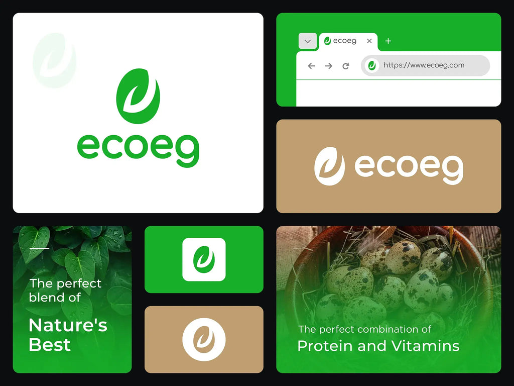
Source: Soaib, Eco Logo, Dribbble, https://dribbble.com/shots/25744903-eco-logo
Continue Reading
- 30 Best Vintage Logo Design Ideas You Should Check
- 30 Best Restaurant Logo Design Ideas You Should Check
- 30 Best Fitness Logo Design Ideas You Should Check
- 30 Best Fashion Logo Design Ideas You Should Check
- 30 Best App Logo Design Ideas You Should Check
- 30 Best Creative Studio Logo Design Ideas You Should Check
Playful Logos, Mascots, and Illustrative Characters
Playfulness is returning as brands look for ways to appear more approachable and memorable. Instead of relying exclusively on restrained minimalism, designers are using expressive illustrations, unusual symbols, and character-driven animal logo design ideas.
Mascots as Brand Personalities
A mascot can give a brand a recognizable face and create opportunities for storytelling. In event logo design ideas, the character may appear in the logo, advertisements, stickers, merchandise, social posts, and animated content.
Mascots are especially useful for food, entertainment, sports, technology, youth-oriented brands, and education logo design ideas. They can explain services, react to events, or represent different moods without changing the central identity.
Unexpected Symbols and Visual Humor
Playfulness can also come from exaggerated proportions, strange combinations, visual jokes, or deliberately surprising details. A serious-looking wordmark paired with an unusual icon may create enough contrast to become memorable.
Humor can encourage interaction across social media and packaging, but it must remain intentional and brand-appropriate.
Designing Playfulness Without Losing Credibility
The amount of humor should match the audience. For example, healthcare logo design ideas may use softer curves and friendly illustrations rather than an overt cartoon character.
Carefully controlled playfulness can make even a professional identity feel more accessible and human.
AI-Assisted Logo Design and the Value of Human Direction
Artificial intelligence is changing logo development, but it has not removed the need for designers. Its greatest value currently lies in exploration, research, and iteration.
AI for Research and Early Exploration
Designers can use AI to generate visual associations, compare conceptual logo design ideas, build rough mood boards, explore color ideas, or imagine unexpected combinations. This can make the early stages of a project faster and help teams discuss possibilities before committing to a direction.
AI can also organize variations, create presentation mockups, and test concepts across applications.
The Limits of Automated Logo Creation
Generated concepts may contain generic symbolism, inconsistent details, weak letterforms, or visual similarities to existing work. They may also look convincing at first glance but fail when converted into clean vectors or reduced to a small size.
Typography remains challenging because generated lettering may contain distorted characters, inconsistent spacing, or irreproducible details.
The Designer’s Evolving Role
Human direction is essential for defining the strategy, evaluating originality, understanding cultural meaning, refining typography, and preparing a practical identity system. AI can expand the number of ideas available, but professional judgment determines which idea deserves to become a brand.
As generative tools spread, designers may spend more time editing, evaluating, and connecting visual decisions to brand purpose.
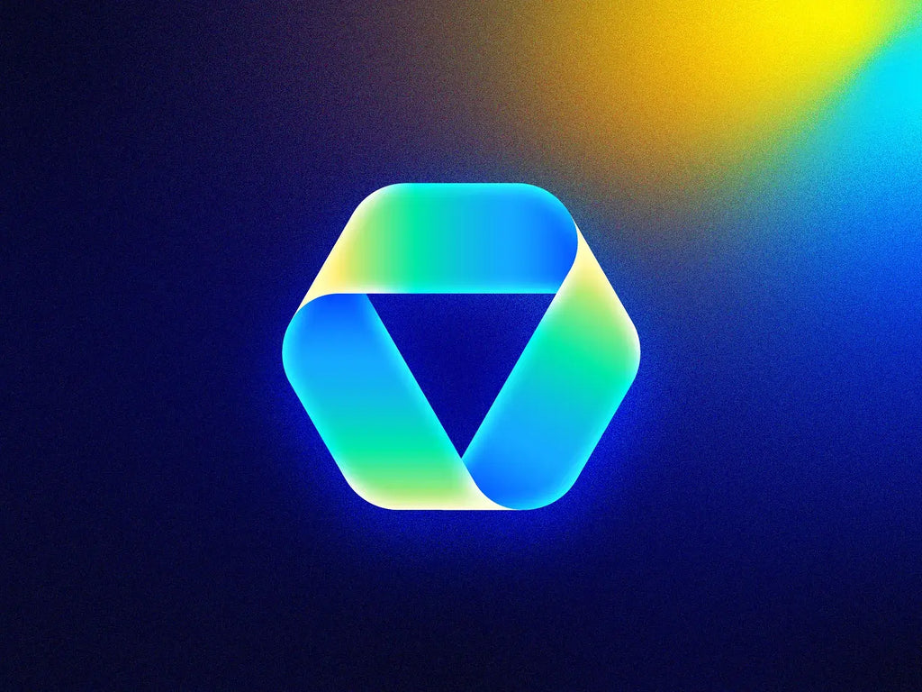
Source: Mihai Dolganiuc, Futuristic Logos #13 - Google Drive, Dribbble, https://dribbble.com/shots/18021082-Futuristic-Logos-13-Google-Drive
How to Choose and Apply the Right Logo Design Trend
A trend is useful only when it communicates the right message, so visual direction should begin with the brand.
Begin With the Brand, Not the Trend
Before deciding on a style, define the brand’s purpose, audience, personality, market position, and most important qualities. Consider how people should describe the brand after encountering it.
A handmade mark may be suitable for a local bakery but misleading for a company that wants to appear highly precise and technical. Similarly, a dimensional animated logo may suit a media platform but create unnecessary complexity for a small professional service.
Match the Trend to the Desired Impression
Responsive identity systems are useful for digital-first brands operating across many platforms. Custom typography can help fashion, editorial, cultural, and hospitality brands establish a more distinctive voice.
Handmade details suit brands built around craft, care, or personal service. Heritage styles can reinforce history and tradition, while mascots can make consumer brands feel approachable.
Test the Logo in Real Situations
A logo should be evaluated on the surfaces where it will actually appear. Test it on mobile screens, social profile images, website headers, packaging, invoices, signs, uniforms, and merchandise.
Check whether the name remains readable, the symbol remains recognizable, and the design works without gradients, textures, animation, or color. Practical testing often reveals problems that are not obvious on a large presentation screen.
Build a Complete Identity Around the Logo
The logo is only one part of the visual system. Typography, colors, patterns, illustration, photography, layout, motion, and brand voice should reinforce the same idea.
A modest logo within a coherent identity usually outperforms an impressive mark surrounded by inconsistent design.
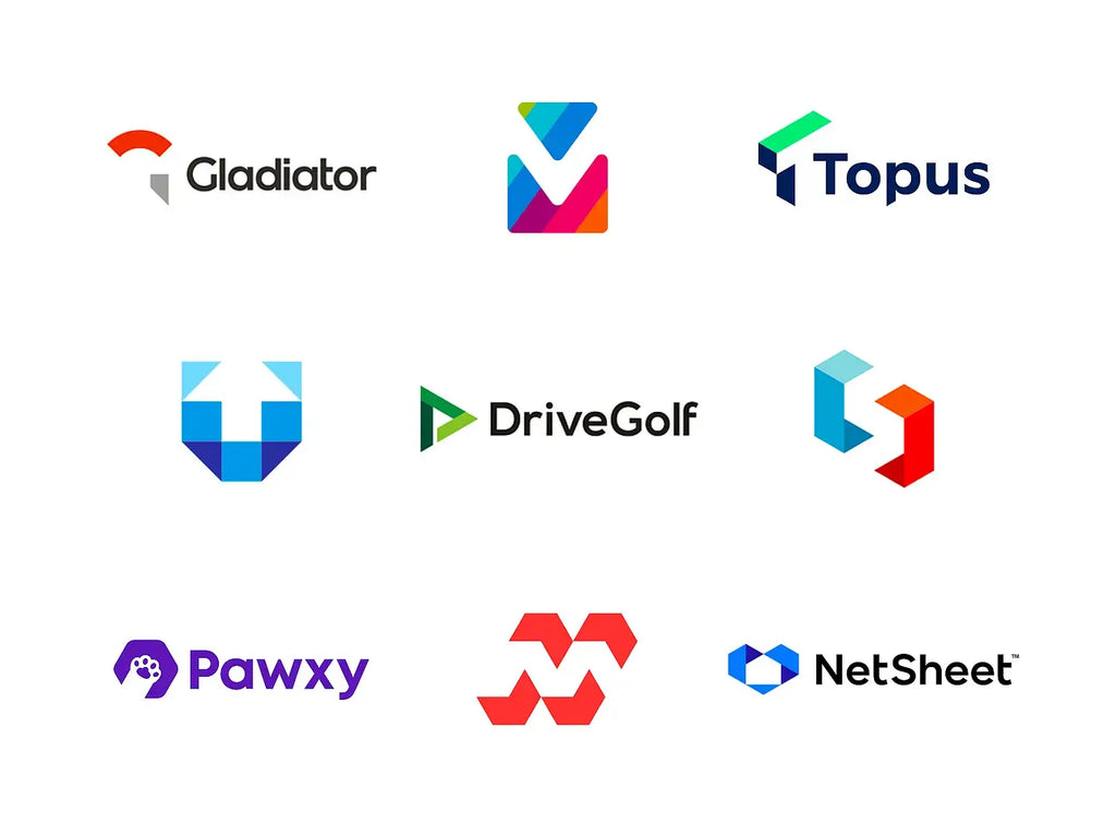
Source: Alex Tass, Negative Space Logos Collection, Dribbble, https://dribbble.com/shots/23907244-Negative-space-logos-collection
Logo Trend Mistakes That Can Weaken a Brand
Following Too Many Trends at Once
One common mistake is combining too many popular ideas. A logo does not need experimental typography, retro colors, three-dimensional effects, handmade textures, and an animated mascot all at once.
Copying Surface-Level Aesthetics
Another mistake is copying the surface appearance of a successful brand. Similar colors or letterforms cannot reproduce the strategy, reputation, and history that make another identity effective.
Trend references are starting points; the final concept must reflect the brand’s audience, values, and competitive position.
Ignoring Practical Logo Requirements
Practical requirements should remain central. Excessive detail, poor contrast, unreadable lettering, and dependence on special effects can make a logo difficult to reproduce.
The design must work at small sizes, in one color, on digital interfaces, and under imperfect production conditions.
Rebranding Without a Clear Reason
Brands should avoid redesigning simply because a new trend has appeared. Sometimes the best choice is a subtle refinement, such as adjusting spacing, improving proportions, simplifying a symbol, or expanding the number of responsive versions.
A redesign should solve a genuine communication, recognition, or usability problem.
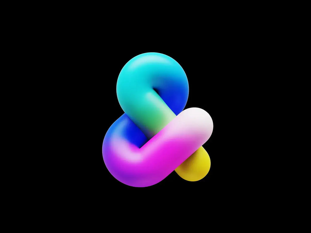
Source: Mihai Dolganiuc, Ampersand 3D Logo, Dribbble, https://dribbble.com/shots/24869500-Ampersand-3D-Logo
Frequently Asked Questions
What Are the Biggest Logo Design Trends in 2026?
The biggest logo design trends in 2026 include adaptive identity systems, expressive typography, handcrafted details, dimensional effects, motion-ready logos, modern nostalgia, and culturally grounded design. Many brands are also moving toward flexible visual identities that can change across platforms while maintaining a recognizable and consistent core.
Is Minimalist Logo Design Still Popular in 2026?
Minimalist logo design remains popular because it offers clarity, versatility, and strong digital performance. However, overly generic minimalism is becoming less effective. In 2026, simple logos often include distinctive typography, meaningful geometry, unusual proportions, or subtle visual details that give the brand a more memorable personality.
Should Every Brand Follow Current Logo Design Trends?
Not every brand should follow current logo design trends. A trend should only be used when it supports the brand’s personality, audience, industry, and long-term goals. Choosing a style simply because it is popular can make a logo feel disconnected from the business or cause it to become outdated quickly.
How Is AI Changing Logo Design?
AI is changing logo design by helping designers generate ideas, explore compositions, test color combinations, and develop visual directions more quickly. However, AI cannot replace strategic thinking, cultural understanding, originality checks, or detailed refinement. Professional designers are still needed to turn initial concepts into coherent and usable brand identities.
What Makes a Logo Look Modern in 2026?
A modern logo in 2026 is adaptable, recognizable, and designed to perform across digital and physical environments. Strong typography, thoughtful simplicity, flexible variations, and a distinctive visual character are more important than following one specific style. A modern logo should also connect naturally with the wider brand identity.
How Can a Trendy Logo Avoid Becoming Outdated?
A trendy logo can remain relevant by being built around a clear concept and a simple, recognizable core. More temporary design trends can be introduced through colors, animation, textures, patterns, or supporting graphics. This allows the brand to refresh its visual style without repeatedly replacing its primary logo.
Which Logo Trends Work Best for Small Businesses?
Small business logo design ideas should prioritize trends that improve clarity, recognition, scalability, and ease of use. Custom typography, approachable handmade details, distinctive colors, and flexible logo variations can work well when they reflect the business accurately. The design should remain practical for websites, social media, packaging, signage, and printed materials.
Conclusion: Creating a Current Logo That Can Still Last
The leading logo design trends of 2026 show that branding is becoming more flexible, expressive, dimensional, and emotionally aware. Responsive systems help identities work across changing formats, while custom typography, handmade details, heritage references, organic forms, and playful characters give brands a more recognizable personality. Motion and AI are also expanding what designers can create and how quickly they can explore ideas.
The most fashionable option is not automatically effective. A lasting logo must communicate clearly, remain recognizable, and perform reliably.
Treat trends as creative tools rather than fixed rules. Select those that support the brand’s purpose, then refine them into an identity that feels current without depending on temporary visual fashions.
You May Also Like
- 30 Best Technology Logo Design Ideas You Should Check
- 30 Best Typographic Logo Design Ideas You Should Check
- 30 Best Minimalist Logo Design Ideas You Should Check
- 30 Best Modern Logo Design Ideas You Should Check
Let Us Know What You Think!
Every information you read here are written and curated by Kreafolk's team, carefully pieced together with our creative community in mind. Did you enjoy our contents? Leave a comment below and share your thoughts. Cheers to more creative articles and inspirations!
Related Articles


Leave a Comment