
How To Create A Logo Design That Tells A Story
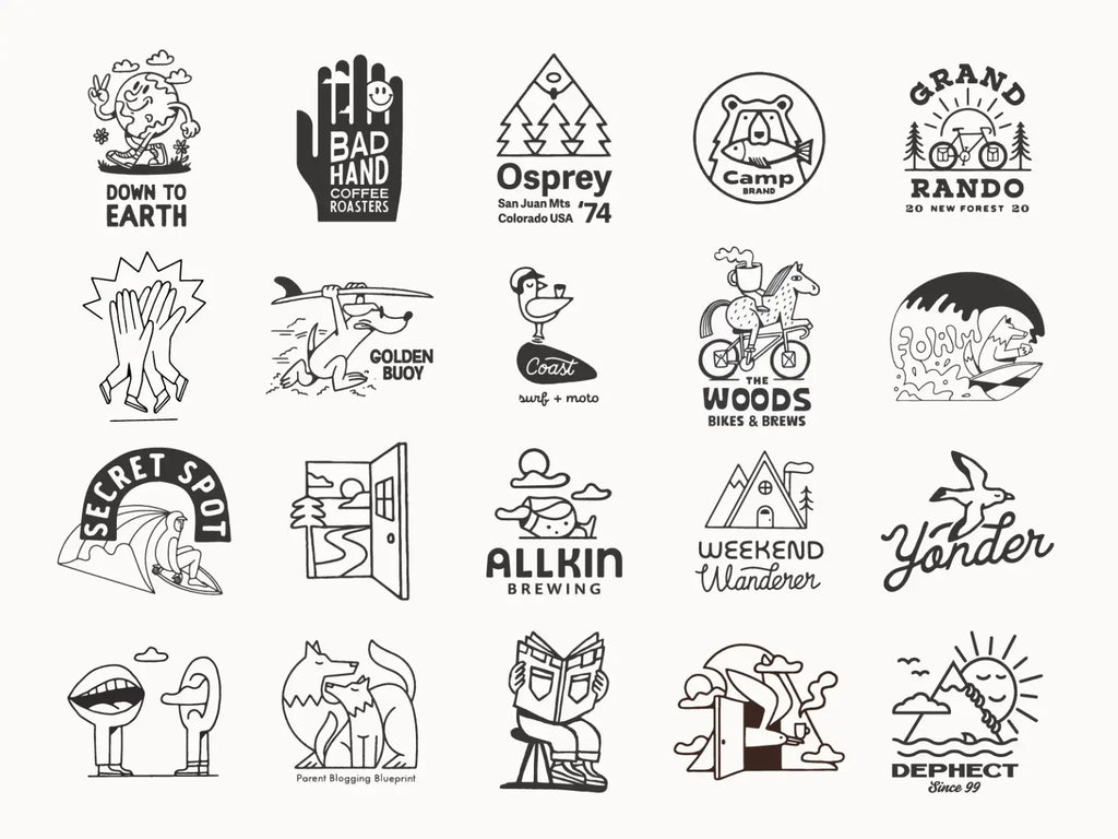
Source: Aron Leah, Round Up!, Dribble, https://dribbble.com/shots/17664879-Round-up
A logo can do more than identify a business. It can hint at where a brand came from, what it values, and how it wants people to feel. That is the purpose of logo design storytelling: using a compact visual system to communicate one meaningful idea without relying on a long explanation. The story does not need to cover every part of a company’s history. Trying to include too much usually weakens the result. A strong logo focuses on one narrative, such as growth, craftsmanship, community, discovery, or transformation. Every visual choice can then support that direction. Creating this kind of logo requires a clear brand story, audience awareness, and careful translation from words into symbols. The process below helps keep that story focused and memorable.
Identify the Central Story Before Designing
Begin with a narrative rather than random sketching. Before choosing shapes or typefaces, decide what the logo needs to say. This keeps attractive but unrelated ideas from taking over.
Clarify the Brand’s Beginning
Examine how the brand started. Was it created to solve a personal frustration, preserve a tradition, support a community, or introduce a better way of doing something? The origin does not have to appear literally in the logo, but it can reveal the most meaningful part of the identity.
A family bakery rooted in inherited recipes will suggest a different visual direction from a technology company built to simplify a difficult process.
Define the Brand’s Purpose
Identify what the brand wants to improve, provide, or change. A company built around confidence may need a different visual tone from one centered on speed, protection, or exploration. Try to express the purpose in one direct sentence.
Choose One Narrative Direction
Most brands contain several stories, but a logo cannot communicate all of them equally. Choose one dominant idea and let secondary details support it. A focused concept is easier to recognize, remember, and develop consistently.
Understand What the Audience Should Feel
Logo design storytelling is not only about what the brand wants to express. It also depends on what people are likely to understand when they see the design. Viewers rarely study a logo for long, so the first emotional impression matters.
Identify the Desired Emotional Response
Choose the feeling the logo should create, such as trust, curiosity, warmth, confidence, calm, or energy. The goal is to align the visual identity with the experience the brand provides.
A financial service may need to communicate stability and clarity. A children’s product may need to feel playful and safe. Naming the desired response makes later design decisions easier to evaluate.
Consider the Audience’s Existing Associations
People bring their own associations to symbols, colors, and styles. A mountain can suggest adventure or endurance, while a circle may represent unity or continuity. Meanings also change across cultures and industries, so research the audience before settling on a concept.
Avoid Messages That Require Explanation
A logo can contain a subtle second layer, but its main idea should not depend on a designer’s presentation. If viewers only understand the concept after hearing a detailed explanation, the story may be too obscure.
Translate the Story Into Visual Themes
Once the narrative is clear, turn it into visual material. This connects strategy with sketching and prevents symbols from being chosen only for appearance.
Extract Important Keywords
List words connected to the brand’s origin, purpose, personality, and audience. Include objects, actions, emotions, textures, places, and movements. A story about helping small businesses grow might produce words such as roots, steps, momentum, guidance, structure, and possibility.
Group related words into a few themes so the concept remains manageable.
Build Meaningful Visual Connections
Translate each theme into possible forms. Growth could become a sprout, an upward path, expanding rings, or an opening shape. Connection might appear through interlocking forms, joined lines, or a shared center.
Explore literal, symbolic, and abstract interpretations. The strongest concept may come from connecting two themes rather than choosing the first obvious symbol.
Create a Focused Mood Board
Collect imagery, materials, colors, typography, and compositions that reinforce the selected narrative. Avoid filling the board with unrelated styles. A focused mood board gives the design a visual boundary and helps maintain consistency during development.
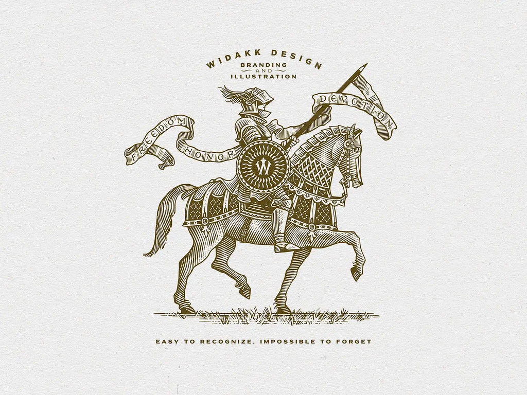
Source: Srdjan Vidakovic, Knight Without a Lord, Dribble, https://dribbble.com/shots/18263509-Knight-Without-a-Lord
Develop Symbols With More Than One Layer of Meaning
A storytelling logo can become memorable when one simple symbol carries two related ideas. The challenge is adding depth without creating clutter.
Use Relevant Metaphors
Metaphors make abstract ideas visible. A bridge can suggest connection or progress. A shield may represent protection. A doorway can communicate access, opportunity, or transition.
Choose metaphors that relate directly to the brand’s actual role. The symbol should feel earned by the story rather than attached afterward.
Combine Symbols Carefully
Two ideas can sometimes be merged through negative space, shared outlines, or overlapping geometry. A leaf may also resemble a flame, a path may form an initial, or two hands may create a heart.
These combinations work best when both meanings support the same narrative. If the relationship feels forced, simplify it.
Keep the Symbol Connected to the Brand
Ask why the symbol belongs to this particular brand. If the same mark could represent many unrelated businesses without adjustment, it may be too generic.
Respect Cultural Meanings
Research symbols that may carry regional, historical, religious, or social meanings. A concept that feels harmless in one context may communicate something very different elsewhere.
Use Color and Typography to Support the Narrative
The symbol may introduce the story, but color and typography shape its tone. Both should reinforce the same personality.
Select Colors for Meaning and Mood
Choose a restrained palette based on the emotional direction and context. Muted tones may suggest heritage or seriousness, while brighter combinations can feel optimistic or energetic. Natural colors may support stories related to craft, sustainability, or place.
Color meanings are not universal, so consider the audience and industry rather than relying on simple color formulas.
Match Typography to the Brand’s Voice
Typography gives the brand a voice. A refined serif may suggest tradition or authority. A geometric sans serif can feel structured and contemporary. Custom lettering may communicate craft or individuality.
Pay attention to width, stroke contrast, corners, spacing, and rhythm. These details influence the story as much as the typeface category.
Create Consistency Between Every Element
Review the symbol, lettering, and palette together. If one element suggests heritage while another feels futuristic, the narrative may become unclear. Consistency makes the identity feel deliberate and believable.
Shape the Composition Around the Story
Composition influences which meaning viewers notice first. Direction, balance, spacing, and hierarchy can all support the narrative.
Use Direction to Suggest Movement
Upward angles can imply growth or ambition. Forward movement may suggest progress or speed. Circular arrangements often communicate unity or continuity, while inward movement can create a sense of focus or protection.
Use movement only when it fits the central idea.
Control the Visual Hierarchy
Decide what viewers should notice first. The main silhouette should communicate the primary message, while smaller details can reveal themselves later. This creates depth without weakening recognition.
Use Negative Space Intentionally
Negative space can reveal a second symbol, letter, or direction without adding clutter. The hidden element should still reproduce clearly at small sizes and must not interfere with the main shape.
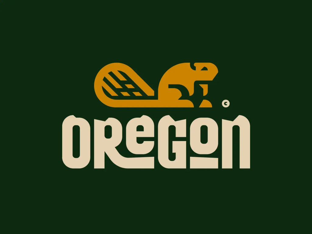
Source: Milos Djuric/Djuksico, Oregon, Dribble, https://dribbble.com/shots/17447989-Oregon
Simplify the Story Without Losing Its Meaning
A strong narrative does not require detailed illustration. Simplification helps a logo work on signs, screens, packaging, and small printed materials.
Remove Decorative Elements
Review every line, shape, and effect. If an element does not improve recognition or meaning, remove it. Decoration often makes the concept busier without strengthening the story.
Preserve the Essential Visual Clue
Identify the feature that carries the narrative. It may be a hidden path, a joined shape, a distinctive curve, or a meaningful relationship between forms. Protect that feature as the design becomes simpler.
Test the Logo in One Color
A one-color version shows if the idea depends too heavily on gradients, shadows, or color differences. The central story should remain visible through shape and structure alone.
Balance Subtlety and Clarity
A deeper meaning can reward closer attention, but the main symbol should still be easy to recognize. Give viewers an immediate impression first and a secondary detail to discover later.
Test How Clearly the Story Is Understood
Designers can become so familiar with a concept that its meaning feels obvious. Testing reveals the difference between intention and audience interpretation.
Ask Viewers What They Notice First
Show the logo without explaining it. Ask what people see, what feeling it creates, and what kind of brand they imagine. First reactions are usually more useful than general questions about personal taste.
Compare Responses With the Intended Message
Look for patterns. If most viewers describe ideas close to the intended narrative, the concept is working. If they repeatedly see an unrelated object or feel the wrong emotion, the design needs refinement.
Refine Rather Than Explain
When the same misunderstanding appears several times, revise the visual solution instead of adding a longer explanation. Adjust the silhouette, spacing, hierarchy, or relationship between symbols until the story becomes easier to read.
Conclusion
A logo that tells a story begins with one clear idea, not a complicated image. Define the central narrative, understand the audience’s likely response, and translate the story into visual themes before developing the final mark. Color, typography, composition, and negative space should then strengthen the same message. Effective logo design storytelling does not explain everything about a brand. It captures one meaningful idea clearly enough to work across different contexts. Subtle details can add depth, but the main message must remain recognizable. When every visual choice supports the same narrative, the logo feels intentional rather than decorative. It becomes a compact expression of the brand’s purpose, personality, and direction—one that people can notice quickly and remember easily.
Let Us Know What You Think!
Every information you read here are written and curated by Kreafolk's team, carefully pieced together with our creative community in mind. Did you enjoy our contents? Leave a comment below and share your thoughts. Cheers to more creative articles and inspirations!
Related Articles


Leave a Comment