
How To Prepare Logo Designs For Prints
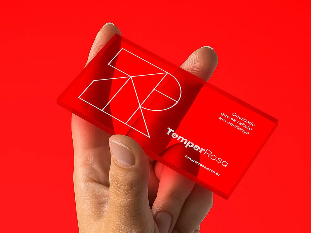
Source: Mr.Mockup, Business Card Mockups, Dribble, https://dribbble.com/shots/15091771-Business-Card-Mockups
A logo may look polished on a screen and still fail once it reaches paper, fabric, packaging, or another physical surface. Colors can shift, thin lines can disappear, small text can become unreadable, and low-resolution files can produce blurred edges. These problems usually come from incomplete file preparation rather than weak design. Preparing a logo design for print means translating the original artwork into a form that a printer can reproduce accurately. That process includes choosing suitable color settings, preserving vector quality, checking scale, preparing alternate versions, and exporting the correct files. Careful preparation protects the design and the brand behind it. When the files are built correctly, the printed logo remains clear, recognizable, and consistent across applications, from a small business card to a large sign.
Understand How Printing Can Affect a Logo
Printing is not simply a physical copy of what appears on a monitor. Screens create color with light, while printers build color with inks, pigments, or other materials. That difference changes how brightness, contrast, and saturation are reproduced.
Screen Color Versus Printed Color
Most screens use RGB color, which combines red, green, and blue light. RGB can display intense blues, greens, and neon-like tones that standard printing cannot reproduce exactly. Commercial printing commonly uses CMYK inks: cyan, magenta, yellow, and black. A logo that depends on highly luminous RGB colors may appear flatter after conversion. Testing the artwork in the intended print color space early helps prevent unpleasant surprises.
Printing Methods and Materials
Different production methods place different limits on the artwork. Offset and digital printing can reproduce detailed color work, while screen printing may use only a few solid inks. Embroidery replaces printed shapes with stitches, and foil stamping or embossing usually depends on simplified artwork. Paper, cardboard, plastic, metal, and fabric also affect the result. A color on glossy white stock can look very different on uncoated kraft paper, so preparation must reflect the actual method and surface.
Start With Editable Vector Artwork
A strong print workflow begins with a clean vector master file. Vector artwork is built from mathematical paths rather than fixed pixels, so it can be enlarged or reduced without losing sharpness.
Why Vector Files Work Best
A vector logo can move from a product label to a storefront sign while keeping smooth curves and crisp edges. Formats such as AI, EPS, SVG, and vector-based PDF are commonly used during production, depending on the printer’s requirements. Raster files can support a project, but they should not be the only source. Enlarging a small website JPEG reveals pixels and compression artifacts.
Keep an Editable Master File
Preserve one organized source file with live text, editable shapes, named layers, and original color values. This version becomes the foundation for future exports and adjustments. Before creating production copies, save a separate working version so text can be outlined and effects expanded without damaging the editable original.
Clean Up Unnecessary Elements
Remove hidden objects, unused swatches, stray anchor points, empty text frames, and accidental shapes outside the artboard. Review masks, transparency, and overlapping paths. Simplifying the file reduces the chance of unexpected objects appearing during export or output.
Set Up Colors for the Printing Method
Color preparation has a direct effect on brand consistency. The right setup depends on the number of colors, the printing process, the material, and the level of accuracy required.
Convert RGB Colors to CMYK
For most full-color commercial printing, prepare a CMYK version of the logo. Do not rely on automatic conversion at the final stage, because software may shift the colors in ways that weaken contrast or alter the brand appearance. After conversion, compare the CMYK result with the original and adjust it intentionally. A vivid screen color may need to become darker or less saturated to reproduce well.
Use Spot Colors When Consistency Matters
Spot colors use premixed inks rather than combinations of CMYK dots. Systems such as Pantone can help maintain a more consistent brand color across different print runs and suppliers. Spot colors suit simple logos, stationery, packaging, and jobs where exact matching matters. The printer should confirm whether they fit the process and budget.
Prepare Reliable Black Values
A standard black made with 100 percent black ink is suitable for small text, thin lines, and simple logo details. Rich black combines black with additional CMYK inks to create a deeper tone over large areas. Registration black should never be used as an ordinary design color. It prints with every ink plate and can cause excessive coverage or alignment problems.
Create One-Color and Reversed Versions
A complete logo design for print package should include more than the full-color mark. Prepare black, white, grayscale, and single-color versions for applications with limited inks or restricted backgrounds. Check reversed white logos carefully. Fine negative spaces may need to be opened slightly so they do not close on dark material.
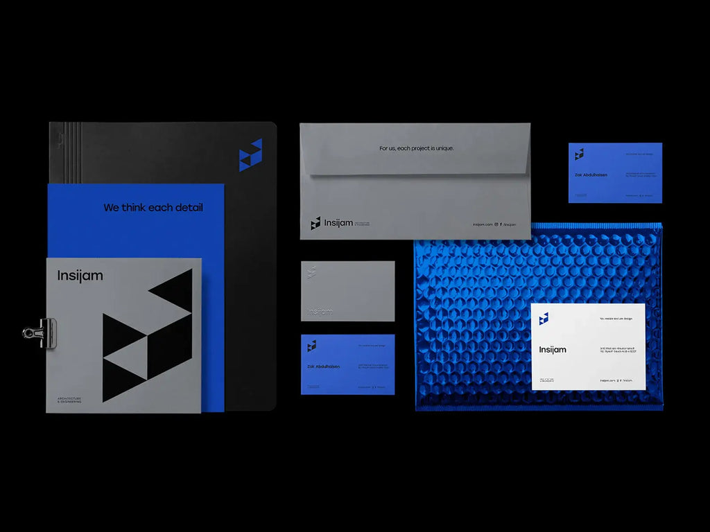
Soruce: Mr.Mockup, Corporate Stationary Mockups, Dribble, https://dribbble.com/shots/15758098-Corporate-Stationery-Mockups
Prepare Typography and Supporting Assets
Typography can create production problems when fonts or linked files are missing. Final artwork should be self-contained and easy for the printer to open.
Outline Fonts Carefully
Convert final logo lettering to vector outlines so the appearance does not depend on the printer owning the same font. Outlined text preserves shape, spacing, and custom adjustments. Keep a separate editable file with live text because outlined lettering is harder to revise.
Embed or Package Linked Files
If the logo contains placed textures, raster effects, or other external assets, embed them or package them with the source file. Missing links can create blank areas or low-resolution previews in the exported artwork.
Check Special Characters and Font Details
Before outlining, inspect punctuation, spacing, ligatures, accent marks, and modified letterforms. Zoom in closely and review the logo at normal size. Small typographic errors are easy to overlook but highly visible once printed repeatedly.
Check Resolution, Scale, and Fine Details
A logo must work at its actual production size, not only when enlarged on screen. Every detail should remain clear under realistic printing conditions.
Confirm Raster Image Resolution
Any raster elements should have enough effective resolution at the final size. For many printed applications, 300 pixels per inch is a common target, although large-format work may use lower resolution because it is viewed from farther away. Check effective resolution after scaling, since enlarging a small image reduces its usable detail.
Test the Logo at Actual Size
View the artwork at 100 percent and print a basic desktop proof at the intended dimensions. This reveals problems that zoomed-in inspection can hide. A line that looks substantial on screen may be barely visible on a small tag. Likewise, a compact slogan may become unreadable on a pen, sticker, or business card.
Review Minimum Line Weights
Check thin strokes, tiny gaps, narrow counters, delicate patterns, and closely spaced shapes. Ink can spread slightly, especially on uncoated or absorbent materials. Fine details may merge or disappear. Ask the printer for minimum line-weight guidance for screen printing, engraving, embroidery, or specialty finishes.
Simplify Small Logo Variations
Create a simplified version for very small uses. Remove a tagline, reduce internal detail, or use only the symbol when the full logo becomes crowded. This controlled adaptation preserves recognition.
Use Bleed, Trim, and Safe Areas Correctly
Bleed and trim settings matter when a logo sits near an edge or forms part of a full-page graphic.
Add Bleed When Artwork Reaches the Edge
Bleed extends printed artwork beyond the final cut line. It prevents unwanted white slivers caused by slight movement during trimming. If a logo sits inside a background shape that reaches the edge, the background should extend through the bleed area. The logo itself usually stays inside the safe zone unless the design intentionally crops it.
Protect the Safe Area
Keep important logo elements away from trim lines, folds, perforations, seams, and packaging creases. A safe margin allows slight production variation without damaging essential content.
Follow the Printer’s Template
Use the printer’s dieline or production template for labels, cartons, sleeves, and folded materials. Do not resize or redraw it without permission. Place the logo on the correct layer and confirm which lines are guides rather than printable artwork.
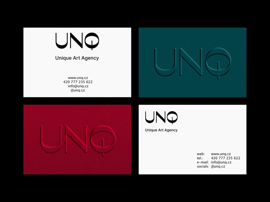
Source: Bonumo, Business Cards Design, Dribble, https://dribbble.com/shots/19756115-Business-Cards-Design
Create the Right Print-Ready File Versions
Printers may request several formats for different purposes. An organized set prevents confusion and unnecessary conversions.
Export a Production PDF
A print-ready PDF is often the main delivery file. Use the printer’s requested preset or PDF standard, preserve vectors, embed profiles when required, and confirm that the page size matches the job. Avoid aggressive compression, then open the exported PDF separately to verify edges, transparency, and colors.
Supply Original Vector Formats When Requested
Some printers prefer AI or EPS files for spot-color separation, cutting paths, or production adjustments. Supply source artwork only after cleaning it and outlining final text.
Avoid Relying on Web Formats
PNG and JPEG files are useful for previews, but they should not replace the production master. They may use RGB color, limited resolution, or damaging compression.
Use Clear File Names
File names should identify the logo version, color mode, background treatment, and format. Names such as Brand_Logo_CMYK_FullColor.pdf or Brand_Logo_White_SpotColor.eps make the package easier to understand.
Proof the Logo on Its Intended Application
A logo should be judged in context. The same mark can behave differently on a coated box, a fabric shirt, a narrow label, or a textured card.
Test Common Printed Sizes
Place the logo into mockups or production layouts at realistic dimensions. Check business cards, letterheads, packaging, signage, apparel, and any other likely application. Focus on readability, spacing, and visual balance rather than presentation effects.
Review Light and Dark Backgrounds
Test every approved version on light, dark, colored, and photographic backgrounds. Make sure contrast remains strong and that transparent areas behave as expected.
Consider Paper and Material Samples
Physical swatches reveal how surface color, texture, gloss, absorbency, and transparency affect the logo. Metallic ink on matte paper, for example, differs from the same ink on glossy stock.
Request a Printed Proof
For large, costly, or color-sensitive jobs, request a contract proof, press proof, or production sample. Review color, placement, scale, and finishing before approving the complete run.
Run a Final Preflight and Consult the Printer
A final preflight catches technical problems before production begins.
Confirm the Printer’s Specifications
Ask which formats, color profiles, bleed values, PDF settings, and spot-color names the printer requires. Also confirm minimum line weights, supported transparency, and any special rules for cutting, foil, embroidery, or white ink.
Inspect Technical File Settings
Review overprint settings, embedded images, clipping paths, transparency, document dimensions, and color separations. Remove accidental printer marks unless the supplier specifically asks for them.
Verify Every Delivered Version
Open every exported file independently rather than assuming the export worked. Check that fonts, shapes, layers, colors, and dimensions remain correct. This inspection can prevent an expensive reprint.
Conclusion
Preparing a logo design for print is part of the design process, not an administrative afterthought. Clean vector artwork, controlled color settings, readable details, suitable file formats, and accurate production boundaries all help the printed mark remain faithful to the original idea. The most reliable workflow also accounts for the intended material and printing method. A logo prepared for offset paper printing may need changes before it works in embroidery, screen printing, or foil stamping. By testing at actual size, creating alternate versions, and confirming specifications with the printer, designers can protect clarity and brand consistency across every physical application.
Let Us Know What You Think!
Every information you read here are written and curated by Kreafolk's team, carefully pieced together with our creative community in mind. Did you enjoy our contents? Leave a comment below and share your thoughts. Cheers to more creative articles and inspirations!
Related Articles
Related Articles


Leave a Comment