10 Tips to Print Logo Designs on Business Cards

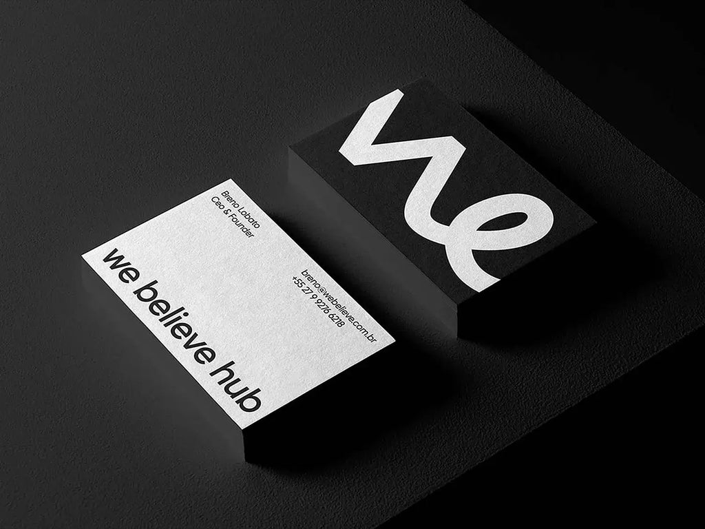
Source: Mr.Mockup, Business Card Mockups, Dribbble, https://dribbble.com/shots/18449372-Business-Card-Mockups
A business card is more than just a piece of paper—it represents your brand, professionalism, and identity. One of the most crucial elements of an effective business card is a well-printed logo. A high-quality logo print enhances brand recognition and leaves a lasting impression on clients, partners, and potential customers. However, printing logo designs on business cards requires careful planning and attention to detail to ensure the best results.
In this article, we will explore ten essential tips to help you print logo designs on business cards with professional quality. Whether you are a designer, entrepreneur, or business owner, these guidelines will ensure your business cards stand out with a polished and visually appealing logo. By following these best practices, you can create business cards that effectively showcase your brand and leave a strong impression on everyone who receives them.
Choose the Right Printing Method
Selecting the right printing method is essential to ensure your logo appears sharp, vibrant, and professional on business cards. Different printing techniques offer varying levels of detail, durability, and finish, so choosing the best one depends on your design requirements and budget.
Offset printing is a high-quality option that delivers precise color reproduction and sharp details. It is ideal for bulk orders as it maintains consistency across large quantities. However, it requires more setup time and is less cost-effective for small batches.
Digital printing is a versatile and cost-effective method, especially for short runs. It produces crisp, full-color images without the need for printing plates. While not as refined as offset printing, it offers quick turnaround times and is suitable for most business card designs.
Letterpress printing adds texture and depth to logos by pressing the design into thick paper. This technique is best for minimalist or monochrome logos, as it emphasizes tactile appeal.
Screen printing and foil stamping are great options for specialty finishes, such as metallic or glossy effects. These techniques enhance the logo’s appearance, making the business card stand out.
Before finalizing your choice, consider the complexity of your logo, the paper type, and the overall aesthetic you want to achieve. Testing a sample print can help determine the best method for your business cards.
Use High-Resolution Logo Files
Using high-resolution logo files is crucial to achieving a crisp, professional print on business cards. A low-quality or pixelated logo can make a business card look unpolished and unprofessional, reducing the impact of your brand.
For the best results, always use vector files such as AI, EPS, or SVG formats. Vector graphics maintain sharpness at any size, ensuring clean lines and precise details when printed. Unlike raster images like PNG or JPEG, vector files do not lose quality when resized.
If you must use a raster image, ensure it is at least 300 DPI (dots per inch). A higher DPI prevents pixelation and blurriness in print. Avoid low-resolution images (under 72 DPI) as they are designed for screens and do not print well.
When preparing your logo for printing, make sure it is in the CMYK color mode instead of RGB. CMYK is the standard for printing, ensuring accurate color reproduction. RGB colors may appear vibrant on screens but can print differently than expected.
Additionally, always convert text to outlines to prevent font issues and remove unnecessary background elements that may interfere with the final print.
Before sending your files to the printer, request a proof print to check clarity and color accuracy. Ensuring your logo file is in the right format and resolution will guarantee a high-quality print that enhances the professionalism of your business cards.
Select a Suitable Paper Stock
Choosing the right paper stock is essential when printing logo designs on business cards. The type of paper you select affects not only the durability of the card but also how well the logo appears in print. A high-quality paper enhances the visual impact of your design, ensuring a professional and polished look.
Matte paper offers a smooth, non-glossy finish that reduces glare and provides a clean, modern appearance. It works well for subtle and sophisticated logo designs, allowing colors to remain rich without excessive shine.
Glossy paper enhances color vibrancy and sharpness, making it a great choice for logos with bright colors or detailed elements. However, it may reflect light, which can sometimes make small text harder to read.
Textured paper, such as linen or cotton stock, adds a unique feel and makes business cards stand out. These papers are ideal for brands that want a more tactile, premium look. However, heavy textures may affect fine logo details.
Thicker cardstock (16 pt or higher) provides durability and a luxurious feel. Thin paper can make a business card appear flimsy, reducing its perceived value.
Before making a final decision, request paper samples and test print your logo to see how it interacts with different finishes. The right paper stock ensures your business cards not only look professional but also feel premium in hand.

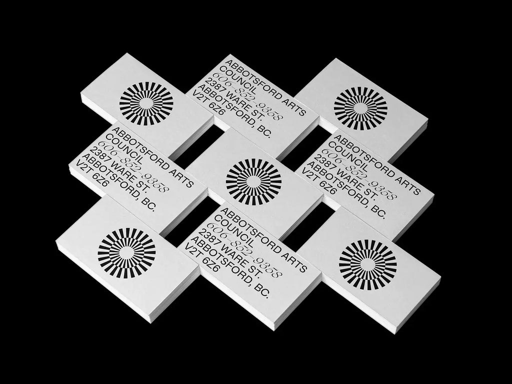
Source: Mr.Mockup, Business Card Mockups, Dribbble, https://dribbble.com/shots/12719414-Business-Card-Mockups
Keep Color Consistency in Check
Maintaining color consistency is critical when printing logo designs on business cards. If colors appear different from your original design, it can affect brand recognition and weaken your professional image.
First, always work in the CMYK color mode, as this is the standard for print. Designs created in RGB may look vibrant on screens but can shift when printed. Converting to CMYK ensures colors remain accurate.
Using Pantone Matching System (PMS) colors is another way to maintain consistency. Pantone colors are pre-mixed and standardized, making them ideal for logos with strict brand guidelines. If your logo has specific brand colors, using PMS can help ensure they appear the same across all printed materials.
Additionally, always consider the impact of paper choice on color. Glossy paper enhances vibrancy, while matte or textured paper may slightly dull colors. If possible, request a printed proof to verify how colors appear on your chosen stock before finalizing the order.
For digital printing, slight color variations may occur between print runs. To minimize this, use a professional printer with high-quality color calibration. Avoid relying solely on home or office printers, as they often lack precision.
Lastly, be mindful of background colors and contrasts. If your logo has light shades, ensure they don’t blend into the card’s background. Proper color management guarantees that your business cards reflect your brand accurately and professionally.
Avoid Overcrowding the Design
When printing logo designs on business cards, maintaining a clean and balanced layout is essential. Overcrowding the design with excessive elements, text, or graphics can make the card look cluttered and reduce its visual impact. A well-organized layout ensures that your logo remains the focal point while keeping other essential information easy to read.
Start by prioritizing the most important elements—your logo, business name, contact details, and possibly a tagline. Avoid adding unnecessary icons, excessive decorative elements, or too much text, as they can distract from the main purpose of the card.
White space plays a crucial role in design clarity. Leaving enough space around the logo and text prevents the card from looking overloaded. White space helps separate elements, making them easier to read and more visually appealing.
Font selection and sizing also contribute to readability. Using multiple font styles or making text too small can create confusion. Stick to one or two professional fonts and maintain a legible size for key information.
Additionally, avoid placing the logo too close to the edges of the card. Keeping a safe margin ensures that the logo remains properly framed and prevents it from getting trimmed during the printing process.
Ensure Proper Alignment and Spacing
Proper alignment and spacing are critical when printing logo designs on business cards. A well-structured layout enhances readability, maintains balance, and ensures a professional appearance. Misalignment or uneven spacing can make a business card look sloppy and reduce the impact of the design.
Start by using a grid system to maintain consistency in placement. Align the logo, text, and other design elements in a structured way to avoid an unbalanced layout. Center alignment is a common choice, but left or right alignment can work well, depending on the brand’s aesthetic.
Maintain even margins and padding around the edges to prevent text or logos from being cut off during printing. The recommended safe zone is at least ⅛ inch (3 mm) from the edges, ensuring that crucial design elements are not lost during trimming.
Proper line spacing (leading) between text lines improves readability, while adequate letter spacing (kerning) ensures clear, legible fonts. Crowding text too closely together can make contact information difficult to read.
When working with double-sided business cards, ensure that elements align correctly on both sides. A slight misalignment can create an off-center look, reducing the card’s visual appeal.
By focusing on alignment and spacing, you can create a clean, well-balanced business card that highlights your logo effectively. A precise layout enhances the professionalism of the card and makes a stronger impression on recipients.
Avoid Thin Lines and Small Details
When printing logo designs on business cards, it’s important to avoid using thin lines and overly intricate details. Small design elements may look sharp on a screen but can become blurry, faded, or lost in print. Ensuring clarity and visibility is essential for a polished, professional business card.
Thin lines often do not translate well in printing, especially on textured paper or when using certain printing techniques like letterpress. Fine details can break up, making the logo appear weak or incomplete. To prevent this, always use a minimum line thickness of 0.25 points (pt) for printed designs.
If your logo includes small icons, fine typography, or intricate patterns, consider simplifying these elements for business card printing. Enlarging key details or using bold strokes can improve visibility and ensure a crisp result.
Color plays a role in how details appear as well. Light-colored thin lines on a white background may not print well, resulting in a faded look. Using darker, high-contrast colors ensures visibility and sharpness.
For embossed, foil-stamped, or letterpress logos, avoid overly complex details, as these effects work best with bold and well-defined elements. Testing a sample print can help determine whether any adjustments are needed.
By keeping lines thick enough and simplifying small details, your logo will remain sharp and legible when printed. This ensures that business cards maintain a professional appearance and reflect the quality of your brand.

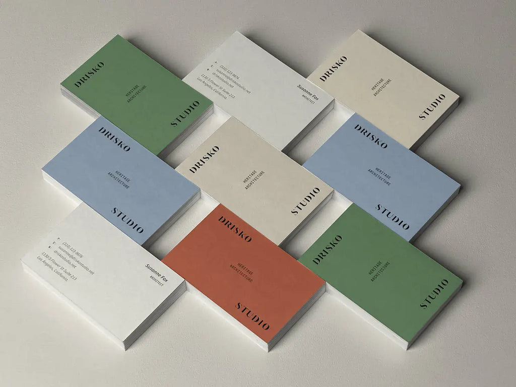
Source: Mr.Mockup, Business Card Mockups, Dribbble, https://dribbble.com/shots/15192289-Business-Card-Mockups
Opt for a Professional Print Service
Choosing a professional print service is essential for achieving high-quality results when printing logo designs on business cards. While at-home printing or budget printing options may seem cost-effective, they often lack the precision, color accuracy, and durability needed for a professional finish.
Professional print services use high-resolution printers that ensure sharp details, vibrant colors, and consistent output. They also provide access to advanced techniques such as offset printing, letterpress, embossing, and foil stamping, which can enhance the appearance of your logo and overall design.
Another key advantage of professional printers is color calibration. They use CMYK and Pantone color matching to ensure your logo colors appear as intended, reducing the risk of unwanted shifts in shade or saturation. This is especially important for maintaining brand consistency across multiple print runs.
Additionally, professional services offer a wide range of paper stocks and finishes, allowing you to choose materials that best complement your design. Whether you prefer a matte, glossy, or textured finish, working with an expert printer ensures the final product aligns with your brand’s aesthetic.
Before committing to a bulk order, always request a proof print. A professional printing service can provide a sample card, allowing you to check for alignment, color accuracy, and overall quality before full production.
Consider Double-Sided Printing
Using double-sided printing for business cards is an effective way to maximize space while maintaining a clean and professional design. A single-sided card may become cluttered if it contains too much information, while a double-sided layout allows for better organization and visual balance.
One side of the business card should focus on your logo and brand identity, ensuring that your company name and logo remain the focal point. This helps reinforce brand recognition and makes the card visually appealing at first glance.
The reverse side can include contact details, social media handles, a tagline, or a call to action. This separation prevents overcrowding and makes the information easier to read. For businesses with QR codes, websites, or appointment scheduling details, the back of the card provides a convenient space to include these elements without sacrificing design quality.
Choosing a contrasting but complementary design for the second side adds visual interest while maintaining brand consistency. For example, a solid-colored front with a minimalist logo can pair well with a detailed layout on the back.
Additionally, double-sided printing enhances durability since ink coverage is spread across both sides, reducing wear and tear. However, always ensure legibility and print clarity by choosing the right paper thickness and finish to avoid text showing through.
Consider Special Finishes
Special finishes can elevate business cards, making logo designs more impactful and memorable. Adding unique textures, metallic details, or raised effects enhances both the visual appeal and the tactile experience, reinforcing a premium brand image.
Embossing and debossing create a raised or pressed effect on the card, adding depth to the logo. This technique works particularly well for minimalist designs, as it adds subtle sophistication without excessive detail.
Foil stamping introduces metallic or glossy highlights, making logos pop with elegance. Gold, silver, or custom-colored foil can enhance brand identity and create a luxurious feel. This technique is ideal for logos with bold typography or signature elements.
Spot UV coating applies a glossy finish to specific areas, such as the logo, while keeping the rest of the card matte. This contrast draws attention to key details and adds a sleek, modern touch.
Letterpress printing uses pressure to imprint the design into thick cardstock, producing a vintage, handcrafted aesthetic. This technique works best with high-contrast logos and simple typography.
For a softer feel, velvet or soft-touch laminate gives business cards a premium, smooth texture. This finish enhances durability while providing an elegant, non-glossy appearance.
Before choosing a special finish, consider the brand identity, budget, and paper compatibility to ensure the best results. Testing a sample print helps assess how the finish complements the logo.
Conclusion
Printing logo designs on business cards requires careful attention to detail to achieve a professional and polished result. From selecting the right printing method and high-resolution files to choosing quality paper stock and special finishes, each step plays a vital role in enhancing the final appearance. Proper alignment, spacing, and avoiding overcrowding ensure clarity and readability. Additionally, double-sided printing offers more space for essential information without compromising design quality. By following these best practices, you can create business cards that effectively showcase your brand, leaving a strong and lasting impression on clients, partners, and potential customers.
Let Us Know What You Think!
Every information you read here are written and curated by Kreafolk's team, carefully pieced together with our creative community in mind. Did you enjoy our contents? Leave a comment below and share your thoughts. Cheers to more creative articles and inspirations!


Leave a Comment