Essential Key Principles of Logo Design Sizing

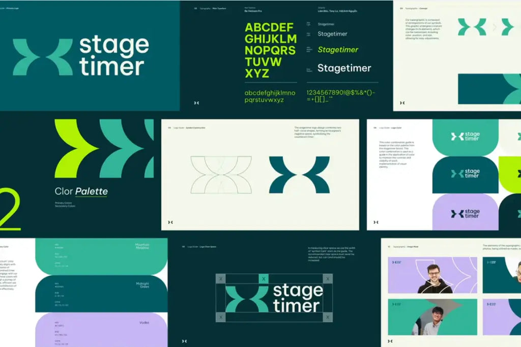
Source: SlabPixel Designer, Stagetimer - Brand Guideline, Dribbble, https://dribbble.com/shots/22476436-Stagetimer-Brand-Guideline
In the world of branding, logo design plays a crucial role in shaping how people recognize and remember a business. A logo is often the first visual element that audiences notice, and its effectiveness depends on more than just color, typography, or style. One of the most important yet often overlooked factors is the size of the logo. Proper sizing ensures that a logo remains clear, recognizable, and visually balanced across a wide range of platforms and materials.
From websites and social media profiles to business cards and large billboards, a well-crafted logo design must work effectively at many different sizes. If a logo is too detailed, it may lose clarity when scaled down. On the other hand, if it lacks structure or proportion, it may appear awkward or unbalanced when enlarged. This is why understanding the key principles of logo sizing is essential for designers and brand owners alike.
By focusing on scalability, proportion, spacing, and visual clarity, designers can create logo designs that maintain their impact in any context. Whether the logo appears on a mobile screen or a large banner, the goal is to ensure that the design remains consistent and easy to recognize. In this article, we will explore essential principles that help guide the sizing process in logo design, helping brands maintain a professional and cohesive visual identity.
Understanding The Importance Of Proper Logo Size
One of the most fundamental aspects of effective logo design is choosing the proper size for different applications. While a logo may look perfect during the design process, it must also maintain its clarity and impact when used across many formats. A thoughtfully sized logo ensures that the brand identity remains consistent whether it appears on a small digital icon or a large printed banner.
In logo design, size directly affects visibility and readability. If a logo is too small, important elements such as typography, symbols, or shapes may become difficult to recognize. Conversely, if a logo is scaled too large without considering proportions, it may appear unbalanced or overwhelming within a layout. Designers must therefore consider how the logo interacts with surrounding elements, such as text, images, and white space.
Proper sizing also helps maintain brand recognition. A well-proportioned logo design allows audiences to identify the brand quickly, even when the logo appears in different contexts. This consistency strengthens brand identity and builds trust with the audience over time.
Another important factor is adaptability. Modern brands use their logos across websites, mobile apps, packaging, social media, and printed materials. Each of these platforms may require different logo dimensions. By understanding the importance of proper sizing early in the logo design process, designers can create flexible logo systems that work effectively in many environments.
Ultimately, thoughtful logo sizing ensures that the design remains clear, balanced, and recognizable, helping brands communicate their identity with confidence.
Designing Logos With Scalability In Mind
Scalability is one of the most important principles in logo design, especially when considering how a logo will appear at different sizes. A scalable logo maintains its clarity and visual balance whether it is displayed on a tiny app icon or printed on a large billboard. Designing with scalability in mind ensures that the logo remains effective across all brand touchpoints.
A common challenge in logo design is creating graphics that work equally well at both large and small sizes. Highly detailed logos may look impressive when viewed up close, but those details can disappear when the logo is reduced. For this reason, many successful logos rely on simple shapes, clean typography, and balanced proportions that remain recognizable even when scaled down.
Vector graphics play a key role in achieving scalability. Unlike raster images, vector-based logo design allows the artwork to be resized without losing quality. This ensures that the logo stays sharp and professional regardless of how large or small it appears.
Designers should also test their logo at multiple sizes throughout the design process. Viewing the logo in small formats, such as website icons or social media thumbnails, helps identify elements that may need adjustment. If certain details become unclear, simplifying the design can improve its scalability.
By prioritizing scalability, designers create logo designs that adapt effortlessly to various applications. This approach ensures that the brand identity remains strong and recognizable across both digital and print environments.
Maintaining Clarity At Small Sizes
One of the most important challenges in logo design is ensuring that a logo remains clear and recognizable when displayed at small sizes. In today’s digital environment, logos often appear in compact spaces such as mobile apps, website headers, social media icons, and browser tabs. If a logo becomes difficult to read or visually confusing when reduced, it can weaken the overall effectiveness of the brand identity.
A clear and readable logo design usually begins with simplicity. Designs that rely on clean shapes, balanced proportions, and legible typography tend to perform much better at smaller sizes. When a logo contains too many fine details, thin lines, or complex illustrations, those elements can easily disappear when the logo is scaled down. As a result, the design may lose its visual strength.
Designers often test their logo design by shrinking it to very small dimensions during the development process. This helps reveal whether the icon, symbol, or lettering still communicates the brand clearly. If certain parts become unclear, simplifying those elements can improve visibility and maintain the logo’s impact.
Typography also plays an important role in small-scale clarity. Fonts that are overly decorative or extremely thin can become difficult to read when reduced. Choosing strong, well-structured letterforms helps maintain readability even in limited space.
By focusing on clarity at small sizes, designers ensure that their logo design performs well across modern platforms. This approach allows brands to maintain strong visual recognition whether the logo appears on a tiny digital icon or within compact interface elements.

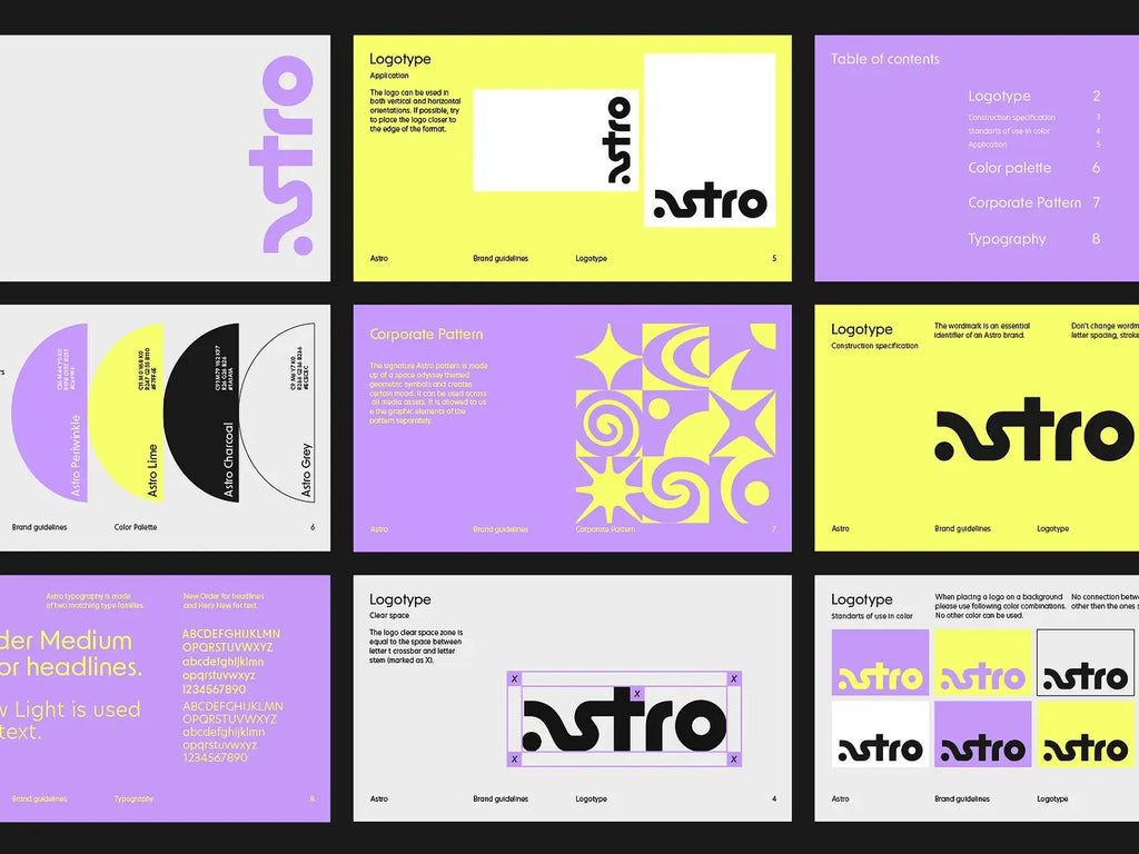
Source: Olga Vasik, Astro Brand Guide, Dribbble, https://dribbble.com/shots/17960440-astro-brand-guide
Choosing The Right Aspect Ratio For Logos
Aspect ratio is a key factor that influences how a logo design fits within different layouts and visual environments. The aspect ratio refers to the relationship between the width and height of a logo. Choosing the right proportions helps ensure that the logo remains balanced and adaptable across a wide range of applications.
Some logo designs are horizontal, with text and symbols arranged side by side. Others use a vertical or stacked structure, placing the icon above the brand name. Each format offers different advantages depending on where the logo will be used. For example, horizontal logos often work well in website headers, while stacked versions may fit better in square spaces such as social media profiles.
A flexible logo design system often includes multiple aspect ratios. This allows the brand to use the most suitable version of the logo depending on the available space. For instance, a full logo might be used for large promotional materials, while a compact version may be used for icons or small digital areas.
Designers should also consider how the logo interacts with surrounding elements. A logo that is too wide or too tall may create layout challenges when placed alongside text or images. Maintaining balanced proportions helps the logo integrate smoothly within different design compositions.
By selecting the right aspect ratio, designers create logo designs that remain visually balanced and adaptable. This flexibility ensures that the logo continues to represent the brand effectively across various formats, devices, and marketing materials.
Considering Logo Usage Across Different Platforms
Modern logo design must work across a wide variety of platforms, from digital screens to printed materials. Because brands appear in so many environments today, designers need to carefully consider how a logo will be used before finalizing its size and proportions. A logo that looks perfect on a website may not perform as well on packaging, signage, or social media profiles if sizing has not been properly planned.
Different platforms often require different logo dimensions. For example, social media platforms typically display logos in square or circular profile images, while website headers often use horizontal formats. Meanwhile, printed materials such as brochures, posters, or business cards may require the logo to appear at much smaller sizes. A thoughtful logo design anticipates these variations and ensures the design remains effective in each context.
Testing the logo across multiple platforms is a useful step during the design process. Designers often place the logo in mockups such as websites, mobile screens, merchandise, or signage to see how it performs. This helps identify whether certain elements need adjustment, such as spacing, line thickness, or icon size.
Consistency is also an important factor when using a logo on different platforms. While the size may change, the visual identity should remain recognizable. Maintaining consistent proportions, colors, and spacing ensures that the logo design communicates the same brand identity everywhere it appears.
By considering platform usage early in the design process, designers create logo designs that are flexible, adaptable, and reliable across both digital and physical brand environments.
Balancing Detail And Simplicity In Logo Design
One of the most important principles in logo design sizing is finding the right balance between detail and simplicity. While creative details can make a logo visually interesting, too many elements may reduce its effectiveness when the design is displayed at smaller sizes. A well-balanced logo design maintains visual interest while remaining clear and recognizable in any format.
Simplicity often plays a major role in successful logo design. Clean shapes, clear typography, and minimal decorative elements allow the logo to remain readable and visually strong even when scaled down. When a logo includes excessive textures, thin lines, or intricate patterns, those elements can disappear or become cluttered at smaller dimensions.
This does not mean that logo designs must be overly plain. Instead, the goal is to focus on meaningful elements that represent the brand clearly. Strategic use of shapes, spacing, and typography can create a distinctive identity without overwhelming the design. Many well-known logos rely on simple forms that remain memorable and easy to recognize.
Designers often evaluate their logo by viewing it at both large and small sizes. If the core idea of the logo remains clear in both cases, the balance between detail and simplicity is likely successful. If important elements become difficult to see, simplifying the design can improve its effectiveness.
By carefully balancing detail and simplicity, designers create logo designs that remain visually appealing while maintaining strong clarity and adaptability across various sizes and platforms.
Testing Logo Visibility On Various Backgrounds
One important principle in logo design sizing is ensuring that the logo remains visible and clear on different backgrounds. Logos rarely appear in only one environment. They may be placed on websites, packaging, advertisements, merchandise, or printed materials, each with different colors and textures. Because of this, designers must test how the logo performs across multiple background conditions.
When a logo design is placed on a busy or low-contrast background, certain elements may become difficult to see. Thin lines, light colors, or subtle shapes may disappear if the contrast between the logo and the background is too weak. This is why designers often create variations of the logo, such as light, dark, or monochrome versions, to ensure visibility in different situations.
Testing the logo at different sizes while using various backgrounds is also essential. A logo that looks strong on a plain white surface might lose clarity when placed on a textured image or colored background. Designers often simulate real-world usage by placing the logo on website banners, product packaging, and promotional materials.
Another useful approach in logo design is maintaining strong contrast and clear shapes. When the logo structure is bold and well-balanced, it remains recognizable even when the background changes. This helps protect the visual identity of the brand across different design environments.
By testing logo visibility across multiple backgrounds, designers can ensure that the logo design remains readable, consistent, and visually effective wherever the brand appears.

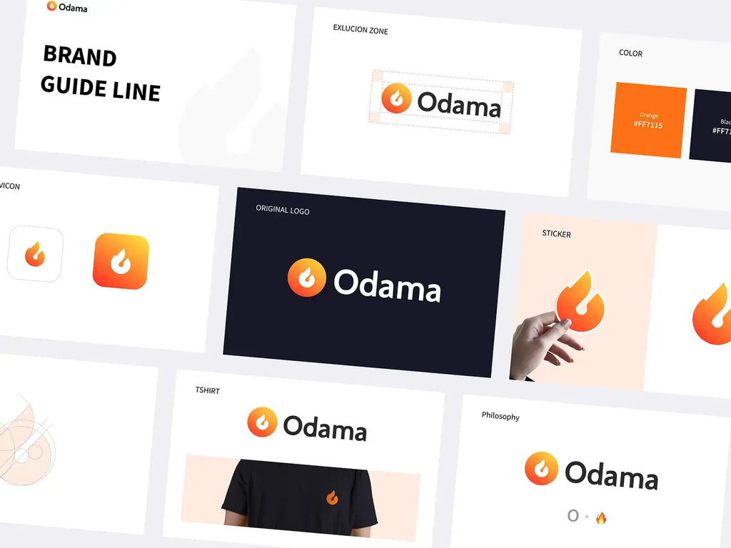
Source: Happy Milliarta, Odama Brand Guideline, Dribbble, https://dribbble.com/shots/14972995-Odama-Brand-Guideline
Creating Multiple Logo Variations For Flexibility
Flexibility is a key factor in modern logo design, especially when considering how logos must adapt to different sizes and layouts. One effective way to achieve this flexibility is by creating multiple logo variations. These variations allow the logo to maintain its visual strength while fitting comfortably within different design spaces.
A typical logo design system may include several versions of the same logo. For example, a primary logo might include the full brand name and symbol, while a secondary version could be stacked or simplified to fit smaller areas. In some cases, designers also create an icon-only version that works well for social media profiles, app icons, or favicons.
Each variation should remain visually connected to the main logo design. Consistent typography, shapes, and color schemes help maintain brand recognition even when the layout changes. This ensures that audiences can easily identify the brand regardless of which version of the logo is being used.
Designers often plan these variations during the early stages of the logo design process. By thinking about different usage scenarios in advance, they can develop a flexible system that supports a wide range of applications. This approach also helps prevent awkward resizing or cropping when the logo needs to fit into smaller spaces.
Creating multiple logo variations allows brands to maintain consistency while adapting to different environments. A flexible logo design system ensures that the brand identity remains clear, professional, and recognizable across all platforms and materials.
Using Vector Formats For Consistent Logo Scaling
One of the most reliable ways to maintain quality in logo design is by using vector formats. Unlike raster images that rely on fixed pixels, vector graphics are built using mathematical paths and shapes. This structure allows a logo to be scaled up or down without losing sharpness or clarity. As a result, vector files play an essential role in ensuring that a logo design remains consistent across different sizes and applications.
Raster images such as JPG or PNG can appear blurry or pixelated when enlarged beyond their original resolution. This can create problems when a logo needs to be printed on large surfaces like banners, billboards, or signage. In contrast, vector-based logo design files can be resized infinitely while maintaining smooth edges and clean lines.
Common vector file formats used in logo design include AI, EPS, and SVG. These formats allow designers to edit shapes, adjust colors, and refine proportions without reducing image quality. Because of this flexibility, vector logos are ideal for both digital and print environments.
Designers also benefit from the efficiency of vector graphics when creating different logo sizes. Instead of redesigning the logo for each use, the same vector file can be scaled to fit business cards, website headers, product packaging, or promotional materials.
By building a logo design in vector format from the beginning, designers ensure long-term usability and professional quality. This approach guarantees that the logo remains sharp, adaptable, and visually consistent no matter where it appears.
Establishing Clear Spacing And Safe Areas For Logos
Another important principle in logo design sizing is establishing proper spacing and safe areas around the logo. Spacing helps protect the visual clarity of the logo by preventing other elements from crowding or interfering with it. When a logo has enough surrounding space, it becomes easier to read, recognize, and appreciate within a layout.
Safe areas are defined zones around a logo where no text, images, or design elements should appear. These margins ensure that the logo remains visually separate from other content. In logo design, maintaining this space helps preserve the logo’s balance and prevents it from looking cluttered or compressed.
Designers often use parts of the logo itself to determine the safe area. For example, the height of a letter or a specific element in the symbol may be used as a measurement guide. This method ensures that the spacing remains proportional regardless of the logo’s size.
Clear spacing becomes especially important when the logo design appears in small formats or busy layouts. Without enough room around it, the logo may lose visibility or compete with surrounding graphics. By protecting the space around the logo, designers maintain its visual impact.
Establishing consistent spacing rules also helps brands maintain a professional appearance across different materials. Whether the logo is used on packaging, advertisements, websites, or social media graphics, the safe area ensures that the logo design always appears clean, balanced, and easy to recognize.
Conclusion
Understanding sizing principles is essential for creating an effective logo design that works across many platforms and formats. From scalability and clarity to spacing and proper proportions, each element plays a role in maintaining a strong and recognizable visual identity. A well-planned logo design ensures that the brand remains clear whether it appears on small digital icons or large printed materials. By focusing on flexibility, balanced structure, and consistent presentation, designers can build logos that adapt easily to modern branding needs while maintaining professionalism and long-term visual impact.
Let Us Know What You Think!
Every information you read here are written and curated by Kreafolk's team, carefully pieced together with our creative community in mind. Did you enjoy our contents? Leave a comment below and share your thoughts. Cheers to more creative articles and inspirations!


Leave a Comment