Determining the Right Dimensions for Your Logo Design

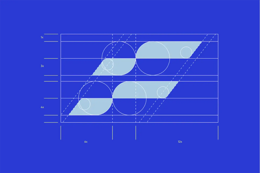
Source: Jonisson Almeida, Rede Farroupilha, Behance, https://www.behance.net/gallery/181394163/Rede-Farroupilha
A well-crafted logo design is more than just an attractive visual symbol. It represents the identity of a brand and helps audiences instantly recognize a business. One important factor that often gets overlooked in logo design is choosing the right dimensions. The size, proportions, and scalability of a logo can greatly affect how it appears across different platforms and materials.
When creating a logo design, designers must consider how the logo will be used in real-world situations. A logo might appear on websites, social media profiles, mobile apps, business cards, packaging, signage, and many other places. Each of these uses requires different dimensions, and a logo that looks great in one size may not work as well in another if it is not designed carefully.
Determining the right dimensions ensures that a logo design remains clear, balanced, and visually appealing no matter where it is displayed. Proper dimensions also help maintain consistency across digital and print applications. By planning the dimensions early in the design process, designers can create logos that are flexible, scalable, and easy to adapt.
In this article, we will explore key considerations that help designers determine the right dimensions for a logo design. These practical insights can help ensure your logo remains effective, professional, and recognizable across many different uses.
Understanding Standard Logo Dimensions
When starting a logo design, one of the first things designers should understand is the concept of standard logo dimensions. While there is no single universal size that works for every situation, having a general understanding of common dimensions can help guide the design process. A well-proportioned logo design should be created with flexibility in mind so that it performs well across different platforms.
Many designers begin their logo design on a square artboard, often using dimensions such as 1000 by 1000 pixels or similar proportions. This approach provides a balanced canvas that allows the designer to experiment with shapes, typography, and layout. Starting with a larger size also helps maintain clarity when the logo is scaled down for smaller applications.
It is also important to remember that the actual dimensions of a logo design will vary depending on how it will be used. For example, a website header might require a wide horizontal logo, while a social media profile icon may need a compact square version. Understanding these typical uses allows designers to plan their dimensions more effectively from the beginning.
Another key consideration is scalability. A successful logo design should look clear and recognizable whether it appears on a large banner or a small mobile screen. Creating the logo as a vector graphic ensures that it can be resized without losing quality. By understanding standard logo dimensions and designing with flexibility in mind, designers can create logos that remain strong and consistent across many different applications.
Considering Logo Dimensions For Different Platforms
A modern logo design must function across many platforms, which makes dimension planning an essential part of the design process. Businesses today use their logo in a wide variety of environments, including websites, mobile apps, social media pages, printed materials, and digital advertisements. Each platform often requires different sizes and proportions, so designers should consider these needs early on.
For example, social media platforms typically use square profile images, which means the logo design must remain clear when placed inside a compact square space. On the other hand, website headers usually benefit from horizontal logos that fit neatly within navigation bars. Without planning these variations, a logo may appear cropped, distorted, or difficult to read.
Another important factor is how users interact with digital platforms. Many people access websites and social media on mobile devices, where screen space is limited. A logo design that looks great on a desktop monitor might appear too small or detailed on a smartphone. Designers should test their logos at smaller dimensions to ensure that key elements remain visible.
Print platforms also introduce different dimension requirements. Logos used on business cards, packaging, or signage need enough space to remain legible and visually balanced. By carefully considering the dimensions required for each platform, designers can create a logo design that adapts smoothly to various environments while maintaining a consistent brand identity.
Choosing The Right Aspect Ratio For Your Logo
Aspect ratio plays an important role in determining the dimensions of a successful logo design. The aspect ratio refers to the proportional relationship between the width and height of the logo. Choosing the right ratio helps ensure that the logo looks balanced and visually appealing in different layouts and placements.
Many logo design projects begin by exploring common aspect ratios such as square, horizontal, or vertical formats. A square logo is often versatile because it fits easily into social media icons, mobile applications, and profile images. Meanwhile, a horizontal logo design works well for website headers, banners, and business signage where wider space is available.
Designers should carefully consider the brand’s typical usage before selecting an aspect ratio. For example, companies that rely heavily on digital platforms may benefit from a logo design that adapts easily to square formats. Businesses that use signage, packaging, or long headers might prefer a horizontal layout that spreads visual elements across a wider space.
Another important factor is visual balance. A well-proportioned logo design distributes shapes, icons, and typography in a way that feels natural and harmonious. Poor aspect ratio choices can make a logo look stretched, cramped, or awkward when placed in certain environments.
By selecting the right aspect ratio early in the design process, designers can create a logo design that remains flexible across many applications. This thoughtful planning helps ensure that the logo maintains clarity, structure, and visual impact wherever it appears.

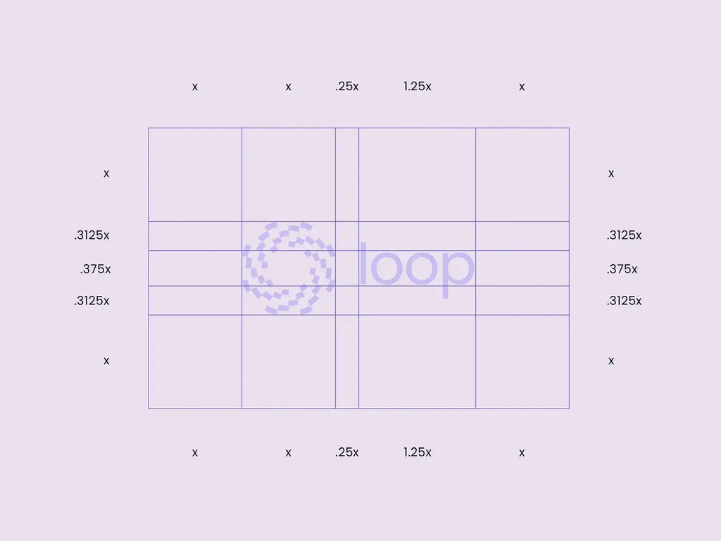
Source: Tuell Design, Logo Grid & Clearspace, Dribbble, https://dribbble.com/shots/22002678-Logo-Grid-Clearspace
Designing A Scalable Logo For Multiple Sizes
Scalability is one of the most essential characteristics of an effective logo design. A scalable logo maintains its clarity, proportions, and visual strength regardless of how large or small it appears. Since logos are used in many different contexts, designers must ensure that their logo design works across a wide range of dimensions.
One of the best ways to achieve scalability is by creating the logo design using vector graphics. Vector-based designs are built from mathematical paths rather than pixels, which allows the logo to be resized without losing quality. Whether the logo appears on a large billboard or a small mobile icon, the shapes remain sharp and clean.
Another key strategy is simplicity. Overly complex logos with too many details can become difficult to read when scaled down. A clear and simple logo design ensures that important elements such as symbols, letters, and shapes remain recognizable even at smaller sizes.
Designers should also test their logo design at multiple sizes during the creation process. Viewing the logo at both large and small dimensions helps reveal potential problems with spacing, line thickness, or readability. Adjustments can then be made to improve visibility across all uses.
By focusing on scalability, designers create a logo design that performs consistently across print materials, websites, social media platforms, and mobile devices. This flexibility ensures that the logo remains professional and recognizable no matter where it is displayed.
Balancing Logo Size And Visual Clarity
One of the most important considerations when determining logo dimensions is maintaining visual clarity. A good logo design should remain easy to recognize and visually balanced regardless of its size. If a logo becomes too crowded or complex, it may lose its clarity when displayed at smaller dimensions.
Designers should focus on creating a logo design that communicates the brand message without relying on excessive details. Simple shapes, clear typography, and well-planned spacing help maintain readability. When a logo is scaled down for items like social media icons or mobile interfaces, these elements remain visible and easy to understand.
Another helpful approach is testing the logo at multiple sizes throughout the design process. Viewing the logo design at both large and small dimensions allows designers to identify areas where details might become unclear. Thin lines, tiny text, or intricate patterns can easily disappear when the logo is reduced.
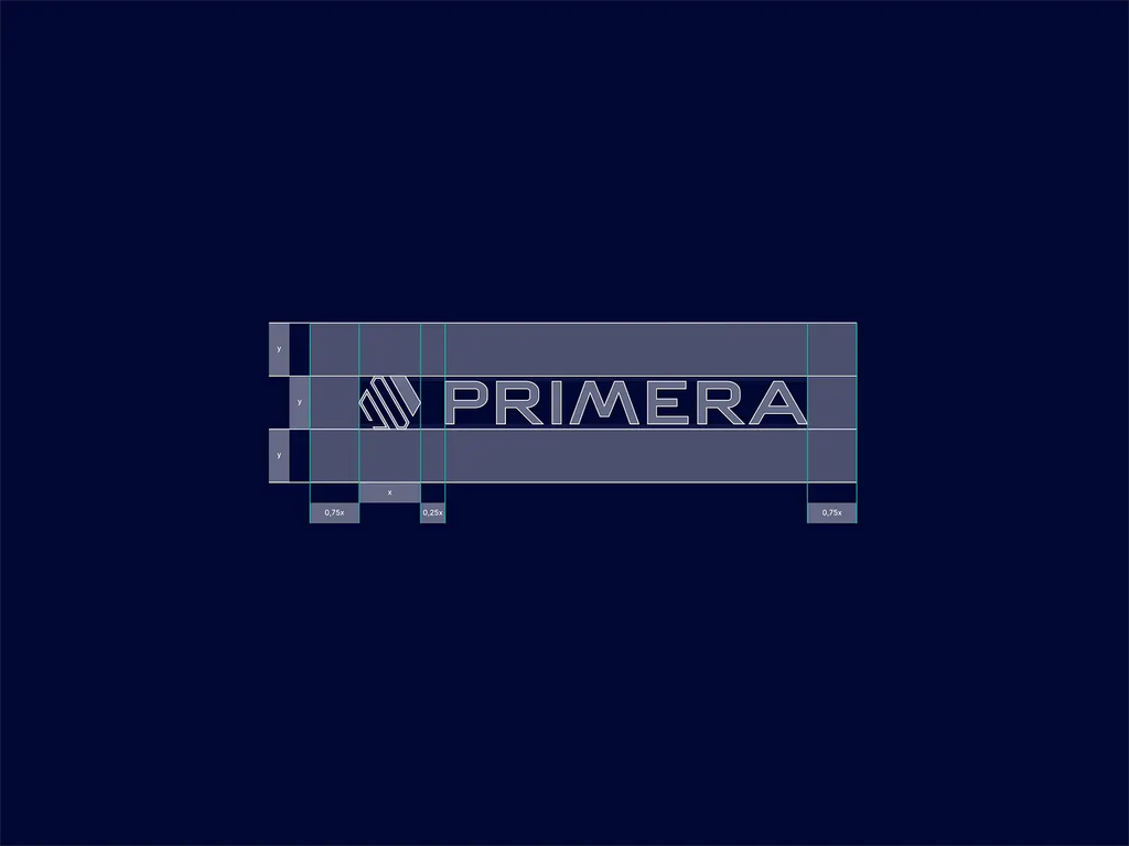
Spacing also plays a major role in visual clarity. Proper padding around the logo ensures that it does not appear cramped when placed inside different layouts. Maintaining balanced spacing helps the logo design feel professional and organized in any environment.
Ultimately, balancing logo size and clarity helps create a logo design that communicates effectively across various platforms. By keeping the design clean and well-proportioned, designers ensure that the logo remains recognizable and visually appealing whether it appears on a large display or a small digital icon.
Planning Logo Dimensions For Print Materials
Print applications require careful planning when determining the dimensions of a logo design. Unlike digital screens, printed materials often involve fixed sizes and physical constraints. Business cards, brochures, packaging, posters, and signage all require different logo dimensions to ensure the design remains clear and professional.
When preparing a logo design for print, designers should consider the minimum size at which the logo will appear. For example, a logo placed on a business card must remain readable even at a relatively small dimension. If the design includes very fine lines or small text, these details may become difficult to see once printed.
Another important factor is resolution and scaling. A well-prepared logo design should be created in vector format so that it can be resized without losing quality. This flexibility allows the same logo to appear on both small promotional items and large printed displays while maintaining sharp edges and consistent proportions.
Designers should also think about the surrounding layout of printed materials. The logo must fit comfortably within the design while leaving enough space for other elements such as text, images, and branding information. Proper placement and sizing help the logo design integrate smoothly into the overall composition.
By carefully planning logo dimensions for print materials, designers ensure that the logo design maintains its clarity and impact in physical formats. Thoughtful sizing helps the logo remain visually strong across many printed applications.
Adapting Logo Dimensions For Digital Use
Digital environments require careful attention when determining the dimensions of a logo design. Unlike print materials, digital platforms display logos across a wide variety of screen sizes, including smartphones, tablets, laptops, and large desktop monitors. Because of this variation, designers must ensure that the logo design remains clear, balanced, and readable in different digital contexts.
One common approach is to create the primary logo design at a larger size and then adapt it for smaller digital spaces. This allows designers to preserve important visual details while ensuring that the logo can be scaled appropriately. Digital interfaces such as website headers, navigation bars, and mobile apps often require logos with specific dimensions that fit comfortably within the layout.
Another important factor is screen resolution. Modern devices display images at different pixel densities, which means the logo design must maintain its clarity even on high-resolution screens. Vector-based logo files help achieve this flexibility because they can scale smoothly without losing quality.
Designers should also test the logo design in real digital environments. Viewing the logo on a website mockup or a mobile screen helps reveal whether the dimensions feel balanced and readable. Small adjustments to spacing, line thickness, or proportions may improve how the logo appears on screen.
By adapting logo dimensions specifically for digital use, designers create a logo design that functions effectively across modern platforms. This thoughtful approach ensures that the logo remains professional and visually consistent wherever it appears online.

Source: Rolans Kims, Primera Logo Grid, Dribbble, https://dribbble.com/shots/15393974-Primera-logo-grid
Maintaining Consistency Across Different Logo Sizes
Consistency is essential when working with different dimensions in a logo design. A logo may appear in many sizes throughout a brand’s visual system, from small social media icons to large promotional banners. Despite these variations, the logo design should always maintain the same recognizable identity.
One way to maintain consistency is by preserving the core visual elements of the logo design. These elements may include the main symbol, typography style, spacing, and overall proportions. Even when the logo is resized or adjusted for different dimensions, these core components should remain visually aligned with the original design.
Designers often create a set of approved logo variations to support consistency. For example, a primary horizontal logo design may be paired with a compact stacked version for square spaces. Although the layout changes slightly, the visual style and branding elements remain the same.
Another important aspect is maintaining proportional balance. When resizing a logo design, it is important to scale all elements together rather than stretching or compressing the logo. Distorting the dimensions can weaken the visual integrity of the brand.
By maintaining consistency across different sizes, designers ensure that the logo design remains recognizable and professional in every situation. A consistent logo strengthens brand identity and helps audiences quickly associate the visual mark with the company it represents.
Testing Your Logo Design At Various Dimensions
Testing is an essential step when determining the right dimensions for a logo design. Even a well-crafted logo can encounter problems if it has not been evaluated at multiple sizes. Since a logo design will appear in many contexts, designers should always test how it performs when scaled up or down.
A common practice is to preview the logo design at both large and small dimensions during the design process. For example, a designer might examine how the logo looks on a large banner, then reduce it to the size of a social media icon or mobile app symbol. This comparison helps identify whether any elements lose clarity or balance when the logo becomes smaller.
Testing also allows designers to evaluate the thickness of lines, the readability of typography, and the spacing between elements. A logo design that appears clear on a large artboard might reveal spacing issues or crowded details when reduced. By reviewing the logo at multiple dimensions, designers can refine the design to improve legibility.
Mockups are another helpful tool during the testing stage. Placing the logo design on realistic items such as websites, packaging, business cards, or signage helps reveal how the dimensions function in practical situations. This step gives designers valuable insight into how the logo will appear in everyday use.
By testing the logo design at various dimensions, designers ensure the final result remains clear, balanced, and effective across different platforms and applications.
Creating Flexible Logo Variations For Different Dimensions
A flexible logo design often includes multiple variations that adapt to different dimensions and layouts. Because brands use their logos in many environments, a single version may not always work perfectly in every situation. Creating flexible variations allows the logo design to maintain its clarity and visual strength across different formats.
One common approach is to develop a primary logo along with alternative layouts. For example, a horizontal logo design may work well for website headers and signage, while a stacked or vertical version may be better suited for square spaces such as social media icons. These variations maintain the same core elements but adjust the arrangement to fit different dimensions.
Another useful variation is a simplified logo mark. In some cases, the full logo design may contain both an icon and text, which can become difficult to read at very small sizes. A simplified symbol version can be used for compact applications like app icons, favicons, or small digital graphics.
When creating variations, designers should ensure that all versions follow the same visual style. The typography, color palette, and overall proportions should remain consistent so the brand identity stays recognizable.
By developing flexible logo variations, designers ensure that the logo design adapts smoothly to different dimensions. This flexibility helps maintain a strong and consistent brand presence across many platforms and applications.
Conclusion
Determining the right dimensions is an important step in creating a successful logo design. A well-planned logo design should remain clear, balanced, and recognizable across different platforms, from digital screens to printed materials. By considering aspect ratio, scalability, platform requirements, and flexible variations, designers can ensure their logos perform effectively in many environments. Testing the logo at multiple sizes also helps maintain visual clarity and consistency. When designers carefully plan dimensions from the beginning, the final logo design becomes more adaptable, professional, and capable of representing a brand confidently across a wide range of applications.
Let Us Know What You Think!
Every information you read here are written and curated by Kreafolk's team, carefully pieced together with our creative community in mind. Did you enjoy our contents? Leave a comment below and share your thoughts. Cheers to more creative articles and inspirations!


Leave a Comment