How To Use The Golden Ratio For Logo Design

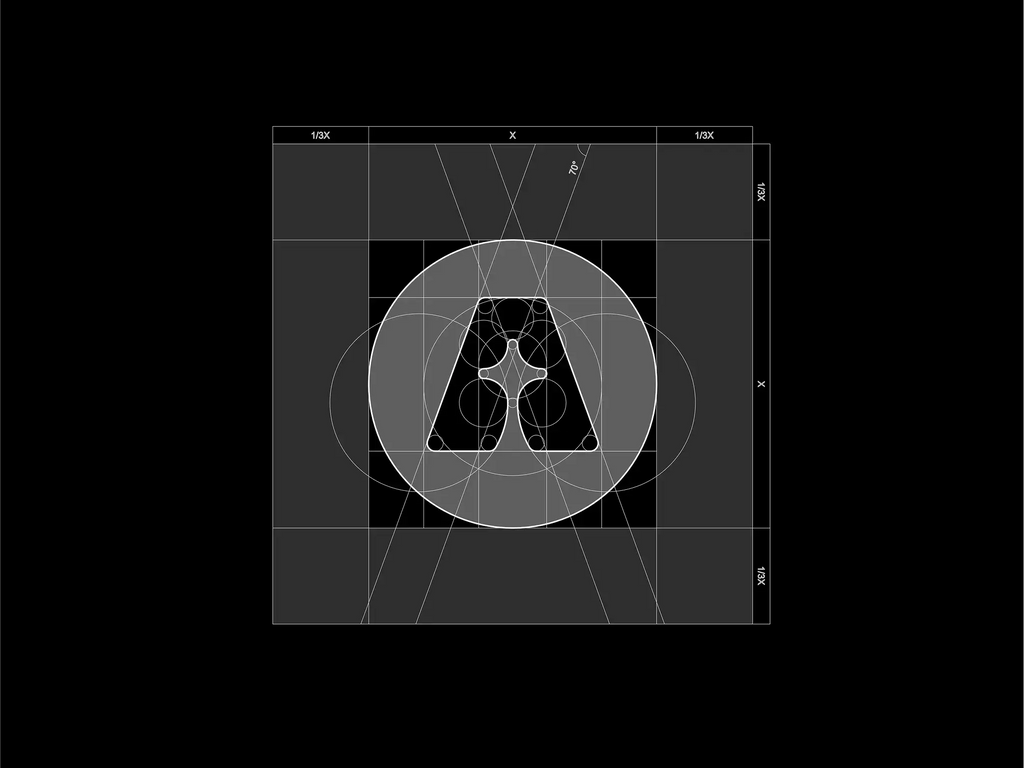
Source: Daniel Rotter, ASCAN - Logo Construction, Dribbble, https://dribbble.com/shots/19393662-ASCAN-Logo-construction
The golden ratio is one of the most fascinating concepts used in art, architecture, and modern design. This mathematical proportion, approximately 1:1.618, has been admired for centuries because it creates shapes and layouts that feel naturally balanced to the human eye. In the world of logo design, the golden ratio is often used as a guide to build harmonious proportions, helping designers create logos that are visually appealing and professionally structured.
Many successful brands rely on thoughtful proportions to make their visual identity memorable. By applying the golden ratio, designers can organize shapes, spacing, and typography in a way that feels both natural and aesthetically pleasing. Instead of relying only on intuition, this approach allows designers to create a logo design with consistent balance and strong visual flow.
Using the golden ratio in logo design does not mean every element must strictly follow mathematical formulas. Instead, it acts as a helpful framework that guides the design process. Designers can use it to determine element sizes, spacing relationships, and overall composition. When used properly, the golden ratio helps create logos that look clean, balanced, and timeless.
In this article, we will explore how designers can effectively use the golden ratio to improve logo design, understand its principles, and apply practical techniques to create visually powerful brand marks.
Understanding The Golden Ratio In Logo Design
The golden ratio is a mathematical proportion commonly represented by the number 1.618. This ratio has been used throughout history in art, architecture, and visual design because it creates shapes and layouts that appear naturally balanced. In logo design, the golden ratio serves as a helpful guideline for organizing elements so that the final composition feels harmonious and visually pleasing.
Designers often apply the golden ratio when determining the proportions between different elements of a logo design. For example, the size relationship between a symbol and typography can follow the golden ratio to create a clear visual hierarchy. When elements are proportioned carefully, the viewer’s eye can move smoothly across the design without feeling overwhelmed or distracted.
Another reason the golden ratio is valuable in logo design is that it helps designers create consistency. Instead of guessing the spacing or proportions between shapes, the golden ratio provides a reliable framework that ensures balance across the entire design. This makes the logo look polished and professionally structured.
It is important to understand that the golden ratio is not meant to limit creativity. Rather, it acts as a design tool that helps guide decisions related to spacing, alignment, and proportions. By understanding how the golden ratio works, designers can make smarter choices during the logo design process and create logos that feel both visually balanced and timeless.
Why The Golden Ratio Works In Logo Design
The golden ratio is widely appreciated because it reflects proportions that frequently appear in nature. From the spiral of a seashell to the arrangement of flower petals, this ratio creates patterns that the human eye naturally finds attractive. In logo design, using the golden ratio can help designers achieve the same sense of natural balance and visual harmony.
One of the main reasons the golden ratio works well in logo design is that it creates strong visual structure. Logos often include multiple elements such as symbols, shapes, and typography. When these components are arranged using the golden ratio, they relate to each other in a clear and organized way. This makes the logo easier to understand and visually appealing.
The golden ratio also helps establish hierarchy in a logo design. Certain elements need to stand out more than others, such as the main icon or brand name. By scaling elements according to the golden ratio, designers can guide the viewer’s attention toward the most important parts of the design.
Another benefit is that logos built with the golden ratio often appear timeless. Because this proportion has been used successfully for centuries, it tends to create designs that remain visually effective even as trends change. When designers combine creativity with the golden ratio, they can produce logo design solutions that feel both modern and enduring.
Using Golden Ratio Circles To Build Logo Shapes
One of the most practical ways to apply the golden ratio in logo design is by constructing shapes using proportional circles. Designers often build a circular grid where each circle follows the golden ratio relationship. This technique allows curves, symbols, and icons to be created with precise proportions that feel visually balanced.
When multiple circles are arranged based on the golden ratio, they naturally form smooth curves and consistent geometry. These circles can be used to guide the edges of a symbol, the curvature of a letterform, or the proportions of a graphic mark. As a result, the final logo design appears structured and harmonious rather than randomly shaped.
Using golden ratio circles is particularly helpful when designing modern brand marks that rely on geometric precision. Many professional designers begin by sketching a rough concept and then refine it using circular grids based on the golden ratio. This process helps remove inconsistencies and improves the overall visual quality of the logo design.
Another benefit of this approach is scalability. Because the shapes follow clear geometric relationships, the logo design maintains its balance whether it appears on a large billboard or a small digital icon. This consistency is essential for building a strong brand identity.
By applying circular grids based on the golden ratio, designers gain better control over shape construction, resulting in logos that feel clean, professional, and visually satisfying.

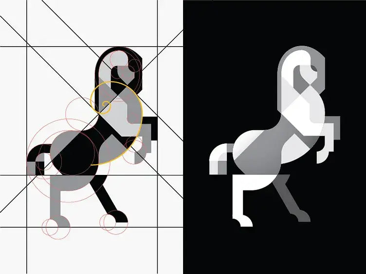
Source: Davit Chanadiri, Geometry Horse, Dribbble, https://dribbble.com/shots/4061919-Geometry-Horse
Creating Balanced Logo Layouts With The Golden Ratio
A strong layout is a key element of successful logo design, and the golden ratio can help designers organize visual elements with greater precision. When creating a logo, designers must decide how symbols, text, and spacing interact within the overall composition. Using the golden ratio as a guide makes this process easier and more structured.
One common approach is to divide the logo space using golden ratio proportions. For example, the area dedicated to the symbol might be larger, while the typography occupies a smaller space that still maintains a harmonious relationship. This proportion ensures that no element feels too dominant or too small within the logo design.
The golden ratio also helps determine spacing between elements. Proper spacing is essential because crowded designs can look messy, while overly spaced layouts can feel disconnected. By applying the golden ratio to margins, alignment, and spacing, designers can achieve a balanced and comfortable visual flow.
Another advantage of using the golden ratio in logo design is that it improves readability. When typography and symbols follow proportional relationships, the viewer can quickly understand the structure of the logo. This clarity is especially important when the logo appears in different sizes or environments.
Designers who use the golden ratio to organize their layout often produce logo designs that feel intentional and refined. The result is a balanced composition that communicates the brand clearly while maintaining a visually pleasing structure.
Scaling Logo Elements With The Golden Ratio
Scaling elements correctly is an essential part of creating a balanced logo design, and the golden ratio provides a reliable method for doing this. Instead of guessing the relative size of symbols, text, or supporting shapes, designers can use the golden ratio to establish proportional relationships between elements. This helps the overall composition feel structured and visually harmonious.
In practical logo design, the golden ratio can guide how large one element should be compared to another. For example, a primary icon might be 1.618 times larger than a supporting shape or detail. Likewise, typography can be sized according to the same ratio to ensure it complements the symbol without overpowering it.
This proportional scaling helps create a clear visual hierarchy. In any logo design, viewers should immediately understand which element is the focal point. When elements are scaled using the golden ratio, the hierarchy becomes more natural, allowing the eye to move smoothly across the design.
Another advantage of using the golden ratio for scaling is consistency. When all elements follow a similar proportional system, the logo design appears more polished and professional. Even small details, such as spacing between shapes or the thickness of lines, can benefit from golden ratio relationships.
By carefully scaling elements with the golden ratio, designers can create logo designs that feel intentional, balanced, and visually appealing across different sizes and applications.
Using The Golden Spiral To Guide Visual Flow
The golden spiral is another concept derived from the golden ratio that can be extremely useful in logo design. This spiral is created by dividing a golden rectangle into smaller squares, forming a curve that expands outward in a smooth and natural pattern. Designers often use this spiral to guide the visual flow of a composition.
In logo design, the golden spiral can help determine where important elements should be placed. The center of the spiral often becomes the focal point, drawing the viewer’s attention naturally toward that area. By aligning key features of a logo with the curve of the spiral, designers can create a composition that feels dynamic yet balanced.
This technique is particularly helpful when designing symbols or icons that involve curves or movement. The spiral can guide the shape of the symbol, ensuring that it follows a natural visual rhythm. When used correctly, the golden spiral enhances the sense of harmony within the logo design.
Another benefit of applying the golden spiral is that it encourages thoughtful placement of elements. Instead of randomly positioning shapes or text, designers use the spiral to organize the layout in a structured way. This approach often results in logo designs that feel more refined and visually engaging.
By incorporating the golden spiral into the creative process, designers can strengthen the flow and balance of a logo design while maintaining the elegant proportions associated with the golden ratio.
Applying The Golden Ratio To Logo Typography
Typography plays a major role in logo design, and the golden ratio can help designers create balanced relationships between letters, symbols, and supporting elements. When text is proportioned carefully, the overall composition of a logo design becomes easier to read and more visually appealing. The golden ratio provides a reliable framework for determining how typography should interact with other components of the design.
One common way to apply the golden ratio in logo design is by defining the size relationship between the icon and the brand name. For example, the height of the icon may follow the 1.618 proportion compared to the typography. This ensures that neither element feels too dominant while maintaining a clear hierarchy within the design.
The golden ratio can also guide spacing within typography. Letter spacing, line height, and the distance between text and symbols can all follow proportional relationships inspired by the golden ratio. When these details are thoughtfully adjusted, the logo design appears more organized and refined.
Another advantage of using the golden ratio with typography is consistency. Designers can apply similar proportional rules across multiple variations of the logo design, such as horizontal and stacked layouts. This ensures that the brand identity remains cohesive across different applications.
By integrating the golden ratio into typography decisions, designers can improve readability, visual balance, and overall harmony. The result is a logo design where text and symbols work together naturally, creating a professional and memorable brand mark.

Source: DAINOGO, Fox Logo with Golden Ratio Grids, Dribbble, https://dribbble.com/shots/4367838-Fox-Logo-with-Golden-Ratio-Grids
Simplifying Logo Shapes With The Golden Ratio
Simplicity is one of the most important principles in effective logo design. A logo should be easy to recognize, easy to reproduce, and visually clear at different sizes. The golden ratio can help designers simplify shapes while still maintaining balanced proportions. By using this mathematical relationship, complex ideas can be refined into clean and elegant forms.
During the logo design process, designers often begin with rough sketches that contain many details. As the concept develops, unnecessary elements are removed to create a clearer symbol. The golden ratio can guide this refinement by helping determine the ideal proportions of curves, shapes, and spacing.
Geometric construction is another area where the golden ratio becomes valuable. Designers frequently use circles, rectangles, and grids based on the golden ratio to rebuild a logo symbol with better structure. These geometric guides ensure that the shapes align smoothly and maintain consistent proportions.
Using the golden ratio to simplify shapes also improves scalability. Because the proportions are balanced, the logo design remains recognizable whether it appears on a website, packaging, or social media icon. This flexibility is essential for modern branding.
When designers combine simplicity with the golden ratio, the final logo design feels both minimal and refined. The symbol communicates the brand clearly while maintaining the harmonious proportions that make the golden ratio such a powerful design tool.
Learning From Famous Logos That Use The Golden Ratio
Many well-known brands have applied the golden ratio in their logo design process to achieve balance and visual harmony. Studying these examples can help designers understand how mathematical proportions improve the structure and clarity of a logo. The golden ratio is often used to define curves, spacing, and overall proportions, resulting in a logo design that feels naturally pleasing to the eye.
Some famous brands are known for incorporating the golden ratio when constructing their logos. Designers often use circular grids or proportional rectangles to shape the icon and typography. These geometric guides ensure that each element of the logo design maintains a consistent relationship with the others. The result is a symbol that appears clean, balanced, and professionally crafted.
Analyzing these logo designs reveals how the golden ratio helps control details that might otherwise feel uneven. For example, the spacing between shapes, the thickness of lines, and the placement of elements often follow proportional relationships based on the golden ratio. This attention to proportion creates a strong sense of order within the design.
Learning from established logo design examples also helps designers recognize when and how to apply the golden ratio effectively. Rather than copying existing logos, designers can study the underlying principles that guide their structure and composition.
By observing how successful brands apply the golden ratio, designers gain valuable insights that can improve their own logo design work and lead to more balanced and visually appealing brand identities.
Using The Golden Ratio As A Flexible Design Guide
While the golden ratio is a powerful tool in logo design, it should be treated as a helpful guide rather than a strict rule. The main goal of any logo design is to communicate the identity of a brand clearly and effectively. The golden ratio supports this goal by helping designers create balanced proportions and visually pleasing compositions.
During the design process, many designers start by exploring creative concepts through sketches and experimentation. Once a strong idea is developed, the golden ratio can be applied to refine the proportions of shapes, symbols, and typography. This approach allows creativity to remain at the center of the design while still benefiting from the mathematical harmony of the golden ratio.
Using the golden ratio flexibly also encourages designers to focus on the overall visual impact of a logo design. In some cases, strict adherence to the ratio may not perfectly fit the concept. Designers can adjust proportions slightly while still maintaining the balanced feeling that the golden ratio provides.
Another advantage of treating the golden ratio as a guide is that it helps maintain consistency throughout the logo design. From icon construction to spacing and layout, the ratio can influence many small decisions that collectively strengthen the final result.
When used thoughtfully, the golden ratio becomes a supportive design tool that enhances creativity rather than restricting it, allowing designers to create logo designs that feel balanced, memorable, and timeless.
Conclusion
The golden ratio is a valuable principle that can greatly improve the structure and harmony of a logo design. By using this mathematical proportion, designers can create balanced layouts, well-proportioned shapes, and clear visual hierarchy. The golden ratio helps transform creative ideas into refined compositions that feel natural and visually pleasing. While it should not limit creativity, it serves as a helpful guide for improving consistency and precision. When thoughtfully applied, the golden ratio can elevate a logo design and help designers create brand identities that appear professional, memorable, and visually timeless across different platforms and applications.
Let Us Know What You Think!
Every information you read here are written and curated by Kreafolk's team, carefully pieced together with our creative community in mind. Did you enjoy our contents? Leave a comment below and share your thoughts. Cheers to more creative articles and inspirations!


Leave a Comment