Common Mistakes in Logo Design Sizing to Avoid

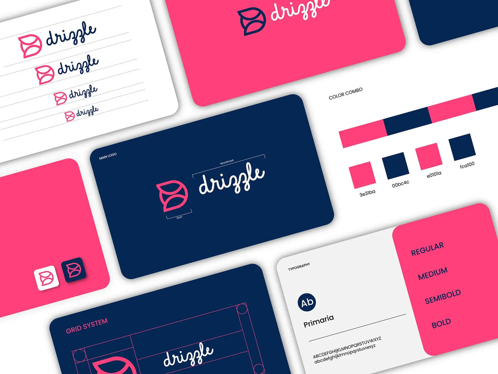
Source: Unique Idea, Logo Design, Dribbble, https://dribbble.com/shots/18653887-Logo-Design
Designing a logo involves much more than creating a visually appealing graphic; it requires a meticulous approach to ensure the logo performs well across various applications. One critical aspect often overlooked by designers is logo design sizing. Ensuring your logo scales effectively across different media—from tiny mobile screens to massive billboards—is crucial for maintaining brand integrity and recognition. A well-sized logo not only enhances visibility but also ensures that every element of the design is clear and distinguishable, regardless of its application. However, designers often encounter common pitfalls that can undermine a logo's effectiveness.
These mistakes can range from scalability issues to neglecting how the logo appears on different backgrounds. In this article, we will explore these common mistakes in logo design sizing to help you avoid them in your projects, thereby ensuring your logo always looks its best and functions effectively in all intended environments. This guide aims to arm designers with the knowledge to make smarter decisions about logo sizing, fostering designs that are both beautiful and adaptable.
Ignoring Scalability
Scalability is a fundamental element in logo design that ensures a logo maintains its clarity and impact when resized across different platforms. A scalable logo retains all its aesthetic and functional qualities, whether displayed on a large billboard or as a small icon on a mobile app. Designers must prioritize vector graphics over raster images to achieve optimal scalability. Vector graphics are resolution-independent and can be enlarged or reduced without losing quality, making them ideal for logo design sizing.
Ignoring scalability can result in logos that become blurred or lose detail when scaled down, which can significantly diminish brand recognition and professionalism. Effective scalability involves a careful balance of simplicity and detail, ensuring that the logo remains legible and visually coherent at any size. Designers should regularly test their logos at various scales during the design process to prevent scalability issues and ensure the logo’s versatility across all intended uses.
Not Testing on Multiple Platforms
Testing a logo on multiple platforms is crucial to ensure that it looks consistent and functions well across various media. This step is often overlooked, leading to logos that might look great on paper but lose their effectiveness on digital screens, or vice versa. It's important for designers to consider the different characteristics of each platform, such as resolution, color profiles, and display sizes. For example, a logo that looks vibrant and clear on a high-resolution monitor might appear muddy or indistinct on a billboard due to differences in production techniques and viewing distances.
Similarly, logos intended for use on mobile devices need to be optimized for smaller screens and potentially lower resolutions. Testing across multiple platforms allows designers to make necessary adjustments to the logo’s sizing, color, and detail to ensure optimal visibility and impact. By incorporating this practice into the design process, designers can prevent potential sizing errors that could undermine the logo’s effectiveness and the brand’s overall appeal.
Using Too Many Details
Incorporating excessive details into a logo can significantly hinder its effectiveness, particularly when it comes to logo design sizing. Detailed logos often fail to scale down well, losing clarity and impact when reproduced at smaller sizes, such as on business cards or mobile applications. This common mistake can make logos appear cluttered and unreadable, which detracts from brand recognition and professionalism. To avoid this, designers should aim for simplicity and versatility in their creations. A simpler design ensures that the logo remains legible and effective across all sizes and applications.
It's crucial to focus on essential elements that convey the brand's identity clearly without unnecessary complexity. Testing the logo in various sizes during the design process can help identify elements that do not scale well. Reducing detail does not mean sacrificing uniqueness but rather emphasizing strong, clean lines and easily recognizable shapes that encapsulate the brand's essence effectively. By keeping the design straightforward, you ensure that the logo remains functional and aesthetically pleasing, no matter its size.

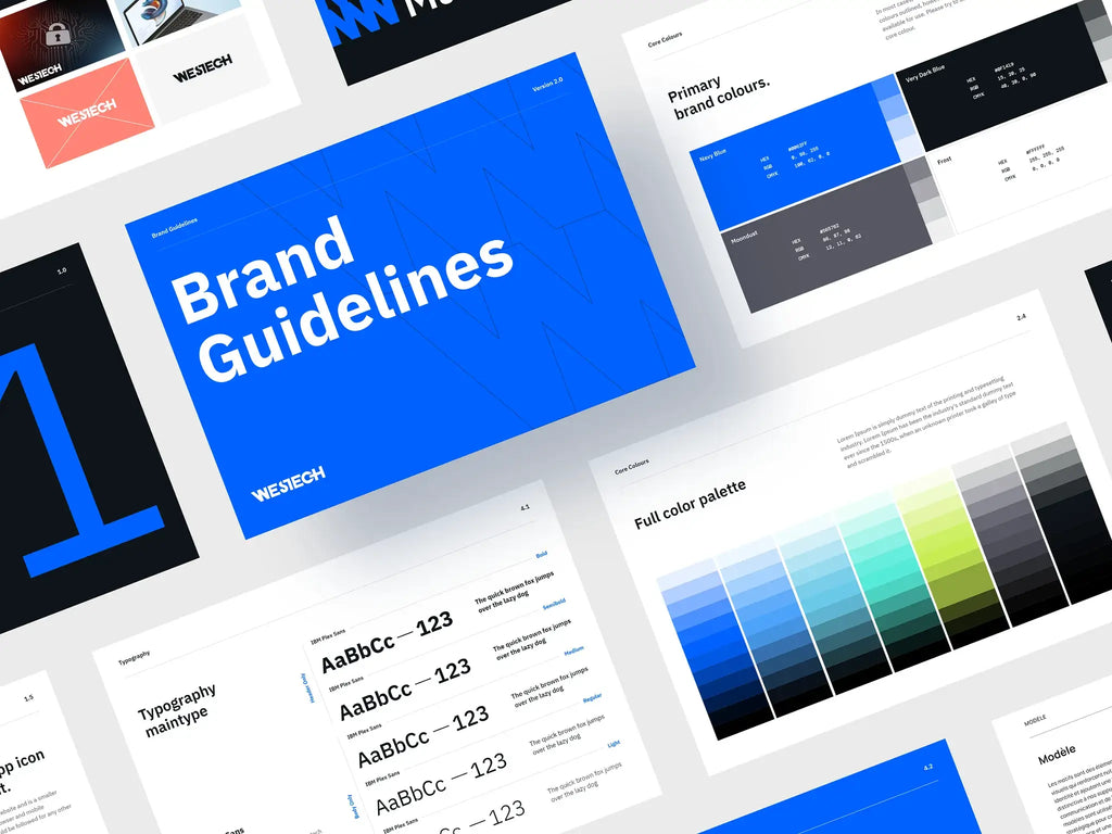
Source: Praveen Singh Solanki, Westech Solution Brand Guideline Design | Brand Identity, Dribbble, https://dribbble.com/shots/22426355-Westech-Solution-Brand-Guideline-Design-Brand-Identity
Neglecting Mobile Optimization
In today's digital age, mobile optimization is essential for logo design. Neglecting to create logos that are optimized for mobile devices can result in designs that are too intricate to be discernible on smaller screens. This oversight in logo design sizing can lead to a significant reduction in brand recognition and reach, especially as mobile usage continues to rise. To ensure logos perform well on mobile devices, designers should prioritize clarity and simplicity. A mobile-optimized logo should be easily recognizable at a glance, with bold, clear features that stand out even on small displays.
This includes avoiding overly complicated graphics and ensuring that the logo is not dependent on color gradients or fine details that might not translate well to mobile screens. Additionally, testing the logo on various devices, under different settings and resolutions, is crucial to understand how it will appear in real-world conditions. Designing with mobile optimization in mind not only enhances the logo’s visibility across all platforms but also ensures it communicates the brand's message effectively in the increasingly mobile-centric market.
Forgetting About Print Needs
A common oversight in the logo design process is neglecting the specific needs of print media. When designing a logo, it's crucial to consider how it will look not only on digital platforms but also when printed on various materials and sizes. Print media can include business cards, merchandise, billboards, and corporate stationery, each requiring different considerations for logo design sizing. Logos that are not optimized for print can suffer from issues like blurring, color shift, or detail loss, particularly if the logo includes fine lines or gradients that do not translate well to a print format.
To avoid these issues, designers should create logos in vector format, which allows for scaling without quality loss. Additionally, it's important to test the logo at the specific print sizes and on the materials intended for use. Considering factors such as ink spread and the print method (digital, offset, screen printing) will help ensure the logo maintains its integrity and effectiveness in all physical forms. By addressing these print-specific considerations, designers can ensure their logos are versatile and maintain quality across both digital and print platforms.
Disregarding Aspect Ratios
Ignoring the aspect ratio of a logo can lead to significant visual issues when the design is adapted for different formats and sizes. The aspect ratio—the proportional relationship between the logo’s width and height—helps maintain the design’s balance and integrity when resized. A logo that looks great in a horizontally oriented space might not translate well to a vertical format if the aspect ratio is not considered. Disregarding this can result in logos that appear squished or stretched when applied to different media such as web banners, billboards, or social media profiles.
To prevent these problems, designers should establish clear guidelines for the aspect ratios of their logos and test these in various real-world applications. Creating adaptable logo variants that maintain the brand’s identity while fitting different aspect ratios is also a viable solution. This approach ensures the logo remains visually appealing and functional, regardless of where it appears, enhancing brand consistency and recognition across all platforms. By paying careful attention to aspect ratios, designers can avoid common sizing errors and create more versatile, impactful logos.
Lack of Margin and Padding
A crucial aspect often overlooked in logo design is the proper use of margins and padding. These elements are essential to ensure that the logo has enough breathing space around it, preventing other design elements or text from encroaching on the logo's visual impact. Insufficient margin and padding can cause the logo to blend into its surroundings, which reduces its stand-out capability and can diminish brand recognition. To avoid these issues, designers should define clear boundaries around the logo, ensuring it is visually distinct in any context, whether embedded in a website header, on product packaging, or within promotional materials. This space around the logo not only enhances its visibility but also maintains its integrity when resizing for different applications.
Effective logo design sizing includes considering how much empty space is needed to make the logo appear uncluttered and balanced. By testing the logo in various placements and against different backgrounds, designers can determine the optimal margins and padding that should be standard across all media. Ensuring consistent margin and padding in logo design helps in maintaining a professional appearance and strengthening the brand’s visual identity across various platforms.

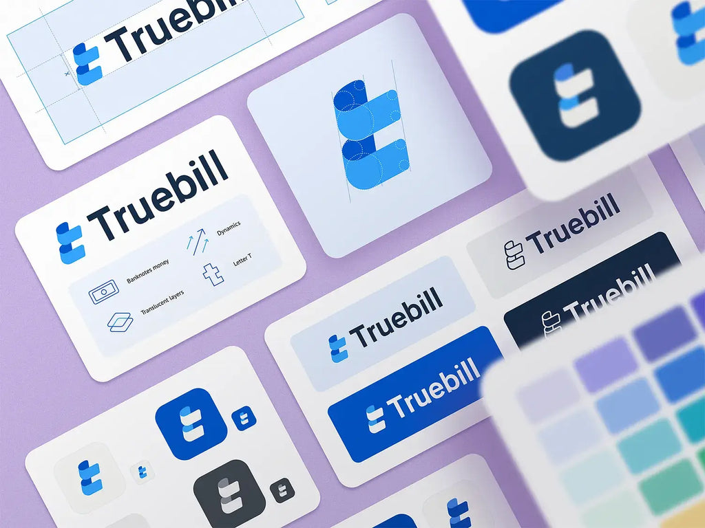
Source: Ramotion, Logo Design, Dribbble, https://dribbble.com/shots/16973971-Logo-Design
Choosing Improper File Formats
Selecting the appropriate file format is paramount in logo design, as it directly affects the logo's usability and quality across different mediums. Many designers err by choosing non-scalable or low-resolution formats, which can severely limit where and how a logo can be used, especially in terms of resizing. For optimal logo design sizing, it is essential to use vector files, such as AI, EPS, or SVG formats. These formats allow for infinite scaling without any loss of quality, making them ideal for everything from small mobile icons to large billboards. Raster images, such as JPEGs or PNGs, are pixel-based and can lose clarity when scaled up, leading to pixelation and a loss of detail.
Additionally, designers should consider the need for transparency and color accuracy, which are better handled by formats like PNG for digital use and TIFF for print. Providing clients with multiple file formats for different applications ensures that the logo will always appear crisp and professional, regardless of its size or the medium it is used on. Understanding and applying the correct file formats in logo design ensures long-term usability and maintains the brand’s professional image.
Overlooking Different Backgrounds
One of the common mistakes in logo design is failing to consider how the logo will appear on different backgrounds. This oversight can affect the logo’s visibility and impact, especially when it comes to resizing and placing it in various contexts. A logo might look great on a white background but could lose its effectiveness on darker or patterned backgrounds if not designed with versatility in mind. To ensure optimal logo design sizing and application, designers should test logos against a variety of background colors and textures. This process includes checking for issues like loss of contrast, which can make a logo hard to discern.
Using contrasting outlines or sufficient negative space can enhance the logo’s prominence on any background. Additionally, providing versions of the logo that work on both light and dark backgrounds can greatly increase its adaptability and effectiveness across diverse media. This approach not only improves the logo’s usability but also strengthens the brand’s visual consistency in all potential applications, ensuring that the logo always serves its purpose of building brand recognition.
Ignoring Industry Standards
Ignoring industry standards in logo design can lead to a logo that is either too big or too small compared to competitors, potentially causing it to go unnoticed or appear overpowering. Industry standards help designers understand the typical sizing and design practices that are expected in a particular market. These standards are not only about the physical size but also about the visual weight and presence of the logo in relation to other elements in the space. For example, a logo for a corporate law firm typically features conservative sizing and simple designs, reflecting professionalism and stability.
In contrast, a tech startup might use bolder and more dynamic logos to convey innovation and energy. Adhering to industry standards in logo design sizing ensures that the logo is appropriate for the target audience and competitive within its market. It also prevents the logo from appearing out of place or inappropriate for its intended use. By researching and understanding these standards, designers can create logos that are not only visually appealing but also appropriately aligned with industry expectations, enhancing the brand’s credibility and marketability.
Conclusion
Mastering logo design sizing is essential for creating versatile and effective brand symbols. By avoiding common pitfalls such as ignoring scalability, overlooking print needs, and disregarding different backgrounds, designers can ensure that logos maintain their integrity and impact across all platforms. Remembering to adhere to industry standards and ensuring proper file format selection further enhances a logo's functionality. As you refine your design process, keep these key considerations in mind to develop logos that are not only visually striking but also adaptable and consistent, reinforcing the brand's identity wherever it appears.
Let Us Know What You Think!
Every information you read here are written and curated by Kreafolk's team, carefully pieced together with our creative community in mind. Did you enjoy our contents? Leave a comment below and share your thoughts. Cheers to more creative articles and inspirations!


Leave a Comment