The Golden Ratio in Action: Innovative Logo Design Principles

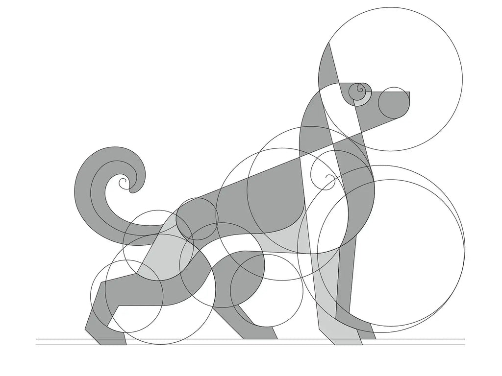
Source: Davit Chanadiri, German Shepherd (Grid), Dribbble, https://dribbble.com/shots/14016879-German-shepherd-grid
The golden ratio has long been recognized as a powerful tool in art and design, offering a natural sense of balance and proportion that appeals to the human eye. In the world of logo design, this timeless principle plays a crucial role in shaping visually compelling and harmonious brand identities. By applying the golden ratio, designers can create logos that feel both structured and organic, helping brands stand out in a competitive visual landscape.
At its core, the golden ratio is a mathematical relationship that appears frequently in nature, architecture, and classical art. When integrated into logo design, it guides the placement, sizing, and spacing of elements to achieve a cohesive and aesthetically pleasing result. This approach not only enhances visual appeal but also contributes to a stronger emotional connection with the audience.
As modern branding continues to evolve, the use of the golden ratio in logo design remains highly relevant. Designers are increasingly blending creativity with mathematical precision to craft logos that are not only beautiful but also functional across various platforms. Understanding how to apply the golden ratio effectively can elevate the quality of logo design, making it more memorable, versatile, and impactful.
Understanding The Golden Ratio In Logo Design
The golden ratio is a mathematical proportion, approximately 1:1.618, that has been widely used in art, architecture, and modern logo design to create visually pleasing compositions. In logo design, this ratio helps designers achieve a natural sense of balance that feels both intentional and effortless. Because the human eye is naturally drawn to harmonious proportions, logos built with the golden ratio often appear more attractive and professional.
When applying the golden ratio in logo design, designers focus on structuring elements such as shapes, spacing, and alignment. This ensures that every component works together cohesively rather than competing for attention. The result is a logo that feels stable, organized, and easy to recognize at a glance.
Another advantage of using the golden ratio is its ability to guide decision-making during the design process. Instead of relying solely on intuition, designers can use this principle as a framework to refine proportions and improve overall composition. This balance between creativity and structure is what makes the golden ratio such a valuable tool in logo design.
Ultimately, understanding the golden ratio allows designers to create logos that are not only visually appealing but also timeless. By integrating this principle thoughtfully, brands can achieve a polished and consistent identity that resonates with their audience.
Why The Golden Ratio Enhances Brand Identity
The golden ratio plays a significant role in strengthening brand identity through thoughtful logo design. When a logo is built using balanced proportions, it naturally feels more refined and trustworthy. This is important because a logo often serves as the first visual interaction between a brand and its audience.
In logo design, the golden ratio helps establish consistency between different visual elements, such as typography, symbols, and spacing. This consistency creates a unified appearance that makes the brand easier to recognize and remember. Over time, this visual harmony contributes to stronger brand recall and a more professional image.
Additionally, logos designed with the golden ratio tend to adapt well across various platforms and sizes. Whether displayed on a website, social media, or printed materials, the balanced proportions ensure that the logo maintains its clarity and impact. This versatility is essential in modern branding, where logos must perform in diverse contexts.
By incorporating the golden ratio into logo design, brands can communicate a sense of quality and attention to detail. This subtle yet powerful effect helps build trust with audiences, making the logo not just a visual mark, but a meaningful representation of the brand’s identity.
Building Logos With Golden Ratio Grids And Circles
One of the most practical ways to apply the golden ratio in logo design is through the use of grids and circular constructions. Designers often create a framework using rectangles or circles based on the golden ratio to guide the placement and proportions of each element. This structured approach helps ensure that every part of the logo aligns harmoniously.
Golden circles are especially popular in logo design because they allow designers to build smooth curves and balanced shapes. By layering circles of different sizes that follow the golden ratio, it becomes easier to form icons, symbols, and letterforms that feel cohesive and visually satisfying. This method is commonly used in iconic logos to achieve a polished and professional appearance.
Using grids based on the golden ratio also improves consistency. It ensures that spacing between elements is proportional, preventing overcrowding or awkward gaps. As a result, the overall composition feels clean and well-organized, which enhances the readability of the logo.
Incorporating the golden ratio into grid systems does not limit creativity. Instead, it provides a reliable foundation that supports experimentation. Designers can explore unique shapes and concepts while maintaining a sense of balance, making the logo design both innovative and visually appealing.

Source: Aminul Islam, Logo Design, Logos, Dribbble, https://dribbble.com/shots/25655618-Logo-Design-Logos
Balancing Typography And Symbols With The Golden Ratio
In logo design, achieving the right balance between typography and symbols is essential, and the golden ratio offers a powerful solution. By applying this principle, designers can determine the ideal size relationship between text and graphic elements, ensuring neither dominates the composition.
The golden ratio helps establish a natural hierarchy within the logo design. For example, the symbol can be scaled in proportion to the text using the ratio, creating a balanced visual flow. This allows viewers to easily process both elements without confusion, improving overall clarity and impact.
Spacing also plays a key role in typography, and the golden ratio can guide letter spacing, line height, and alignment. Proper spacing enhances readability while maintaining a refined and professional look. This is particularly important when logos need to be displayed across various platforms and sizes.
By using the golden ratio in logo design, designers can create a seamless connection between typography and symbols. This harmony strengthens the visual identity of a brand, making the logo more memorable and effective in communicating its message.
Improving Readability And Scalability With The Golden Ratio
Readability is a critical factor in logo design, and the golden ratio plays an important role in achieving it. When designers apply the golden ratio, they create balanced proportions that make logos easier to understand at a glance. This is especially important in today’s digital environment, where logos must remain clear on everything from large billboards to small mobile screens.
Using the golden ratio in logo design helps determine the ideal size relationships between elements such as icons, text, and spacing. This ensures that no part of the logo feels too crowded or too distant, allowing each component to stand out while still working together as a cohesive whole.
Scalability is another key advantage. Logos designed with the golden ratio maintain their structure and clarity when resized. Whether the logo is reduced to a favicon or expanded for print, the balanced proportions ensure that it remains legible and visually appealing.
By focusing on readability and scalability through the golden ratio, designers can create logo designs that perform consistently across all platforms. This approach not only enhances user experience but also strengthens brand recognition over time.
Maintaining Layout Consistency Across Brand Assets
Consistency is essential in building a strong brand identity, and the golden ratio provides a reliable framework for maintaining it in logo design. By applying this principle, designers can ensure that proportions remain uniform across different versions of a logo and various brand assets.
In logo design, the golden ratio helps standardize spacing, alignment, and sizing. This consistency allows the logo to integrate seamlessly into different applications, such as websites, packaging, business cards, and social media graphics. As a result, the brand presents a unified and professional image across all touchpoints.
Design systems often rely on grids and guidelines, and incorporating the golden ratio into these systems enhances their effectiveness. It creates a visual rhythm that ties all elements together, making the overall design feel intentional and well-crafted.
Using the golden ratio in logo design also simplifies future updates or expansions. Designers can easily create variations or additional assets while maintaining the same proportional relationships. This ensures that the brand remains cohesive as it evolves, reinforcing recognition and trust among audiences.
Designing Timeless Logos With The Golden Ratio
Timelessness is one of the most valuable qualities in logo design, and the golden ratio plays a significant role in achieving it. Logos that follow balanced proportions tend to age better because they are rooted in a universal principle that transcends design trends. By using the golden ratio, designers can create logos that remain relevant and visually appealing for years.
In logo design, trends often come and go, but harmony and proportion remain constant. The golden ratio helps establish a structure that feels natural and enduring, allowing logos to maintain their effectiveness even as styles evolve. This is why many well-known brands rely on proportional systems in their visual identity.
Another benefit of using the golden ratio is its ability to create subtle sophistication. Even when viewers are not consciously aware of it, they can sense when a design feels balanced. This subconscious appeal contributes to stronger brand recognition and trust.
By incorporating the golden ratio into logo design, designers can produce work that is not only visually attractive but also resilient over time. This approach ensures that the logo continues to communicate the brand’s message effectively, regardless of changing design landscapes.

Source: DAINOGO, Owl Logo & Grid, Dribbble, https://dribbble.com/shots/15964056-Owl-Logo-Grid
Applying The Golden Ratio In Minimalist Logo Design
Minimalist logo design focuses on simplicity, and the golden ratio becomes even more important when fewer elements are involved. With limited shapes and details, every proportion must be carefully considered. The golden ratio helps designers create clean and balanced compositions that feel intentional rather than empty.
In logo design, minimalism relies on precision. The golden ratio guides the size and placement of each element, ensuring that the design maintains visual harmony. This prevents the logo from appearing too sparse or uneven, which can weaken its overall impact.
Using the golden ratio also enhances clarity in minimalist logos. By maintaining proper spacing and proportion, the design becomes easier to recognize and remember. This is especially important in digital environments where logos need to be instantly identifiable.
Ultimately, combining the golden ratio with minimalist logo design allows designers to achieve maximum impact with minimal elements. The result is a refined, modern logo that communicates effectively while maintaining a strong and balanced visual presence.
Balancing Creativity And Structure In Logo Design
One of the biggest misconceptions about the golden ratio in logo design is that it limits creativity. In reality, it serves as a flexible framework that enhances creative exploration. Designers can use the golden ratio as a guide to structure their ideas while still allowing room for originality and experimentation.
In logo design, creativity often begins with rough concepts and sketches. The golden ratio can then be introduced during the refinement stage to adjust proportions, align elements, and improve overall balance. This process ensures that the final design feels both imaginative and well-constructed.
The golden ratio also helps designers make more confident decisions. Instead of relying solely on intuition, they can use this principle to validate spacing, sizing, and alignment choices. This balance between logic and creativity leads to more polished and effective logo designs.
By combining artistic freedom with the structure of the golden ratio, designers can create logos that are unique yet harmonious. This approach allows for innovation without sacrificing clarity, making the logo design both visually engaging and professionally executed.
Practical Tips For Applying The Golden Ratio In Logo Design
Applying the golden ratio in logo design does not have to be complicated. One practical approach is to start with basic shapes, such as rectangles or circles, that follow the golden ratio. These shapes can serve as a foundation for building more complex elements within the logo.
Another useful technique is to use grid systems based on the golden ratio. These grids help guide alignment, spacing, and proportions, ensuring that all elements work together cohesively. Many design tools allow you to create custom grids, making it easier to integrate this principle into your workflow.
Designers can also experiment with scaling elements according to the golden ratio. Adjusting the size of typography, icons, and spacing using this proportion can significantly improve the visual balance of a logo design. Over time, this practice becomes more intuitive and efficient.
Finally, it is important to remember that the golden ratio is a guideline, not a strict rule. While it enhances structure and harmony, designers should remain flexible and prioritize the overall concept. By thoughtfully applying the golden ratio, logo design can achieve both precision and creativity.
Conclusion
The golden ratio remains a powerful principle in logo design, offering a perfect balance between structure and creativity. By applying the golden ratio, designers can create logos that are visually harmonious, scalable, and timeless. This approach not only enhances aesthetic appeal but also strengthens brand identity across different platforms. While it serves as a helpful guide, the golden ratio should be used with flexibility to support creative ideas. When combined with thoughtful design decisions, it helps produce logo design solutions that are both effective and memorable.
Let Us Know What You Think!
Every information you read here are written and curated by Kreafolk's team, carefully pieced together with our creative community in mind. Did you enjoy our contents? Leave a comment below and share your thoughts. Cheers to more creative articles and inspirations!


Leave a Comment