10 Reasons Why You Should Not Center & Right Align a Logo Design

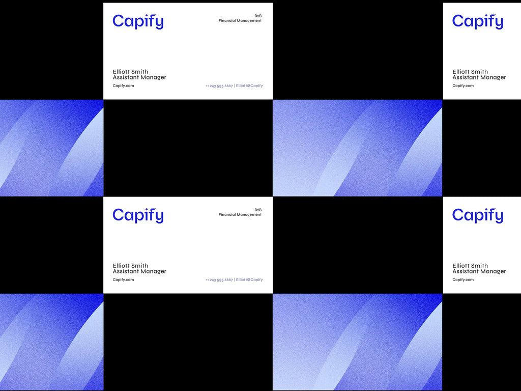
Source: Kevin Craft, Capify Business Cards, Dribbble, https://dribbble.com/shots/22893371-Capify-Business-Cards
Alignment is one of the most important yet overlooked principles in logo design. While many beginners instinctively center everything to make it look “balanced,” alignment decisions can significantly influence how a brand is perceived. The placement of text and symbols affects readability, visual hierarchy, and overall composition. A logo design is not just about aesthetics; it is about communication. Every detail, including alignment, plays a role in shaping that message.
Center and right alignment may seem clean or symmetrical at first glance, but they are not always the most effective choices. In many cases, these alignments can reduce clarity, disrupt natural eye movement, and limit flexibility across different layouts. Since logo design must work across websites, packaging, social media, and print materials, alignment needs to support adaptability and consistency.
As designers, we must move beyond habits and think strategically about structure. Understanding when and why to avoid certain alignment choices helps create stronger, more professional results. In this article, we will explore ten practical reasons why centering and right aligning can weaken a logo design and what to consider instead.
It Weakens Visual Hierarchy In Logo Design
Visual hierarchy is a fundamental principle in logo design. It determines how viewers process information and which element they notice first. When a logo is centered or right aligned without a strategic reason, the hierarchy often becomes flat. The symbol, brand name, and tagline may compete for attention instead of guiding the eye in a clear and intentional way.
In strong logo design, alignment helps establish order. Left alignment naturally creates a starting point for the viewer’s eye, especially in cultures that read from left to right. Center alignment, while symmetrical, can make all elements feel equally important. This removes emphasis and weakens the overall impact of the brand mark.
Right alignment can create even more confusion. It shifts the visual weight toward the edge, making the composition feel less grounded. Instead of feeling stable and structured, the logo design may appear awkward or disconnected from surrounding layouts.
A well-designed logo should communicate instantly. By avoiding unnecessary center or right alignment, designers can create stronger visual flow, clearer emphasis, and a more confident brand presence.
It Reduces Readability And Natural Flow
Readability is critical in logo design because a logo must be understood within seconds. Alignment directly affects how easily people can read and recognize a brand name. Left-aligned text follows the natural reading pattern of most audiences, making it the most intuitive choice in many situations.
When text is centered, each line begins at a different point. This forces the eye to search for the starting position, slowing down recognition. In logo design, even a small delay can reduce memorability. A right-aligned wordmark can feel even more unnatural, as the eye has to adjust to an unfamiliar reading rhythm.
Good logo design supports effortless scanning. The smoother the visual flow, the stronger the brand impression. By prioritizing alignment that matches natural reading habits, designers create logos that feel clear, professional, and easy to engage with across all applications.
It Limits Layout Flexibility Across Applications
A successful logo design must work everywhere. From websites and mobile apps to packaging and billboards, flexibility is essential. When a logo is centered or right aligned, it often becomes harder to adapt within different layout systems. Most digital and print designs rely on grid structures that naturally favor left alignment. A centered or right-aligned logo can feel disconnected from the rest of the composition.
In responsive web design, for example, logos are typically placed in the top left corner. This placement aligns with user expectations and supports easy navigation. A right-aligned logo design may create awkward spacing or force other elements to adjust unnaturally. Over time, this limits consistency across brand touchpoints.
Good logo design anticipates real-world usage. Designers must think beyond the artboard and consider how the mark will function in headers, social media profiles, merchandise, and advertising materials. Left alignment generally offers more flexibility because it integrates smoothly into structured layouts.
By avoiding unnecessary center or right alignment, designers create a logo design that adapts effortlessly. This flexibility strengthens brand consistency and ensures the logo remains effective in every context.

Source: José de Wal, Bundu, Dribbble, https://dribbble.com/shots/20587712-Bundu
It Creates Visual Imbalance Without Purpose
Balance is a core principle of logo design, but balance does not always mean symmetry. Center alignment may appear balanced at first glance, yet it can make a logo feel static and overly formal. Without intentional contrast or supporting elements, the composition may lack energy and direction.
Right alignment can create a different issue. It shifts the visual weight toward one side, often making the logo design feel heavy or unstable. Unless the surrounding layout supports that imbalance, the result can look accidental rather than strategic.
Effective logo design uses alignment to control visual weight. Designers carefully position symbols, typography, and spacing to achieve harmony. When alignment choices are made without considering proportion and context, the composition suffers.
A strong logo should feel intentional and grounded. Avoiding default center or right alignment allows designers to build structure with purpose, resulting in a more confident and visually stable logo design.
It Makes The Logo Design Feel Static And Predictable
Energy and movement are subtle but powerful qualities in logo design. When a logo is centered by default, the composition often feels formal and unmoving. While symmetry can communicate stability, it can also make a brand appear rigid or overly traditional. In competitive markets, brands need personality and presence, and a static structure can limit that expression.
Center alignment tends to anchor everything in the middle, removing directional flow. The viewer’s eye stops rather than travels. In modern logo design, controlled asymmetry often creates more interest and memorability. Slight shifts in alignment can introduce momentum and give the logo a more dynamic character.
Right alignment can create a similar issue. Instead of feeling balanced and progressive, the logo design may appear visually stuck on one side. Without strong conceptual reasoning, this placement can look arbitrary rather than intentional.
A strong logo design should feel alive, not passive. By exploring alignment that supports movement and visual rhythm, designers can create logos that feel contemporary, confident, and engaging across different brand touchpoints.
It Disrupts Natural Reading Patterns
One of the most important goals in logo design is instant recognition. Alignment plays a major role in how quickly viewers process information. In cultures that read from left to right, the eye naturally begins scanning from the left edge. When a logo is right aligned, it interrupts this instinctive behavior.
Instead of flowing smoothly from symbol to wordmark, the viewer’s eye must adjust. This small interruption may seem minor, but in logo design, even slight friction can reduce clarity. Center alignment can also slow down reading because each line begins at a different horizontal point, making scanning less predictable.
Effective logo design supports natural eye movement. The easier it is to read and understand a brand name, the stronger the impression it leaves. Alignment should guide the viewer, not challenge them.
By choosing alignment that aligns with common reading habits, designers create a logo design that feels intuitive and effortless. This simple structural decision can significantly improve recognition and long-term brand recall.
It Can Make The Logo Design Look Outdated
Trends in logo design evolve over time, and alignment plays a subtle but important role in how modern a brand appears. In the past, many logos relied heavily on centered layouts because they felt formal and symmetrical. While symmetry still has its place, overusing center alignment today can make a logo design feel conservative or stuck in a previous era.
Contemporary logo design often embraces simplicity with intentional asymmetry. Designers use alignment to create tension, movement, and a sense of forward direction. A strictly centered or right-aligned composition, when not conceptually driven, may lack that modern edge. It can feel predictable instead of innovative.
Right alignment, in particular, is less common in mainstream branding. When applied without clear reasoning, it can appear experimental in a way that feels unpolished rather than progressive. Strong logo design decisions should feel deliberate and aligned with current visual standards.
Brands that want to project confidence and relevance need a logo design that reflects today’s design language. Choosing alignment thoughtfully helps ensure the logo feels current, adaptable, and visually aligned with modern expectations.

Source: Bill Kenney, Quantive Rebrand/Website, Dribbble, https://dribbble.com/shots/21873262-Quantive-Rebrand-Website
It Reduces Scalability And Responsive Performance
A professional logo design must perform well at every size. From tiny mobile icons to large-format signage, scalability is essential. Centered and right-aligned compositions can create challenges when the logo needs to be resized or rearranged for different formats.
When a centered logo is reduced in size, elements may appear cramped or visually compressed. The even spacing that looked balanced at a large scale can become tight and unclear in smaller applications. In responsive environments, such as websites and apps, right-aligned logo design may also create awkward empty space on one side.
Good logo design anticipates these variations. Designers often create multiple lockups to ensure flexibility, and alignment plays a key role in how easily these variations can be structured. Left-aligned compositions tend to integrate more naturally into responsive layouts and grid systems.
By avoiding unnecessary center or right alignment, designers create a logo design that scales smoothly. This ensures the brand remains clear, balanced, and professional across all platforms and devices.
It Complicates Grid Systems And Layout Structure
Grid systems are the foundation of professional logo design. They help designers create order, proportion, and consistency. When a logo is centered or right aligned without a strategic reason, it can become harder to integrate into structured layouts. Most branding systems, websites, and print materials are built on grids that naturally favor left alignment.
In practical applications, a left-aligned logo design fits smoothly into headers, brochures, business cards, and packaging layouts. The alignment connects naturally with margins and columns, creating a sense of structure. In contrast, right alignment often feels disconnected from the grid, making the overall composition appear less cohesive.
Centered logos can also disrupt layout harmony. While symmetry may look balanced on its own, it may not align well with other left-structured elements like body text, navigation menus, or supporting graphics. This misalignment creates subtle tension that weakens the overall brand presentation.
A strong logo design should support, not complicate, the larger visual system. By choosing alignment that works seamlessly with grid structures, designers ensure the logo enhances the brand’s overall layout rather than fighting against it.
It Weakens Overall Brand Consistency
Consistency is one of the most important goals in logo design. A brand’s visual identity must feel unified across every platform, from digital interfaces to physical products. When a logo is centered or right aligned without strategic planning, it may clash with the rest of the brand’s visual language.
Most modern branding systems rely heavily on left-aligned typography and structured layouts. If the logo design does not align with this system, it can feel separate or disconnected. This inconsistency may seem subtle, but over time it affects how professional and trustworthy the brand appears.
Right alignment can create additional challenges when pairing the logo with taglines, icons, or supporting graphics. Maintaining consistent spacing and visual rhythm becomes more difficult, especially across multiple formats.
Effective logo design is not just about creating a beautiful mark. It is about building a cohesive identity. By avoiding unnecessary center or right alignment, designers can create a logo design that integrates smoothly with the entire brand system and strengthens long-term recognition.
Conclusion
Alignment may seem like a small detail, but it has a powerful impact on logo design. Choosing to center or right align without a clear strategy can weaken hierarchy, reduce readability, and limit flexibility across applications. Strong logo design is intentional, structured, and adaptable to real-world use. By understanding how alignment influences balance, flow, and consistency, designers can create logos that feel modern, professional, and easy to recognize. Thoughtful alignment decisions help ensure a logo design not only looks good, but also performs effectively across every brand touchpoint.
Let Us Know What You Think!
Every information you read here are written and curated by Kreafolk's team, carefully pieced together with our creative community in mind. Did you enjoy our contents? Leave a comment below and share your thoughts. Cheers to more creative articles and inspirations!


Leave a Comment