How to Set A Proper Logo Design Placement

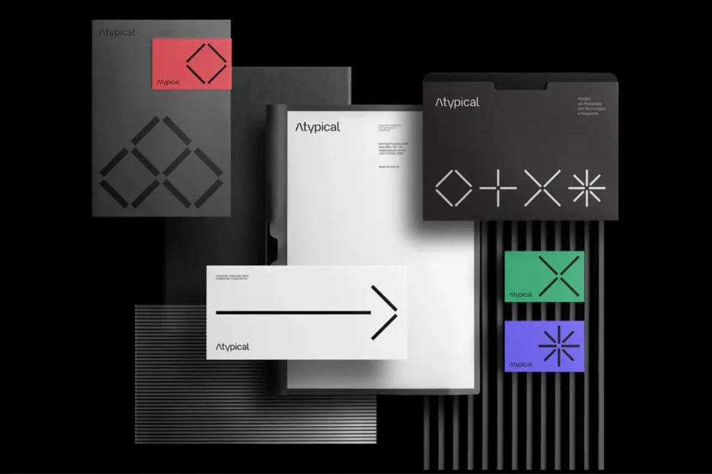
Source: John John Dias, Atypical, Behance, https://www.behance.net/gallery/183317885/Atypical
A well-crafted logo design is one of the most important elements of a brand identity. However, creating a beautiful logo alone is not enough. The placement of a logo design plays a major role in how people notice, understand, and remember a brand. When the placement is done correctly, the logo naturally attracts attention and strengthens brand recognition. On the other hand, poor placement can make even a strong logo design feel hidden or disconnected from the overall layout.
Logo design placement affects everything from visual balance to brand visibility. Whether the logo appears on a website header, product packaging, business card, or marketing material, its position influences how viewers interact with the design. Proper placement helps guide the viewer’s eye and ensures that the brand identity stands out without disrupting the overall composition.
Designers must carefully consider factors such as spacing, alignment, layout structure, and viewing habits when deciding where a logo should appear. The goal is to place the logo in a location that feels natural, balanced, and easy to recognize across different platforms.
In this article, we will explore practical guidelines that help you determine the most effective logo design placement. These tips will help ensure that your logo design looks professional, remains highly visible, and supports a consistent brand presence in every design application.
Understanding The Importance Of Logo Design Placement
A successful brand identity does not rely only on the appearance of a logo design. Where the logo appears within a layout is just as important. Logo design placement influences how quickly viewers recognize a brand and how easily they connect the logo with the surrounding content. When placement is thoughtful and strategic, the logo becomes a natural focal point that strengthens the overall visual message.
Proper logo design placement helps guide the viewer’s eye through a design. Human eyes tend to follow predictable visual patterns, especially when looking at websites, advertisements, or packaging. By placing the logo in a location that aligns with these natural viewing patterns, designers can ensure the brand identity is noticed immediately. This makes the brand more memorable and easier to recognize across different materials.
Placement also affects visual balance. A well-positioned logo design supports the structure of the layout instead of competing with other elements such as images, headlines, or product information. If the placement feels awkward or crowded, the entire design may look unorganized and less professional.
Another important factor is brand consistency. When logo design placement remains similar across different platforms, audiences begin to expect where the logo will appear. This consistency builds familiarity and trust with the brand.
By understanding the importance of logo design placement, designers can create layouts that highlight the brand effectively while maintaining a clean and balanced visual composition.
Choosing A Clear And Visible Logo Location
One of the most important decisions in logo design placement is selecting a location where the logo can be seen easily. A logo design should never feel hidden within a layout. Instead, it should appear in a position where viewers naturally look first when viewing a page, product, or advertisement.
Many designers choose areas such as the top left corner, top center, or upper section of a layout for logo placement. These areas align with common viewing habits, making them ideal for establishing brand presence quickly. For example, on websites the logo often appears in the top corner of the navigation bar because users instinctively check that area for brand identification.
Clear placement also means avoiding visual clutter. If the logo is surrounded by too many competing elements, its impact becomes weaker. Designers should ensure that the logo design has enough breathing room so it stands out without distractions. This approach keeps the brand mark clean and easy to recognize.
Another helpful strategy is to consider how the design will be viewed in real situations. A logo placed on packaging, signage, or merchandise should remain visible even from a distance. Choosing the right location helps ensure the logo design remains noticeable and readable.
By prioritizing visibility and clarity, designers can create effective logo design placement that strengthens brand recognition and supports a clean, professional layout.
Aligning Logo Design Placement With Visual Hierarchy
Visual hierarchy plays a major role in how people understand a layout. When viewers look at a design, their eyes naturally follow a certain order based on size, contrast, and position. Proper logo design placement should work together with this visual flow rather than interrupt it. When the logo is positioned thoughtfully, it becomes part of the natural reading path and strengthens brand recognition.
In many layouts, viewers begin scanning from the top area and move downward. Because of this behavior, placing the logo design near the top of a page or layout is often effective. This placement allows the audience to identify the brand quickly before exploring additional information such as headlines, product details, or images.
Alignment also plays a key role in logo design placement. A logo should align with other design elements such as margins, grid systems, or navigation structures. Consistent alignment keeps the layout organized and prevents the logo from looking out of place. When a logo appears randomly positioned, it can make the entire design feel unbalanced.
Designers should also consider the relationship between the logo and other focal points. If a headline or product image is the main focus, the logo design placement should support that element rather than compete with it. Maintaining this balance ensures that the brand remains visible while the content still communicates its message clearly.
By aligning logo design placement with the visual hierarchy, designers create layouts that feel structured, balanced, and easy for viewers to navigate.

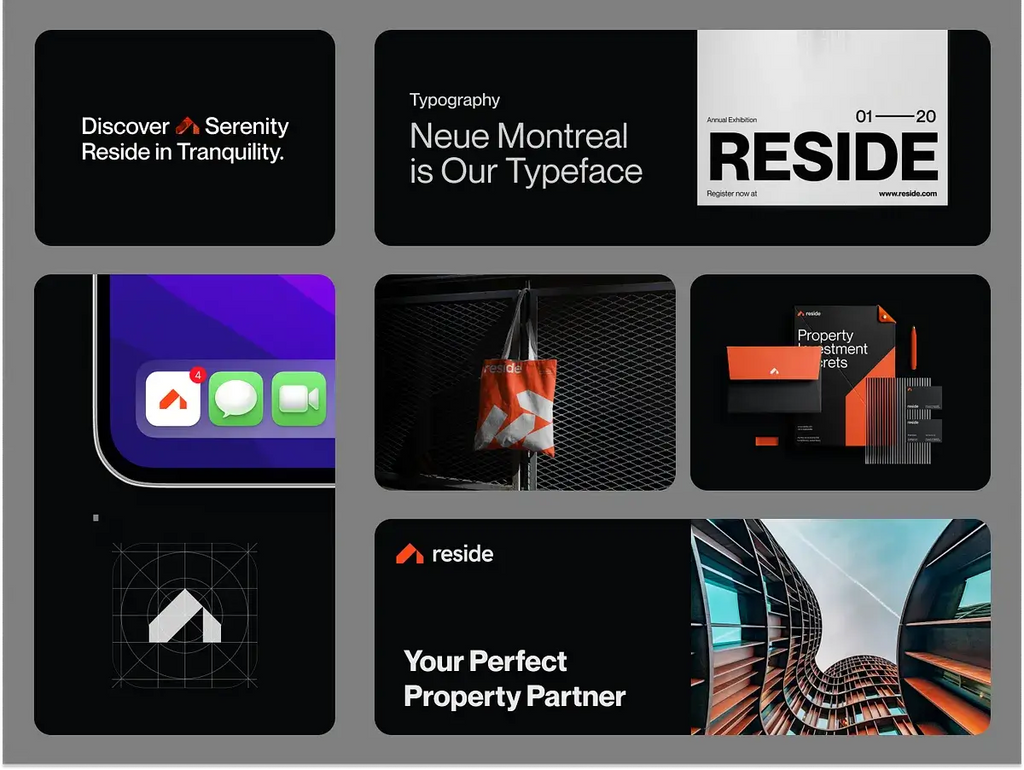
Source: azharfani, Branding Kit for Property Real Estate Company, Dribbble, https://dribbble.com/shots/21667249-Branding-kit-for-property-real-estate-company
Maintaining Consistent Logo Design Placement Across Platforms
Consistency is one of the most important principles in branding. A recognizable brand identity often depends on repeating the same visual patterns across different platforms. Logo design placement should remain consistent so that audiences can quickly identify the brand no matter where they encounter it.
For example, if a logo design consistently appears in the top corner of a website, customers will begin to associate that position with the brand. When the same placement appears on social media graphics, packaging, or marketing materials, the brand feels more organized and professional. This repetition strengthens familiarity and helps viewers recognize the brand faster.
Consistent logo design placement also helps maintain visual structure across different designs. When the logo always appears in a similar position, designers can build layouts that feel unified and balanced. This approach prevents confusion and ensures the brand identity remains clear.
However, consistency does not mean every layout must look identical. Different mediums such as websites, posters, packaging, and merchandise may require slight adjustments. The key is to keep the placement pattern recognizable while adapting to each format’s layout requirements.
Many brands solve this by creating brand guidelines that define proper logo design placement. These guidelines explain where the logo should appear, how much space it should have, and how it should align with other elements. By maintaining consistent placement, brands can build a stronger identity and a more cohesive visual presence.
Using Negative Space To Improve Logo Design Placement
Negative space plays an essential role in successful logo design placement. Negative space refers to the empty area surrounding a visual element. When used correctly, it allows a logo design to stand out clearly without competing with nearby graphics, text, or images. Many designers overlook this aspect, but proper spacing can dramatically improve how professional and readable a layout appears.
A logo should never feel squeezed between other elements. Crowded placement reduces the visual impact of a logo design and can make the brand look less organized. Instead, designers should create a safe area around the logo where no other visual elements intrude. This breathing room helps maintain clarity and ensures that the logo remains the recognizable symbol of the brand.
Effective logo design placement also relies on balancing negative space with the rest of the layout. Too little space can make the design feel cluttered, while too much space may cause the logo to look disconnected from the composition. The goal is to create harmony where the logo feels integrated but still clearly separated from surrounding content.
Many brand guidelines define a minimum clear space around the logo. This space is often based on a portion of the logo’s height or width. By following these guidelines, designers maintain consistent logo design placement across different applications.
When negative space is used thoughtfully, it enhances visibility, improves readability, and allows the logo design to maintain a strong and professional presence in any layout.
Adapting Logo Design Placement For Different Layouts
Not every design layout follows the same structure, which means logo design placement must sometimes adapt to fit different formats. A logo that works perfectly on a website header may need a different placement when used on packaging, promotional materials, or merchandise. Designers must evaluate each layout carefully to determine the most natural and effective position for the logo.
For example, websites often place the logo design in the top corner of the page because this area aligns with common reading patterns. However, product packaging might benefit from a centered logo placement that becomes the focal point of the design. In advertising posters, the logo may appear near the bottom to support the message while still maintaining brand visibility.
When adjusting logo design placement, designers should always consider the visual balance of the layout. The logo should complement the surrounding elements rather than disrupt the design structure. Placement should feel intentional and integrated with the composition.
Another important factor is the viewing environment. Some layouts are viewed quickly, such as billboards or signage. In these cases, the logo design placement must ensure the brand is visible even from a distance. Other formats, like brochures or websites, allow viewers more time to explore the design.
By adapting logo design placement to different layouts while maintaining brand consistency, designers can create flexible designs that remain clear, balanced, and recognizable across many applications.
Balancing Logo Size And Placement In Design Layouts
Logo size and logo design placement work together to create a balanced and professional layout. Even the most well-crafted logo design can lose its effectiveness if the size and placement are not carefully considered. A logo that is too large may dominate the layout and distract from other important elements, while a logo that is too small may become difficult to notice or recognize.
When determining proper logo design placement, designers should think about how the logo interacts with surrounding elements such as headlines, images, and text blocks. The logo should support the composition rather than compete with the content. A balanced approach allows the logo to remain visible while maintaining harmony within the overall design.
Scale also plays an important role in logo visibility. A well-sized logo design should remain clear and readable at different viewing distances. For example, logos on websites or mobile screens often require slightly larger sizing to ensure recognition. In printed layouts, the logo may appear smaller as long as the placement remains prominent and uncluttered.
Another helpful strategy is using a grid system when planning logo design placement. Grids help designers align the logo with other elements while maintaining proportional spacing. This structured approach creates consistency and keeps the layout visually organized.
By carefully balancing logo size with thoughtful placement, designers can create layouts that highlight the brand identity while maintaining a clean and professional visual structure.

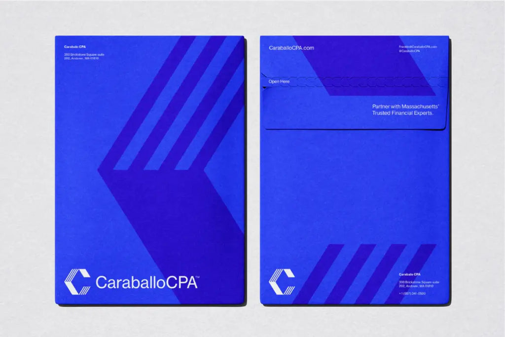
Source: Numinous Agency, Caraballo CPA, Behance, https://www.behance.net/gallery/182421439/Caraballo-CPA-Branding-Visual-Identity
Adapting Logo Design Placement For Different Media
Different media platforms require different approaches to logo design placement. A design that works well on a website may not translate perfectly to packaging, signage, or merchandise. Because each medium has its own layout limitations and viewing conditions, designers must adapt the placement of a logo design to ensure it remains visible and effective.
Digital platforms often prioritize clear navigation and quick recognition. For this reason, logo design placement on websites typically appears in the top area of the page. This position allows users to identify the brand immediately while browsing content. Social media graphics may also place the logo near the edges or corners so that the main message remains the central focus.
In print materials such as posters, brochures, or advertisements, the logo design placement may shift depending on the layout structure. Designers sometimes place the logo near the bottom of a poster to support the message without distracting from the main visual. In packaging design, the logo often becomes a central element that represents the brand directly on the product.
Merchandise and promotional items also require thoughtful placement. For example, logos on apparel are commonly placed on the chest, sleeve, or back area where they remain noticeable and visually balanced.
By adjusting logo design placement for each medium while maintaining consistent branding, designers ensure that the logo remains recognizable and effective across a wide range of visual applications.
Testing Logo Design Placement For Visibility And Readability
Before finalizing any layout, it is important to test how the logo design placement performs in real situations. A design may look balanced during the creative process, but the logo might appear too small, hidden, or visually weak once the design is viewed on different devices or printed materials. Testing helps designers confirm that the logo remains clear, readable, and noticeable across various applications.
One useful approach is reviewing the design at different sizes. A logo design that looks perfect on a large screen may lose clarity when displayed on a smaller device such as a mobile phone. Checking how the placement works on multiple screen sizes ensures that the brand remains recognizable. Designers should also zoom out and view the design from a distance to see if the logo still stands out.
Mockups are another helpful tool when evaluating logo design placement. By placing the logo within realistic scenarios such as packaging, business cards, or signage, designers can better understand how the logo interacts with the full layout. This step reveals whether the placement feels natural or if adjustments are needed.
Gathering feedback from others can also provide valuable insights. Fresh perspectives may identify placement issues that were not obvious during the design process.
By carefully testing logo design placement, designers ensure the logo maintains strong visibility, clear readability, and a balanced presence within every layout.
Creating Clear Guidelines For Logo Design Placement
Once the ideal logo design placement has been established, it is important to document these decisions in clear brand guidelines. Brand guidelines help maintain consistency across all visual materials and ensure that the logo design always appears in a professional and recognizable way.
Guidelines typically explain where the logo should be placed within different types of layouts. For example, they may specify that the logo design should appear in the top corner of a website header, centered on packaging, or aligned with a margin in printed materials. Defining these placement rules prevents confusion and ensures that every design follows the same structure.
Another key element of these guidelines is defining the clear space around the logo. This safe area protects the logo design from being crowded by text, images, or other graphics. Maintaining consistent spacing helps the logo remain visually strong and easy to recognize.
Guidelines may also include examples showing correct and incorrect logo design placement. These visual references help designers, marketers, and partners understand how the logo should appear in different contexts. With clear examples, it becomes easier to maintain a unified brand appearance.
By creating well-structured brand guidelines, businesses can protect the integrity of their logo design. Consistent placement strengthens brand identity and ensures the logo remains recognizable across websites, marketing materials, packaging, and other visual applications.
Conclusion
Proper logo design placement plays a vital role in building a strong and recognizable brand identity. Even a well-crafted logo design can lose impact if the placement is poorly planned. By focusing on visibility, balance, spacing, and consistency, designers can ensure that the logo becomes a natural part of every layout. Thoughtful placement also helps guide the viewer’s attention and strengthens brand recognition across different platforms. When designers carefully test and standardize logo design placement, the result is a professional, cohesive visual presence that supports the overall brand message.
Let Us Know What You Think!
Every information you read here are written and curated by Kreafolk's team, carefully pieced together with our creative community in mind. Did you enjoy our contents? Leave a comment below and share your thoughts. Cheers to more creative articles and inspirations!


Leave a Comment