
30 Best Asian Food Branding Ideas You Should Check
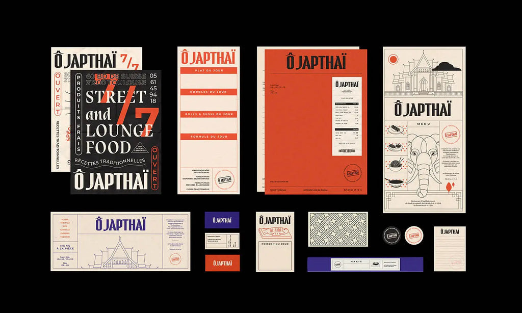
Source: BIS Studio Graphique, O Japthai, Behance, https://www.behance.net/gallery/80481841/BRANDING-O-Japthai-Restaurant-Street-Lounge
Designing within asian food branding is less about decoration and more about translating flavor into a visual language that feels immediate and alive. The energy of sizzling woks, the rhythm of street vendors, and the precision of traditional recipes can all be reflected through thoughtful design choices. This article gathers a range of standout ideas that reinterpret these sensory moments into branding that feels fresh, bold, and full of personality.
Some of the most compelling asian food branding moves away from obvious cultural clichés and instead focuses on mood, motion, and detail. A clever layout might mimic the flow of noodles, while packaging structure could echo the shape of bamboo steamers or folded takeout boxes. Color decisions may draw from real ingredients—like the richness of soy, the brightness of citrus, or the depth of spices—creating a palette that feels edible rather than ornamental. Typography can lean into rhythm and spacing instead of imitation, giving brands a distinct voice without relying on stereotypes. These ideas open the door to branding that feels intuitive, layered, and genuinely connected to the experience of eating.
Asian Food Branding Ideas
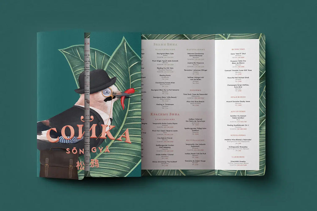
Source: Dmitry Gerais, Сойка, Behance, https://www.behance.net/gallery/75123857/sojka-Jay

Source: Barinchild Creative, Ramen Densetsu, Behance, https://www.behance.net/gallery/101471561/RAMEN-DENSETSU
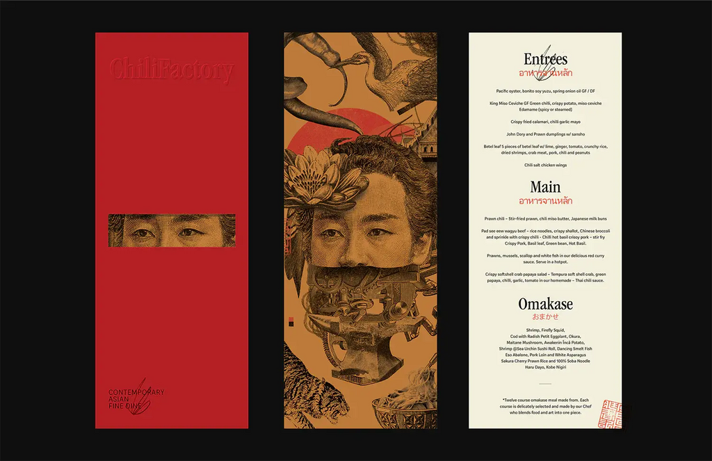
Source: Human, Chili Factory, Behance, www.behance.net/gallery/135936819/ChiliFactory
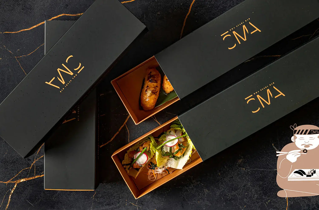
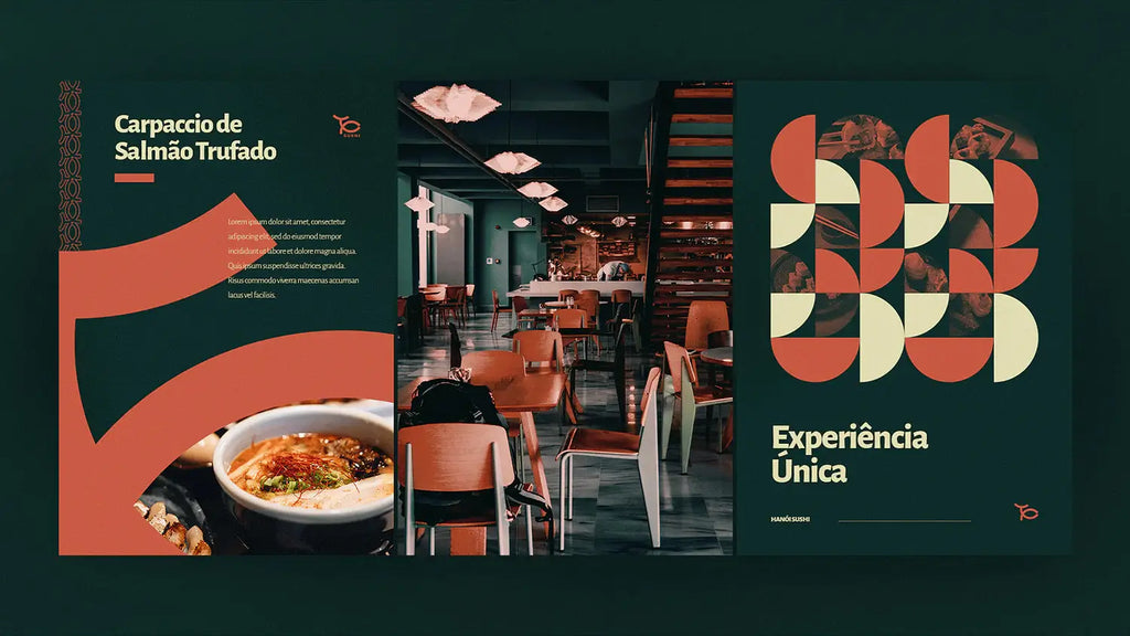
Source: Petros Rigos, Oma, Behance, https://www.behance.net/gallery/123605713/OMA-Sushi-bar
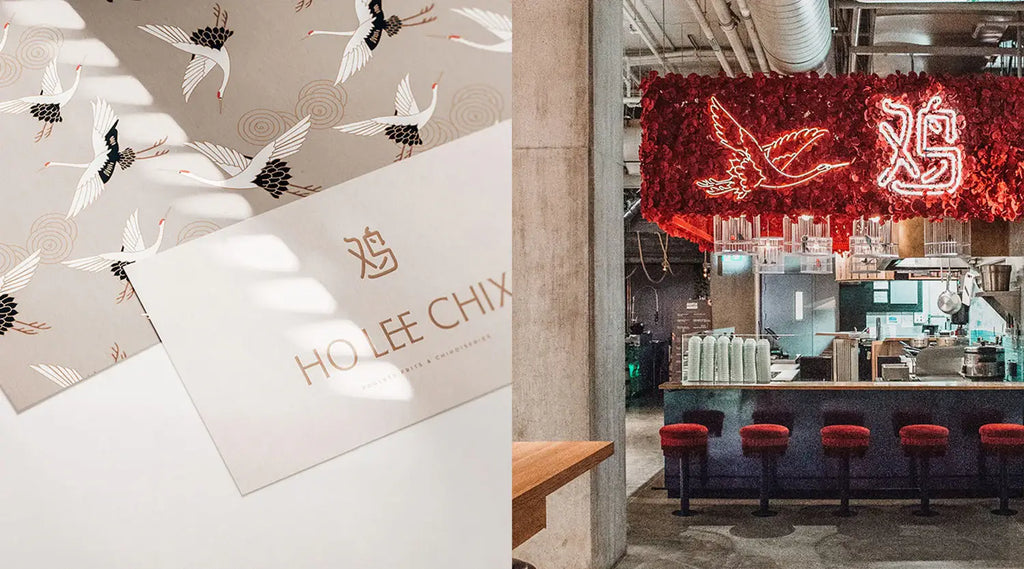
Source: Kat Romanoff, Ho Lee Chix, Behance, https://www.behance.net/gallery/92534827/Ho-Lee-Chix-Brand-Identity
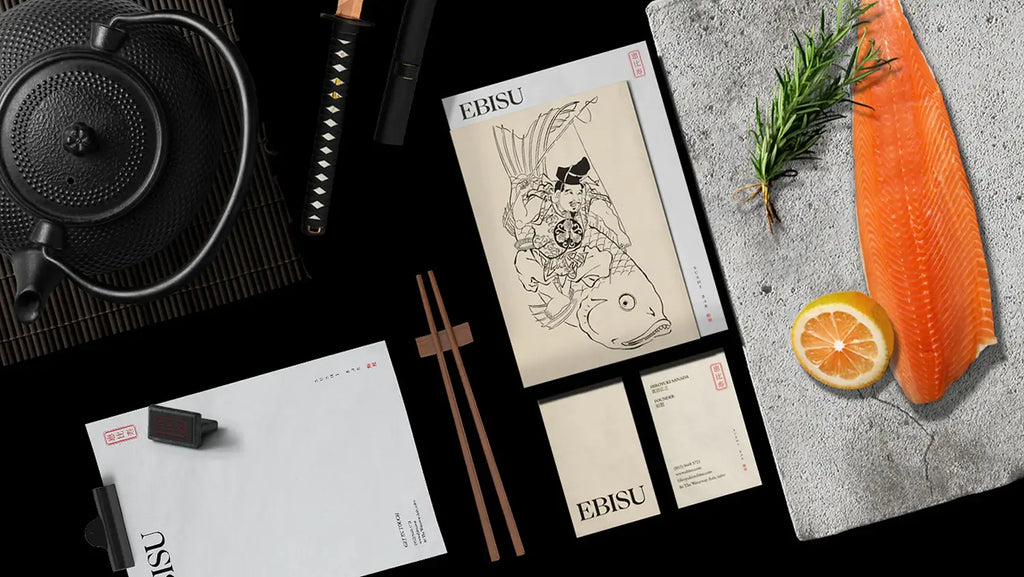
Source: Youssef El-Sebaei, Ebisu, Behance, https://www.behance.net/gallery/129524437/EBISU
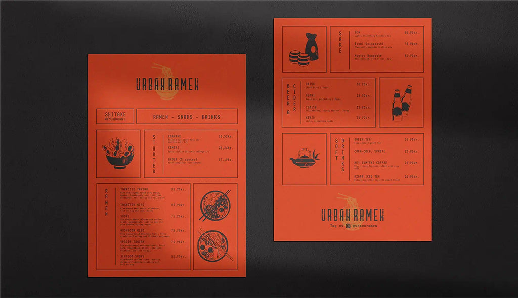
Source: Zane Zake, Urban Ramen, Behance, https://www.behance.net/gallery/114278449/URBAN-RAMEN-BRANDING
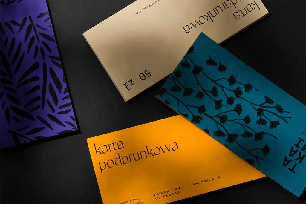
Source: Motyw Studio, Takami, Behance, https://www.behance.net/gallery/90402869/Takami
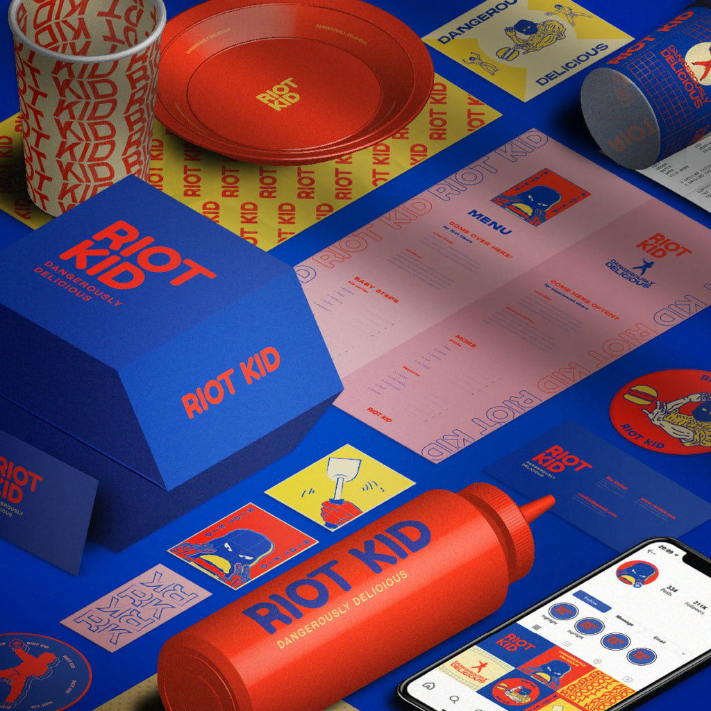
Source: Pancho Karambola, Riot Kid Branding, Behance, https://www.behance.net/gallery/125273005/Riot-Kid-Branding

Source: Hue Studio, Kakoro Sushi, Behance, https://www.behance.net/gallery/92514243/Kokoro-Sushi
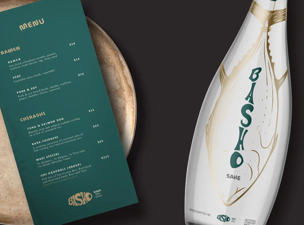
Source: Jose Alcanttara, Basho, Behance, https://www.behance.net/gallery/96639043/BRANDING-Basho-Sushi-Restaurant
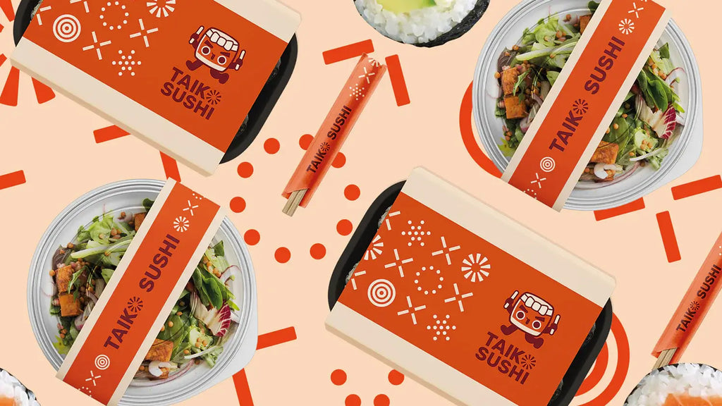
Source: Nightshift Nest, Taiko Sushi, Behance, https://www.behance.net/gallery/127239817/Taiko-Sushi-Branding
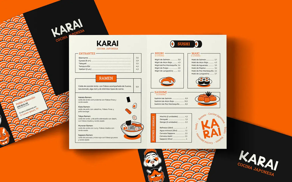
Source: Alvaro Pareza, Karai, Behance, https://www.behance.net/gallery/92576563/KARAI-Japanese-Restaurant-Branding
Source: Everton Lisboa, Hanoi, Behance, https://www.behance.net/gallery/137945209/Hanoi-Sushi

Source: Seachange Studio, Oji Sushi, Behance, https://www.behance.net/gallery/103234327/Oji-Sushi
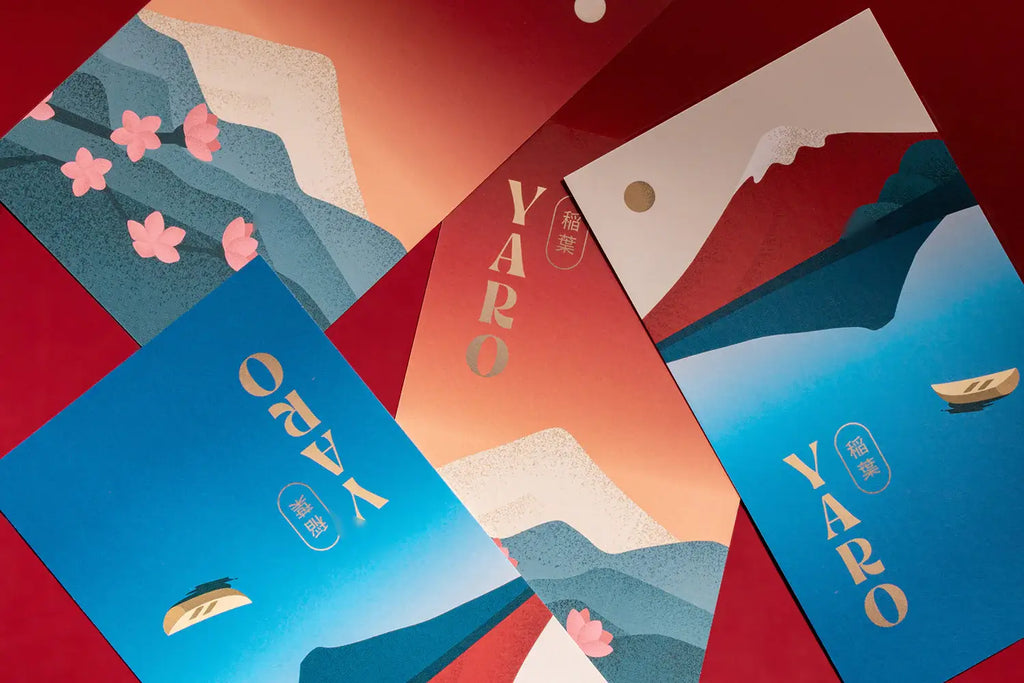
Source: Daniela Barrio de Mendoza, Yaro, Behance, https://www.behance.net/gallery/121797927/Yaro-Sushi-Experience
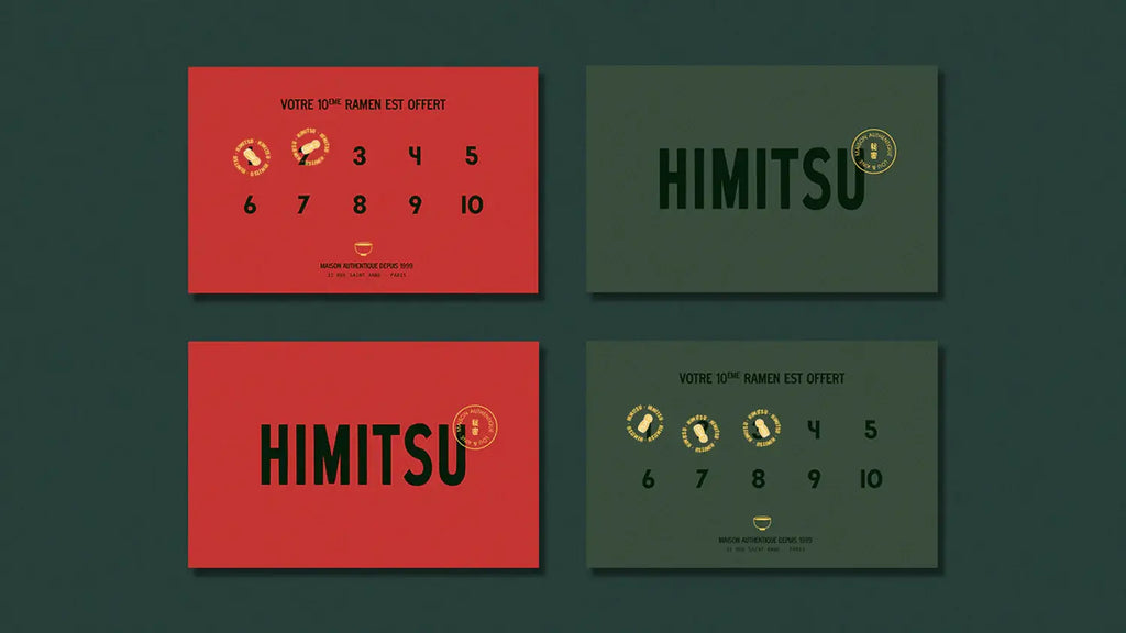
Source: Username, Himitsu Ramen, Behance, https://www.behance.net/gallery/131025733/Himitsu-Ramen-Restaurant
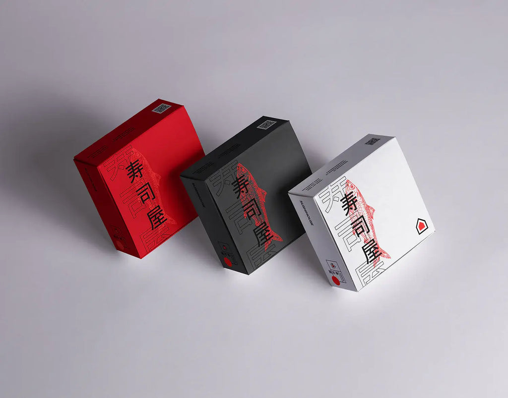
Source: Aydin Garibov, Sushihouse, Behance, https://www.behance.net/gallery/112570303/SUSHIHOUSE-Branding
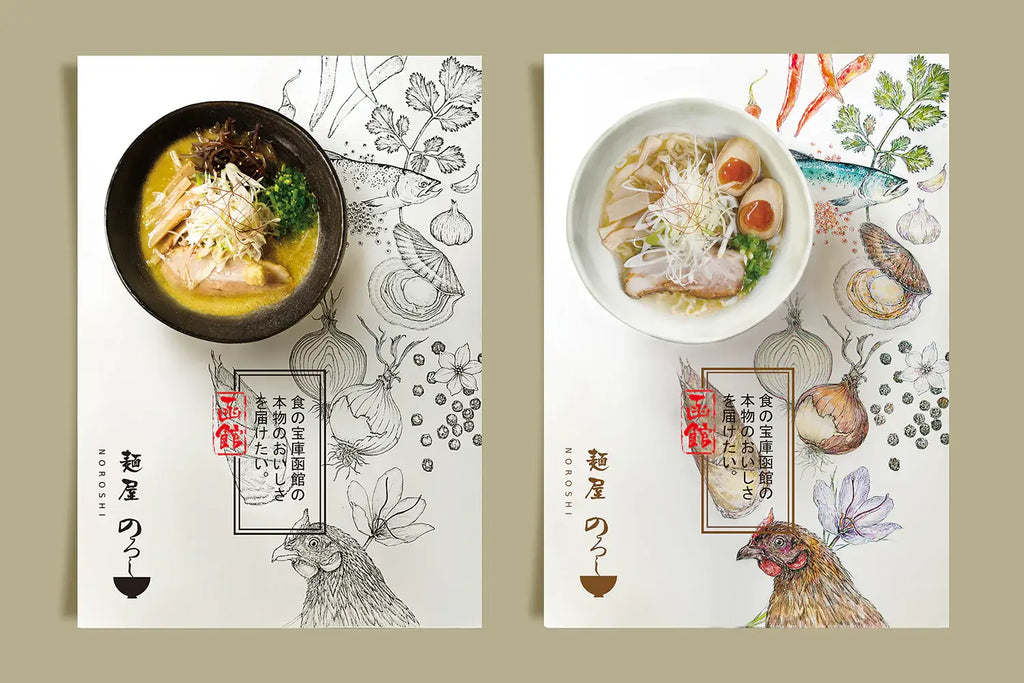
Source: Mortise Design Ilc, Noroshi, Behance, https://www.behance.net/gallery/33555875/NOROSHI
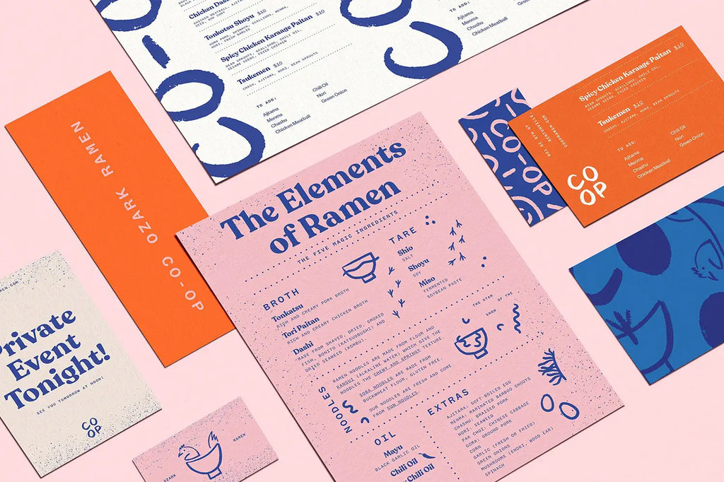
Source: Stitch Design Co, Co Op Ramen, Behance, https://www.behance.net/gallery/98949271/Co-Op-Ramen
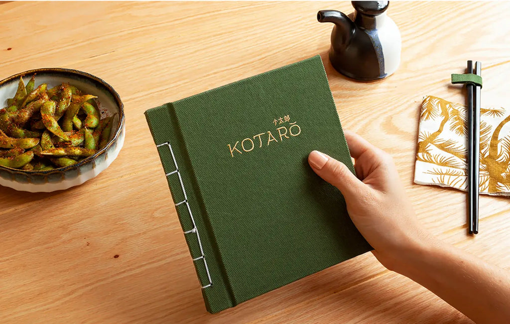
Source: Wikka, Kotaro, Behance, https://www.behance.net/gallery/68883311/Kotaro
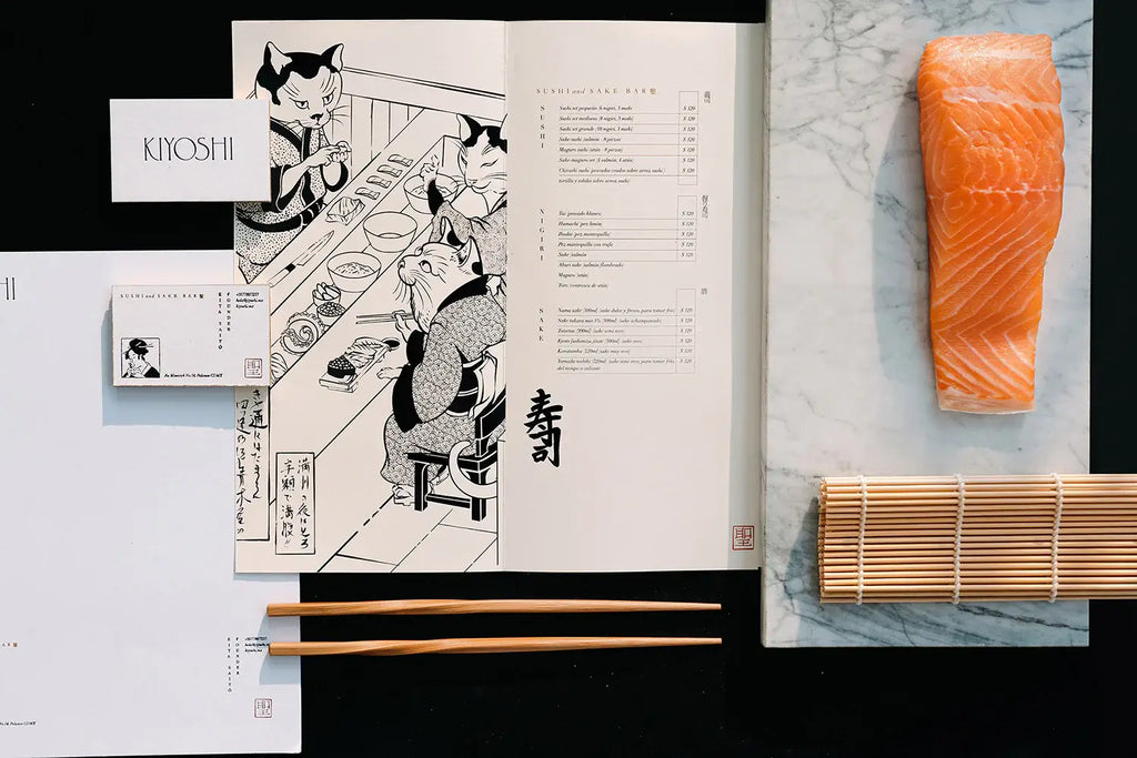
Source: Monotypo Studio, Kiyoshi, Behance, https://www.behance.net/gallery/100981271/Kiyoshi-Sushi-Sake-Bar
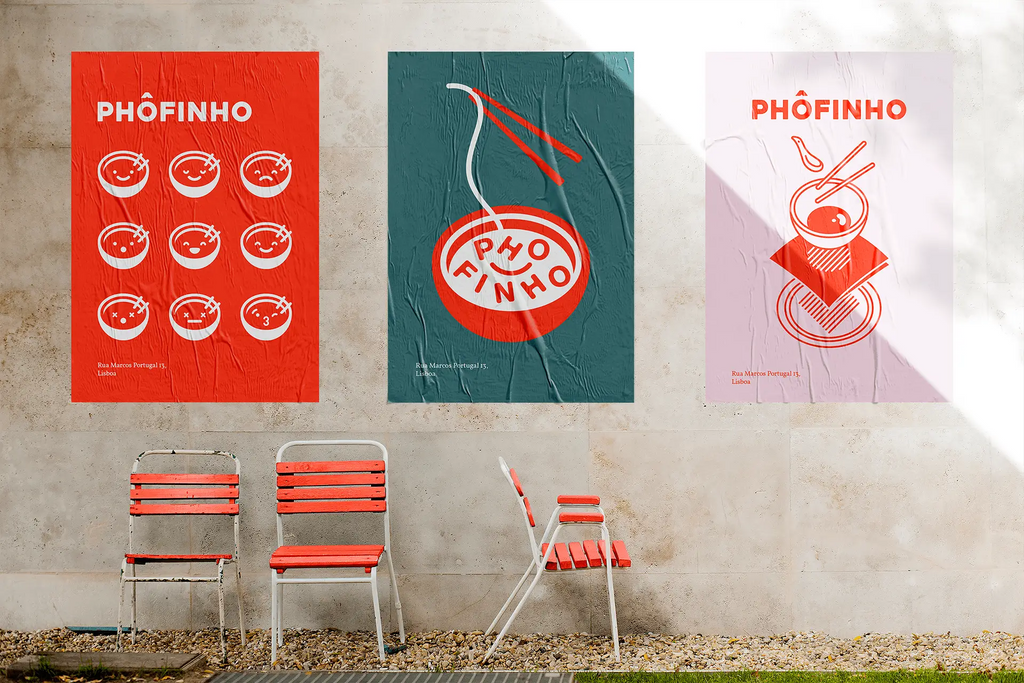
Source: Sofia Ayuso, Phôfinho, Behance, https://www.behance.net/gallery/106202295/Phofinho-Branding
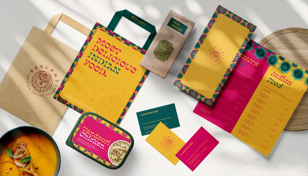
Source: Marawan Ramadan, Berlanti, Behance, https://www.behance.net/gallery/91697985/Berlanti-Branding-Development
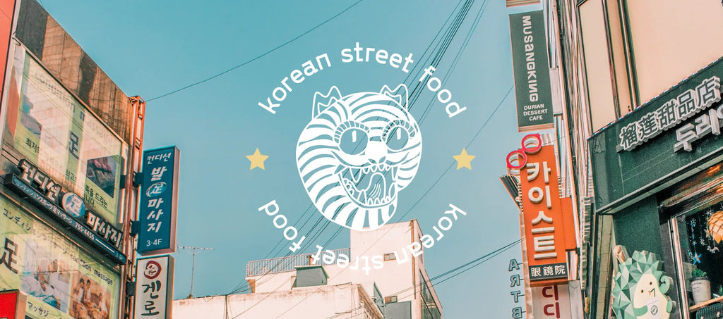
Source: Praid Russia, Korean Food Branding, Behance, https://www.behance.net/gallery/124818285/Korean-Food-Branding
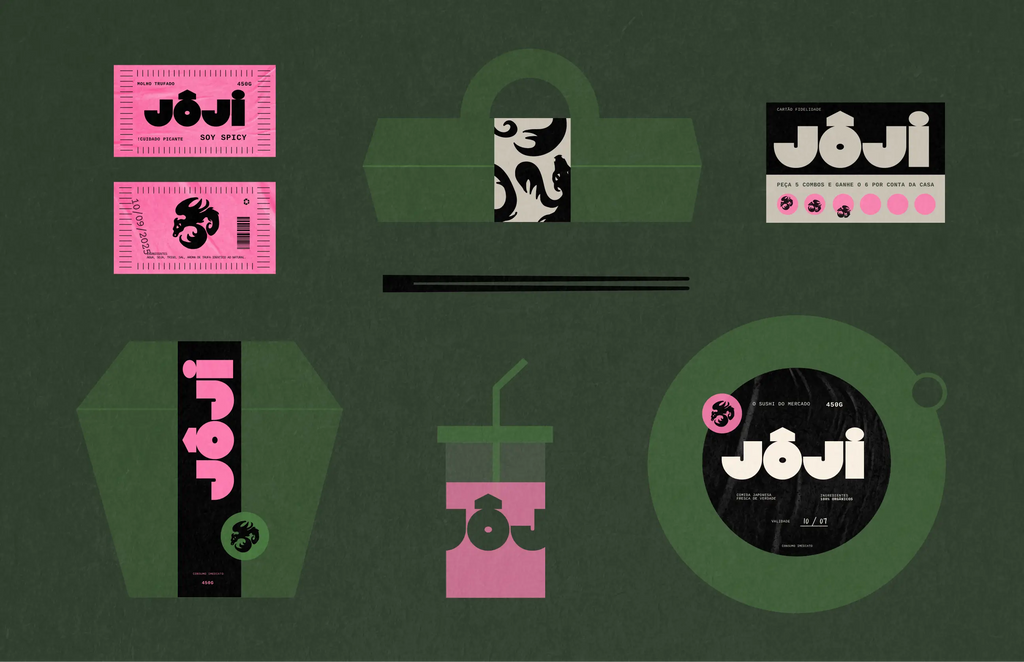
Source: Bolden Branding, Jôji Sushi, Behance, https://www.behance.net/gallery/204620671/JOJI-SUSHI-Branding
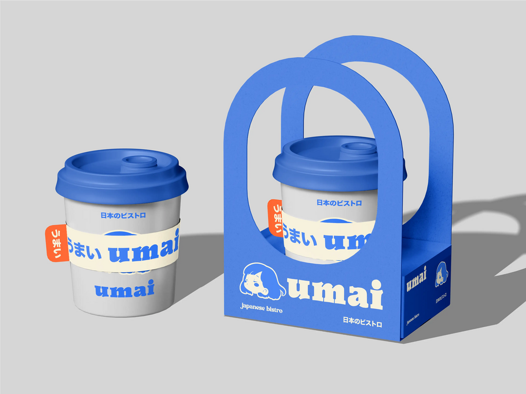
Source: Anastasia Malardyrova, Umai, Behance, https://www.behance.net/gallery/210720063/umai-Japanese-bistro-brand-identity
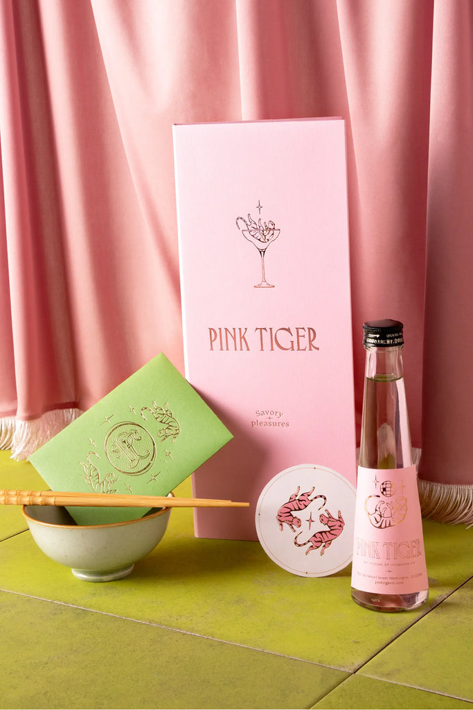
Source: Estudio Albino, Pink Tiger, Behance, https://www.behance.net/gallery/207340053/PINK-TIGER
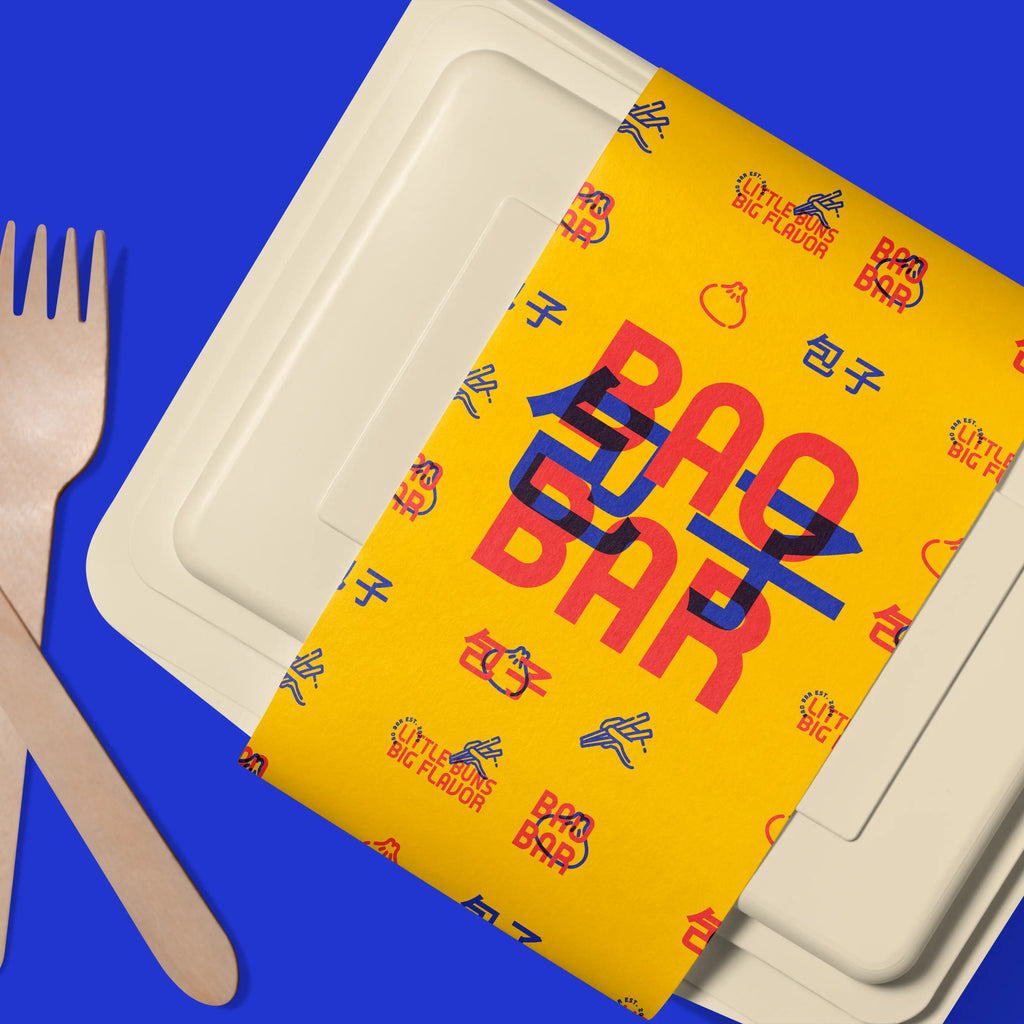
Source: Mari White, Bao Bar, Behance, https://www.behance.net/gallery/206430583/Bao-Bar-Branding-and-App-Design
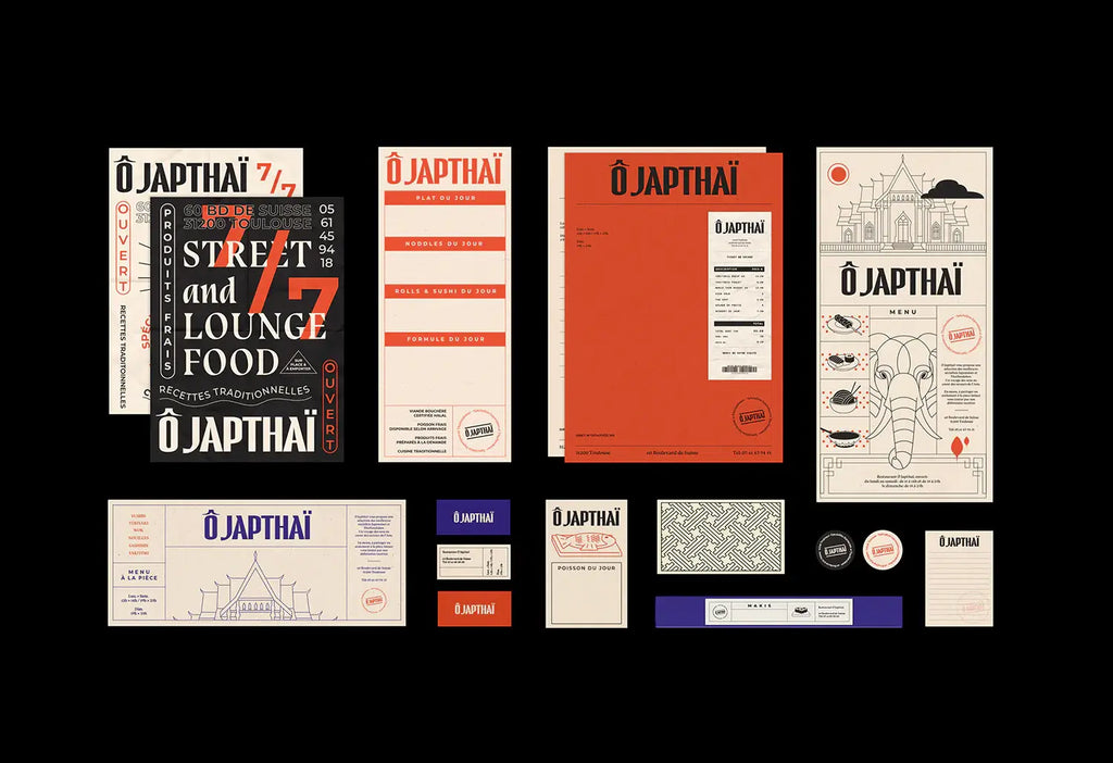
Source: BIS Studio Graphique, O Japthai, Behance, https://www.behance.net/gallery/80481841/BRANDING-O-Japthai-Restaurant-Street-Lounge
What Color Grading Work Best In Asian Food Branding?
Color grading in asian food branding is where visuals begin to taste. Before anyone reads a label or recognizes a dish, color already sets expectations—rich, fresh, smoky, sweet, or bold. The magic lies in how tones are balanced, softened, or intensified to reflect the personality of the food. Instead of relying on predictable palettes, strong asian food branding uses grading to build atmosphere and emotional pull across every visual touchpoint.
Warm Tones That Feel Fresh Off The Pan
Golden highlights, chili reds, and caramelized browns instantly suggest heat and flavor. This grading style works best when highlights are slightly lifted while shadows stay soft, giving food a freshly cooked glow. In asian food branding, this approach adds energy and makes dishes feel ready to eat, especially for grilled, fried, or street-style concepts.
Soft Muted Layers For A Traditional Mood
Lower saturation with gentle contrast creates a calm and nostalgic feeling. Colors like faded greens, tea-inspired browns, and rice-like neutrals give visuals a sense of heritage. This style in asian food branding works beautifully for brands that focus on handmade recipes or cultural storytelling without overwhelming the design.
Dark And Glossy Contrast For A Refined Look
Deep shadows paired with crisp highlights bring a polished and premium feel. This grading approach allows ingredients to stand out sharply against darker backgrounds, creating a sense of precision. In asian food branding, this style is often used for upscale dining visuals or specialty packaging that needs to feel elevated and controlled.
Light And Airy Tones For Clean Appeal
Bright whites, soft pastels, and gentle lighting create a fresh and modern look. This grading works well for desserts, drinks, or lighter dishes where clarity and simplicity matter. Asian food branding benefits from this approach when aiming for a clean, approachable identity that feels easy and refreshing.
Ingredient Driven Color Direction For Authentic Flavor
The most engaging color grading often comes directly from real ingredients. Matcha greens, turmeric golds, soy browns, and vibrant herbs create palettes that feel naturally connected to the food. Instead of forcing visual themes, asian food branding becomes more believable when colors mirror what’s actually served.
What Typography Choices Fit Asian Food Branding Projects?
Typography in asian food branding is not just about readability—it’s about rhythm, flavor, and personality. The right type choice can hint at tradition, suggest motion, or even echo the texture of a dish. Instead of defaulting to obvious “Asian-style” fonts, strong asian food branding explores typography as a storytelling tool, shaping how a brand feels at first glance.
Expressive Brush-Inspired Letterforms
Handcrafted typography with brush-like strokes brings a sense of movement and authenticity. These letterforms can feel fluid, imperfect, and alive—perfect for capturing the energy of noodles, sauces, or quick cooking techniques. In asian food branding, this style works best when refined slightly for clarity, so it feels artistic without becoming difficult to read.
Clean Sans-Serif With Subtle Cultural Touches
Modern sans-serif fonts provide a clean base, but small custom tweaks can make them unique. Slightly extended strokes, rounded terminals, or adjusted spacing can echo traditional scripts without copying them directly. This approach in asian food branding creates a balance between global appeal and cultural identity.
Condensed Fonts For Bold Packaging Presence
Tight, vertical typefaces are excellent for packaging that needs to stand out on shelves. Their compact structure allows for strong headlines while maximizing space. In asian food branding, condensed fonts can feel dynamic and impactful, especially when paired with bold colors or graphic elements.
Playful Rounded Type For Casual And Friendly Brands
Soft, rounded fonts bring a welcoming and approachable vibe. They work especially well for snacks, desserts, or street food concepts where the goal is to feel fun and easygoing. Asian food branding benefits from this style when targeting younger audiences or creating a relaxed, cheerful identity.
Custom Typography Built Around Ingredients And Motion
Some of the most memorable designs come from fully custom lettering inspired by the food itself. Curves that mimic noodles, sharp edges that reflect chopsticks, or flowing forms that resemble steam can turn typography into a visual experience. In asian food branding, this approach creates a strong identity that feels deeply connected to the product.
What Packaging Shapes Enhance Asian Food Branding Appeal?
Packaging shape plays a powerful role in asian food branding because it is the first physical interaction people have with the product. Before colors, typography, or illustrations fully register, the structure itself already communicates something about the food inside. A clever shape can suggest tradition, convenience, or even flavor, making the experience feel more immersive from the very start.
Folded Box Structures Inspired By Street Food Culture
Compact, foldable boxes instantly connect to takeout culture and fast-paced dining experiences. These shapes feel practical yet iconic, especially when designed with smart flaps or locking mechanisms. In asian food branding, this structure creates familiarity while still leaving room for creative surface design that makes it stand out.
Layered Containers That Reflect Serving Styles
Stackable or tiered packaging mimics how food is often served in multiple dishes or compartments. This structure works beautifully for meals with variety, allowing each layer to feel like part of a complete experience. Asian food branding benefits from this format by turning packaging into a storytelling element that unfolds gradually.
Rounded Bowls And Soft Curved Forms
Circular shapes feel comforting and natural, echoing traditional serving bowls. These forms are visually pleasing and easy to handle, making them ideal for soups, rice dishes, or noodles. In asian food branding, curved packaging softens the overall look and creates a sense of warmth and familiarity.
Slim Vertical Packs For Shelf Impact
Tall, narrow packaging creates a striking presence, especially in retail environments. This shape allows for bold vertical layouts and unique opening experiences. Asian food branding often uses this format for snacks, sauces, or ready-to-go items, making products feel modern and distinctive.
Custom Sculpted Shapes That Reflect Ingredients
Some brands push creativity further by designing packaging that subtly mirrors the food itself. A container that hints at a dumpling curve or a noodle flow can instantly communicate what’s inside without words. In asian food branding, this approach creates a memorable identity that feels playful yet intentional.
What Layout Techniques Improve Asian Food Branding?
Layout is the silent director of asian food branding, guiding the eye, shaping focus, and turning scattered elements into a cohesive experience. A strong layout does more than organize—it creates rhythm, balance, and visual storytelling that feels intentional. In asian food branding, thoughtful composition can transform simple packaging or menus into something memorable, dynamic, and full of character.
Asymmetrical Balance That Feels Natural And Dynamic
Instead of centering everything, asymmetrical layouts create movement and energy. Placing key elements slightly off-center allows the design to breathe while still feeling balanced. In asian food branding, this technique reflects the organic flow of food preparation and presentation, making visuals feel less rigid and more alive.
Layered Depth To Build Visual Richness
Overlapping elements such as text, patterns, and imagery can create a sense of depth that draws viewers in. This technique adds complexity without clutter when done carefully. Asian food branding benefits from layering by mimicking the richness of flavors and textures found in the cuisine itself.
Strong Visual Hierarchy For Instant Clarity
Clear hierarchy ensures that the most important information stands out immediately. Bold headlines, distinct spacing, and size contrast guide the viewer through the design effortlessly. In asian food branding, this approach is essential for packaging and menus where quick understanding enhances the overall experience.
Grid Systems With Flexible Rhythm
Using a grid helps maintain consistency, but breaking it slightly can add personality. A structured base combined with intentional variation creates a layout that feels both organized and expressive. Asian food branding often thrives on this balance, where order meets creative freedom.
Negative Space That Enhances Focus
Empty space is just as important as filled space. Strategic use of negative space allows key elements to stand out while giving the design a refined and uncluttered feel. In asian food branding, this technique can evoke simplicity and elegance, especially when paired with minimal visuals.
What Finishing Touches Elevate Asian Food Branding Designs?
The final details in asian food branding are where everything clicks into place. These finishing touches may seem small, but they carry the power to shift a design from ordinary to unforgettable. It’s the difference between something that looks complete and something that feels crafted. In asian food branding, these subtle enhancements shape how people perceive quality, care, and identity at a glance.
Tactile Finishes That Invite Interaction
Textures like soft-touch coatings, embossed logos, or slightly raised patterns add a physical dimension to the design. These details make packaging more engaging to hold and explore. In asian food branding, tactile finishes can echo the richness of ingredients or the craftsmanship behind the food, making the experience feel more premium and thoughtful.
Accent Foils That Catch Light With Purpose
Metallic touches such as gold, copper, or subtle holographic accents can instantly elevate visual appeal. When used sparingly, they highlight key elements like logos or borders without overwhelming the design. Asian food branding benefits from this technique by adding a refined glow that enhances rather than dominates.
Custom Seals And Stickers For Personality
Small branded seals or stickers can add charm and authenticity. Whether it’s a simple logo stamp or a playful closing label, these details create a sense of care and individuality. In asian food branding, they often mimic handmade or freshly packed vibes, reinforcing a connection between the product and its preparation.
Edge Details And Unexpected Trims
Colored edges, die-cut shapes, or unique opening mechanisms can transform standard packaging into something memorable. These subtle structural touches surprise the user and make the product feel distinct. Asian food branding uses these details to stand out without needing excessive graphics.
Consistent Micro-Details Across All Elements
Tiny, repeated details—like pattern fragments, icon sets, or line styles—help unify the entire design system. These micro-elements may not stand out individually, but together they create a cohesive and polished identity. In asian food branding, consistency in these small touches builds recognition and strengthens the overall visual story.
Conclusion
Asian food branding succeeds when every visual decision feels intentional and connected to the dining experience. Strong results come from aligning structure, color, and detail with how the food is prepared, served, and enjoyed. Instead of relying on familiar formulas, thoughtful design choices create a distinct identity that stands apart. From subtle textures to carefully balanced layouts, each element contributes to a clearer and more engaging presentation. Well-crafted asian food branding communicates quality and character instantly, helping audiences form a connection before tasting, while leaving a lasting impression through design that feels considered and complete.
Let Us Know What You Think!
Every information you read here are written and curated by Kreafolk's team, carefully pieced together with our creative community in mind. Did you enjoy our contents? Leave a comment below and share your thoughts. Cheers to more creative articles and inspirations!
Related Articles


Leave a Comment