10 Essential Typography Rules That Designers Must Know

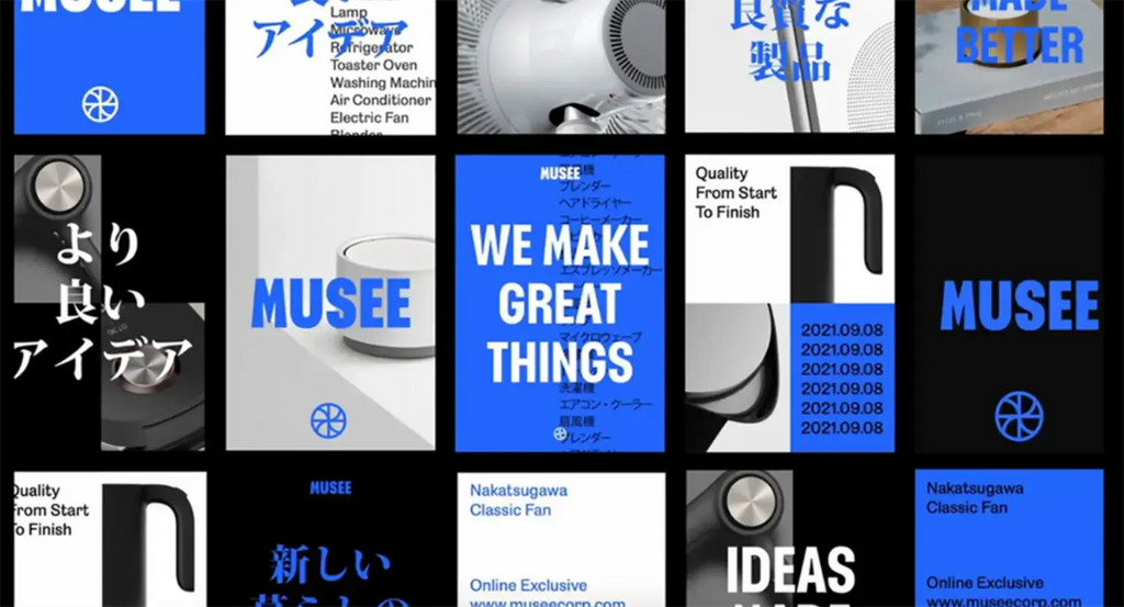
Source: Bruce Mau Design (BMD), Musee, Behance, https://www.behance.net/gallery/118526259/Musee
Typography is the art and technique of arranging type to make written language legible, readable, and visually appealing. As a foundational element of design, understanding typography is essential for any designer looking to communicate effectively through their creations. The right typographic choices can significantly enhance the user experience, conveying the intended mood, message, and functionality. This guide highlights ten essential typography rules that every designer must know to refine their craft and create more compelling designs.
Whether you're designing a website, creating a brand identity, or publishing digital content, these rules will provide the necessary insights to optimize your typographic practices. From selecting appropriate typefaces to mastering text layout and alignment, each rule is geared towards building a stronger understanding and more intuitive use of typography in various design contexts.
Consider Context and Audience
Understanding the context and audience is vital in following typography rules to ensure that the typeface choices resonate with the intended viewers and fit the project's environment. Typography that excels in one setting might not be appropriate in another, making it essential to adapt type choices based on the cultural, age, and professional characteristics of your audience. For example, a tech startup might favor modern, clean sans-serif fonts to convey innovation and approachability, while a legal firm might opt for traditional serifs to emphasize reliability and professionalism.
Consider also the emotional impact of typography. Different fonts can evoke different feelings and associations—serifs are often seen as formal and trustworthy, while sans-serifs are viewed as modern and friendly. The context of your design—whether it’s for a corporate report, an online advertisement, or a children's book—demands specific typographic treatments that enhance readability, accessibility, and the overall communicative purpose.
Adjusting typeface selections to reflect the demographic nuances of your audience will not only improve engagement but also enhance the effectiveness of the communication. Typeface accessibility is also crucial; ensure that your typography is legible for all users, including those with visual impairments. This thoughtful consideration of context and audience in typography ultimately supports a design that is both aesthetically pleasing and functionally sound.
Choose Complementary Fonts
Selecting complementary fonts is crucial in adhering to typography rules and achieving a harmonious design. The key is to pair typefaces that balance each other while enhancing the overall aesthetic of the project. Start by choosing a primary font that reflects the tone and nature of your message. This font will often carry the weight of the most critical information. Next, select a secondary font for supporting content, such as captions and subheadings. Look for contrasts in font styles; for instance, a bold serif can be effectively paired with a light sans-serif, creating a dynamic visual hierarchy that guides the reader’s eye through the layout.
The pairing process should not be random but rather intentional, focusing on type characteristics such as weight, style, and x-height. Ensure that the chosen fonts do not compete for attention but complement each other, facilitating readability and cohesiveness. Using font pairing tools or consulting design resources can provide inspiration and guidelines. Ultimately, effective font pairing amplifies the message without overwhelming the viewer, adhering to the fundamental principles of design and typography.
Prioritize Legibility Over Style
When adhering to essential typography rules, designers must prioritize legibility over style to ensure that the content is accessible and engaging for all readers. The foundation of effective typography is clear communication. While artistic flair can enhance a design, it should not detract from the reader's ability to comprehend the text easily.
Selecting the right typeface is crucial; a simple, well-crafted font often proves more readable than an ornately stylized one, particularly for body text. Designers should consider the contrast between the text and its background, ensuring that there is sufficient differentiation to prevent eye strain. Font size also plays a vital role; too small can be difficult to read, while too large may disrupt the flow of reading.
Kerning and leading adjustments are also significant typography tools. Proper kerning avoids awkward spaces between characters, making words appear more cohesive. Adequate leading, or line spacing, improves readability by defining clear textual separation that aligns with the amount of text and the overall layout.
Ultimately, by prioritizing legibility, designers enhance the user experience, making content not only readable but also visually appealing. Remember, in the realm of typography rules, designers find that simplicity often leads to the most profound impact on reader engagement and content clarity.

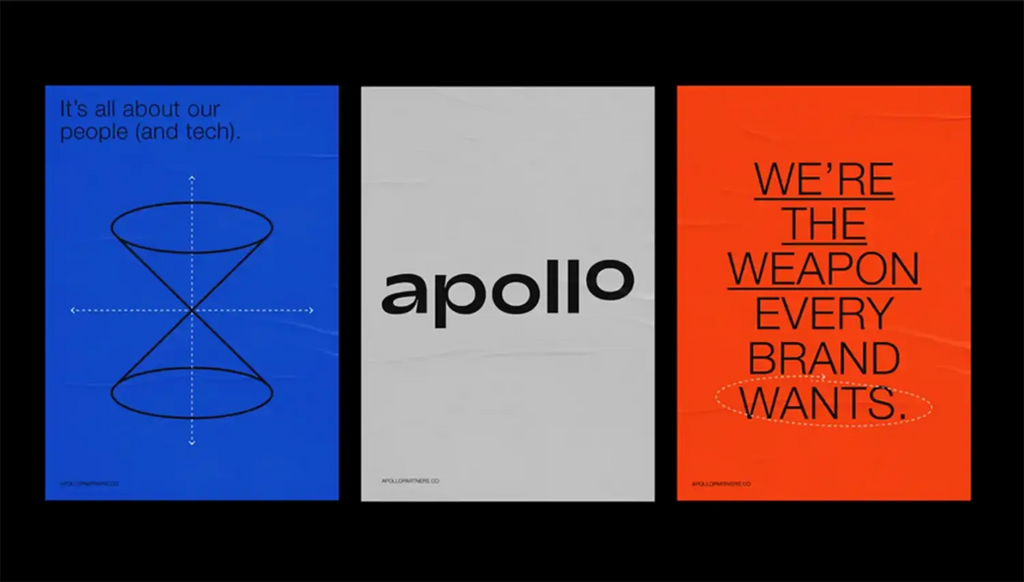
Source: Kyle B. Macy, Apollo Partners, Behance, https://www.behance.net/gallery/99202633/Apollo-Partners
Maintain Consistent Hierarchy
Maintaining a consistent hierarchy is a cornerstone among typography rules for designers, critical for guiding readers through a text in a structured and logical manner. This hierarchy is established by varying the size, weight, and style of typographic elements to denote the importance of different text sections.
Headers and subheaders are the most apparent tools for creating a hierarchy, with larger, bolder fonts capturing attention and indicating major topics or sections. Body text should be noticeably smaller yet still legible, with options such as bold or italic styles to highlight key information or quotes within paragraphs.
Consistent hierarchy helps in scanning content quickly, a common practice among modern readers who often skim through articles online. By designing with a logical typographic structure, you facilitate this scanning process, allowing readers to locate the information they need efficiently.
Bullet points and numbered lists further support hierarchical organization by breaking down information into manageable, easy-to-digest pieces. These elements should be aligned with the overall typographic scheme to maintain visual coherence throughout the design.
Align Text to Enhance Coherence
Text alignment is a fundamental aspect of typography rules that designers must understand to create coherent and visually appealing layouts. Alignment refers to the arrangement of text within a design, influencing how it interacts with other elements and the overall balance of the page. There are four main types of text alignment: left-aligned, right-aligned, centered, and justified.
Left-aligned text is the most common alignment, creating a clean, vertical line on the left side while the right side remains ragged. This alignment is easy to read and natural for Western languages, making it ideal for body text in both print and web designs.
Right-aligned text creates a straight line on the right, often used for aesthetic purposes or to draw attention to specific elements within graphic projects. It is less common for body text as it can disrupt the natural reading flow.
Centered text is symmetrical but can be challenging for lengthy text as it disrupts the reader's ability to establish a rhythm. It is best used sparingly, such as in headings or invitations.
Justified text aligns both sides of the text, creating a clean and formal look. This alignment is often seen in newspapers and books. However, it can lead to uneven spacing between words or characters, which can affect readability if not handled carefully.
Selecting the right text alignment is crucial for ensuring that your design is not only attractive but also functional, facilitating an effortless reading experience and enhancing the overall coherence of your design.
Opt for Appropriate Line Length
Choosing the appropriate line length is crucial in typography, as it directly influences readability and viewer comfort. Line length refers to the number of characters in a single line of text, and it is one of the essential typography rules that designers must adhere to.
An optimal line length generally ranges between 50-75 characters, including spaces. This range is considered ideal for maintaining a comfortable reading rhythm; longer lines can make the text difficult to follow, while shorter lines can disrupt the reader's flow.
For printed materials, a narrower column is often more readable. This is why newspapers and magazines use multiple columns instead of one long text line. In digital media, such as websites and e-books, adhering to this rule is equally important because screen sizes and orientations can vary widely. Responsive design techniques can adjust text lines dynamically, enhancing readability across different devices.
When setting line lengths in your designs, consider the typeface size and spacing, as these will also affect the readability. Tools like the 'measure'—the width of a text block—can help you determine if your line length is appropriate for your typeface and font size.
Applying this rule effectively requires testing and adjustment, especially in multi-device environments. By optimizing line length, designers ensure that the text is visually comfortable to read, which can significantly improve user engagement and content comprehension.
Experiment with Typeface Pairings
Effective typeface pairing is an advanced skill under the umbrella of typography rules that designers use to enhance both aesthetics and functionality in their layouts. Pairing typefaces involves combining different fonts in a way that they complement and balance each other, creating a cohesive and engaging design.
The key to successful font pairing is contrast and harmony. Contrasting typefaces can help distinguish text elements, such as headings from body text, but they should still share a fundamental harmony that ties the design together. For instance, pairing a robust serif with a light sans serif can highlight titles while keeping the overall look unified.
Designers often start with a base font used for body text and select a complementary font for headings and accents. It's crucial to consider the fonts' x-heights and weights to ensure they align well on the page, even if they differ stylistically.
Common pairings include a serif with a sans serif, which combines tradition and modernity, or two different weights of the same family, which maintains consistency while adding visual interest. The context of the design often dictates the best approach, whether it's a professional document or a creative project.
Exploring typeface pairings involves testing and iteration; previewing designs in different formats and sizes ensures that the fonts perform well under various design conditions. Mastering this skill can significantly elevate a designer's work, showcasing their ability to manipulate text to suit any communicative need.

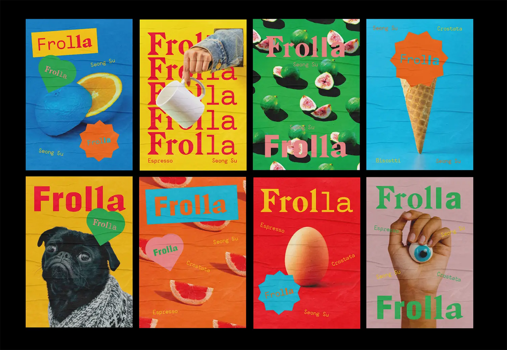
Source: Nick Barclay, Frolla Branding, Behance, https://www.behance.net/gallery/117883731/Frolla-Branding
Respect the Mood Conveyed by Different Fonts
Understanding and respecting the mood conveyed by different fonts is crucial for designers, serving as a core aspect of typography rules. Each font carries its own personality and emotional weight, which can dramatically affect how a message is received.
Fonts can evoke a range of emotions and associations. For example, serif fonts are often seen as traditional and trustworthy, making them excellent choices for formal documents and publications. On the other hand, sans serif fonts offer a clean and modern feel, ideal for contemporary businesses and digital interfaces.
Script fonts, which mimic handwriting, can introduce an element of elegance or casualness, depending on their style. These are perfect for invitations, branding, and advertising where a personal touch is beneficial.
Display fonts are designed to make a strong impression. Their unique and often dramatic features can convey excitement, whimsy, or solemnity, making them suitable for headlines, posters, and any content needing to stand out.
As a designer, selecting a font that matches the intended tone of your communication is essential. This choice impacts not only the design’s aesthetic but also its effectiveness in engaging the audience. It's important to consider the context in which the design will be used, as well as the audience's expectations and cultural perceptions.
Utilize Color with Purpose
Incorporating color into typography is not just about aesthetics; it’s a strategic tool that enhances the readability and emotional impact of a design. Understanding how to use color effectively is one of the key typography rules designers must master. Color can direct attention, evoke moods, and improve user experience when applied thoughtfully.
The choice of color in typography should align with the overall design's purpose and context. For text, high contrast between the background and the font color is essential for readability. For example, black text on a white background is the most readable combination. However, designers can use subtle shades to reduce strain in digital environments, like dark grey text on a light grey background.
Color can also be used to signify importance and hierarchy within a text. Brighter colors draw attention to specific words or phrases, while muted tones can indicate secondary information. This technique helps in guiding the reader’s eye through the design in a logical and aesthetically pleasing manner.
Emotional connections to color vary widely among individuals, but certain general associations exist—blue conveys reliability, red suggests urgency or excitement, and green is often associated with peace or growth. Selecting typography colors that align with the message’s emotional tone can significantly enhance the effectiveness of the communication.
Test Readability Across Various Platforms
Testing readability across various platforms is a critical aspect of typography that ensures the text is clear and legible, regardless of where it is viewed. As digital platforms become increasingly diverse, from smartphones and tablets to laptops and e-readers, designers must apply typography rules that cater to these variations.
The process begins with selecting typefaces that are versatile and maintain readability across different resolutions and screen sizes. Sans serif fonts, for example, are often preferred for digital platforms due to their clarity and simplicity.
Once the typeface is selected, designers must adjust the size, spacing, and layout of text based on the platform. Mobile devices, with their smaller screens, may require larger font sizes and more robust line spacing to enhance readability. Conversely, larger displays like desktop monitors allow for more compact typography without sacrificing legibility.
Testing is a continuous process that involves previewing designs on multiple devices and under various conditions, such as different operating systems and browser types. Tools like emulators can simulate how text displays on different devices, but nothing replaces real-world testing to gather feedback on user experience.
Responsive design techniques, such as flexible grid systems and media queries, also play a crucial role. They ensure that typography automatically adjusts to the viewer's screen, providing an optimal reading experience without manual intervention.
Conclusion
Mastering typography rules is essential for every designer aiming to create impactful and effective visual communications. By carefully selecting complementary fonts, aligning type choices with the context and audience, and adhering to foundational typographic principles, designers can enhance the readability and aesthetic appeal of their projects. Embrace these guidelines to elevate your designs, ensuring they are not only visually engaging but also perfectly tailored to meet the needs of your audience. Remember, good typography is the cornerstone of good design, bridging clarity with creativity to deliver messages in the most compelling way.
Let Us Know What You Think!
Every information you read here are written and curated by Kreafolk's team, carefully pieced together with our creative community in mind. Did you enjoy our contents? Leave a comment below and share your thoughts. Cheers to more creative articles and inspirations!


Leave a Comment