30 Best Pilates Logo Design Ideas You Should Check
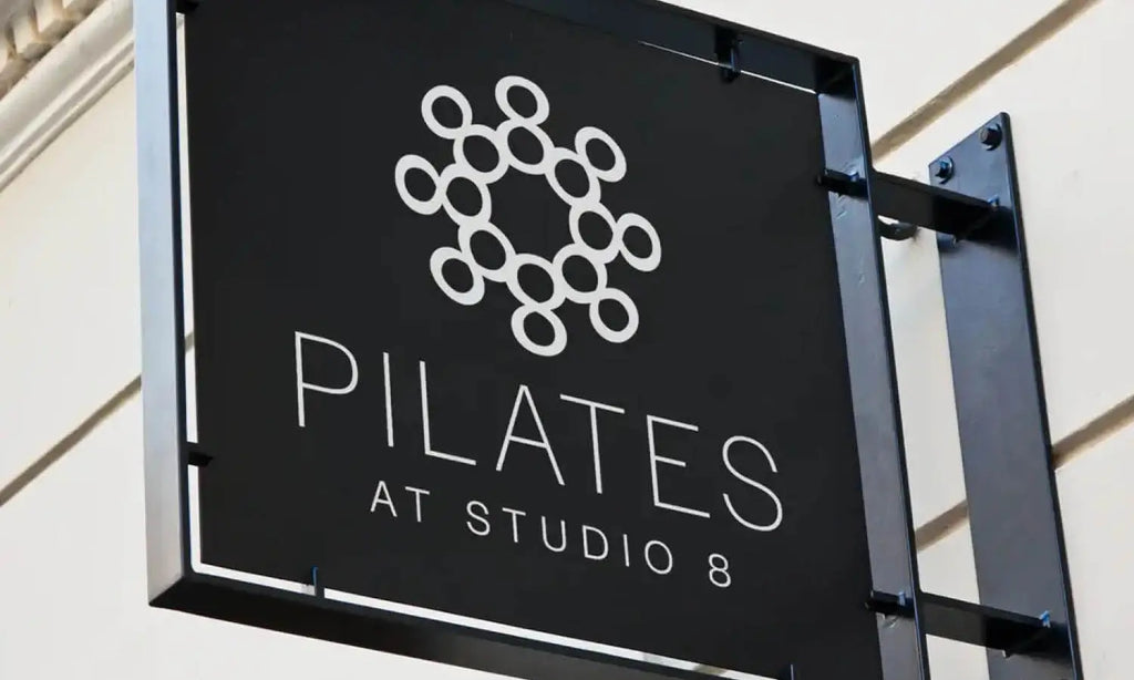
Source: Jai Taylor, Pilates At Studio 8, Dribbble, https://dribbble.com/shots/5472988-Logo-Pilates-At-Studio-8
Pilates is all about balance, strength, and elegance—so why shouldn’t your logo reflect the same? Whether you're opening a new studio or rebranding an existing business, having the perfect pilates logo design can elevate your brand to new heights. From sleek typography that embodies minimalism to artistic symbols of flexibility and movement, there are endless ways to create a logo that speaks to your pilates philosophy.
This article dives into some of the best ideas for pilates logo design, showcasing creativity and professionalism at their finest. We’ll explore how to incorporate calming color palettes, clean lines, and clever imagery to craft logos that inspire and attract your ideal clients. Whether you’re drawn to serene lotus motifs, modern silhouettes of pilates poses, or chic geometric designs, we’ve got something for every aesthetic preference.
Get ready to be inspired by innovative ideas that align perfectly with the fitness and wellness vibe of pilates. These logo designs don’t just look great—they communicate the essence of what pilates stands for: mindfulness, precision, and transformation. Let’s roll out the creativity mat and stretch into some seriously amazing design concepts!
Pilates Logo Design Ideas
Source: Alejandro Torres, Mindbody Pilates Studio, Dribbble, https://dribbble.com/shots/6179290-Mindbody-Pilates-Studio
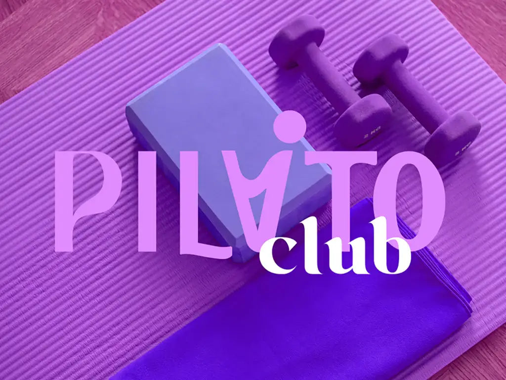
Source: Alejandro Torres, Mindbody Pilates Studio, Dribbble, https://dribbble.com/shots/6179290-Mindbody-Pilates-Studio
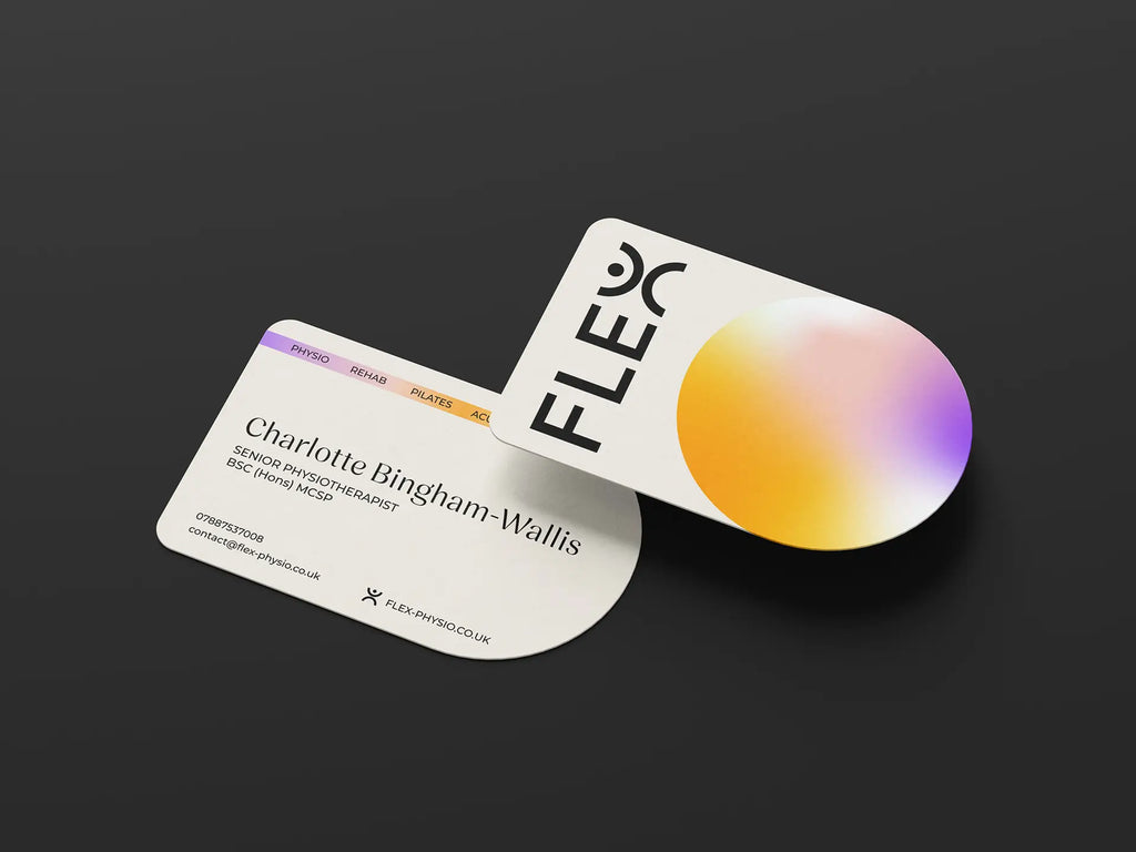
Source: Miguel Angel Martinez, Flex Physio & Pilates, Behance, https://www.behance.net/gallery/211547615/Flex-Physio-Pilates
Source: Une Design Criativo, Solus Pilates, Behance, https://www.behance.net/gallery/133761669/Solus-Pilates-Brand-Identity
Source: Octavo Designs, Reset by Riser, Dribbble, https://dribbble.com/shots/20528900-Reset-by-Riser
Source: Stina Norgren, The Pilates Guy, Dribbble, https://dribbble.com/shots/1676262-The-pilates-guy
Source: Влада Мирошкина, Pause, Behance, https://www.behance.net/gallery/147815799/pauseyoga-and-pilates
Source: Dustin Ryan, A.R.C Pilates Studio, Dribbble, https://dribbble.com/shots/3646755-A-R-C-Pilates-Studio
Source: Fábio Carneiro, Ka’minhos de Cura, Behance, https://www.behance.net/gallery/112393717/Kaminhos-de-Cura-Branding

Source: Lucas Fontes, Lon Pilates, Behance, https://www.behance.net/gallery/152590389/LON-Pilates-RPG
Source: Maria Pensi, La Zuz · Pilates Boutique, Behance, https://www.behance.net/gallery/220747189/LA-ZUZ-Pilates-Boutique

Source: Julia Felix, Renata Firmino Pilates, Behance, https://www.behance.net/gallery/148375255/Identidade-Visual-Renata-Firmino-Pilates
Source: Paula Czachor, Behance, https://www.behance.net/gallery/213066213/Pilates-Studio-Brand-identity
Source: Ayska Niyoshaa, Behance, https://www.behance.net/gallery/137776733/Trainer-pilates-woman-yoga-logo-identity
Source: April Scarduzio, Simply Pilates, Dribbble, https://dribbble.com/shots/2908653-Simply-Pilates
Source: Renato AB, Movimood, Behance, https://www.behance.net/gallery/116526011/Movimood
Source: Naiany Assis, Apresentação de Marca, Behance, https://www.behance.net/gallery/208149273/Apresentacao-de-Marca-Fisioterapia-e-Pilates
Source: Hannah King, The Pilates Room Bristol, Dribbble, https://dribbble.com/shots/3486025-The-Pilates-Room-Bristol-Logo
Source: Razi, Piyo Pilates & Gym, Dribbble, https://dribbble.com/shots/12072175-PiYo-gym-logo
Source: Jamie Stark, Equilibrium Pilates, Dribbble, https://dribbble.com/shots/2241200-Equilibrium-Pilates
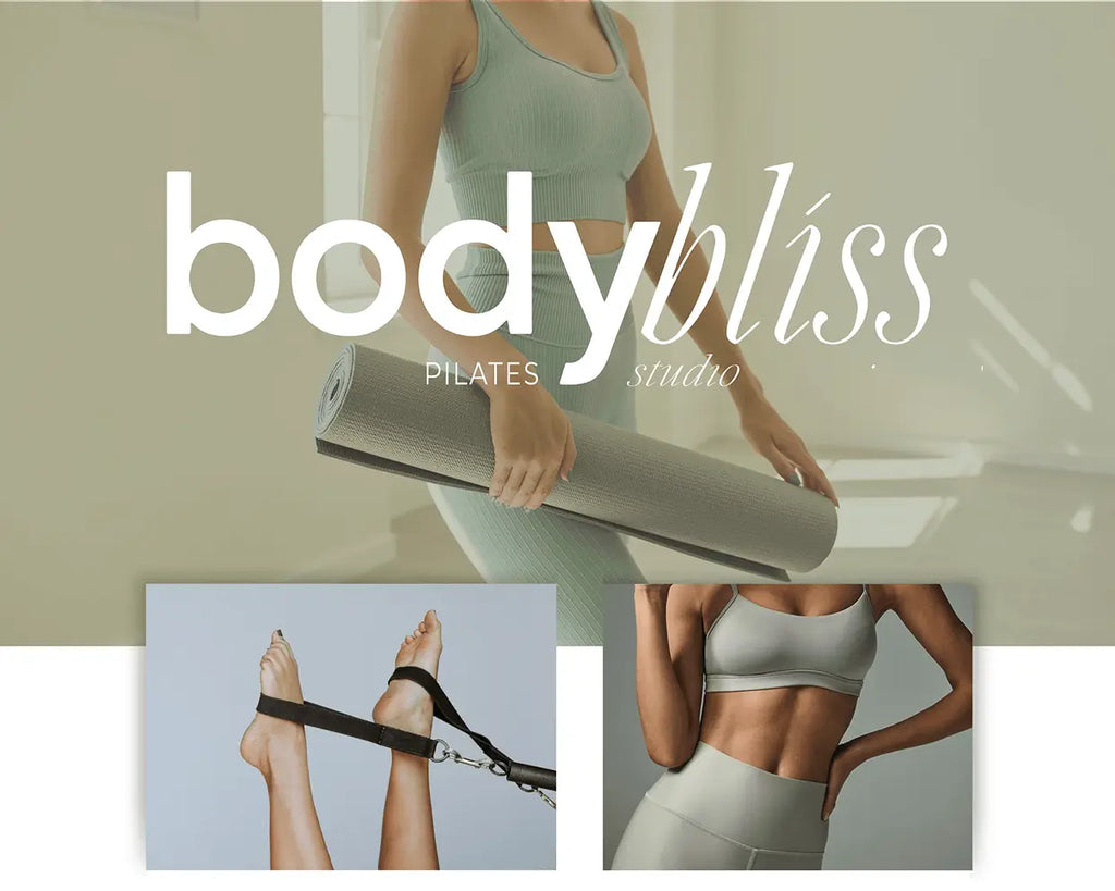
Source: Justine Southworth, Body Bliss Pilates Studio, Behance, https://www.behance.net/gallery/201528741/Branding-for-Body-Bliss-Pilates-Studio
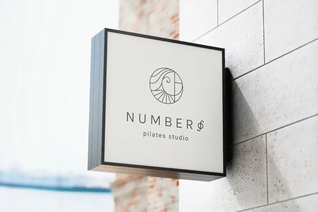
Source: Niki A., Number Φ, Behance, https://www.behance.net/gallery/158132723/Visual-Identity-Strategy-Case-Study-Pilates-Studio
Source: Experimental Cargo, Bird Pilates, Behance, https://www.behance.net/gallery/150364481/BIRD-PILATES-Brand-Identity-Design

Source: Verena Tam, Anatis Pilates, Dribbble, https://dribbble.com/shots/5321241-ANATIS-PILATES
Source: Rafael Ramírez, Estudio C, Dribbble, https://dribbble.com/shots/2975131-Estudio-C-Logo
Source: Rachel Rippy, Studio Sunday, Dribbble, https://dribbble.com/shots/4007356-Studio-Sunday
Source: Sollara Brands, Evolura, Behance, https://www.behance.net/gallery/160142075/EVOLURA-Naming-Visual-Identity
Source: Evan Delagrange, Mindful Movements, Dribbble, https://dribbble.com/shots/10877353-Mindful-Movements
Source: Ansley Randall, Pilates On Third, Dribbble, https://dribbble.com/shots/5302429-Logo-design
Source: Jai Taylor, Pilates At Studio 8, Dribbble, https://dribbble.com/shots/5472988-Logo-Pilates-At-Studio-8
What Are Popular Symbols Used in Pilates Logo Design?
Creating the perfect pilates logo design is all about blending creativity, symbolism, and the essence of pilates itself. Whether you’re designing a logo for a serene studio or a vibrant pilates brand, incorporating meaningful symbols can bring your design to life. Here are five popular symbols commonly used in pilates logo designs, guaranteed to stretch your imagination and inspire your creativity!
The Lotus Flower
A favorite in wellness-related branding, the lotus flower represents purity, strength, and transformation—all values that align beautifully with pilates. Its delicate petals and symmetrical design make it a versatile symbol that works perfectly in minimalistic or detailed logos. A lotus can be stylized as a clean outline or paired with soft gradients for a calming, balanced effect. Plus, who doesn’t love a touch of zen?
Silhouettes of Pilates Poses
Adding the silhouette of someone in a classic pilates pose—like the teaser or roll-up—instantly ties your logo to the practice. These shapes highlight movement and flexibility while showing clients exactly what your brand is about. Sleek, modern silhouettes work especially well for clean, professional logos, while more artistic renditions can add flair.
Circular Elements
The circle is a powerful symbol in pilates logo design, representing unity, wholeness, and the continuous flow of movement. It’s also reminiscent of the pilates ring, a staple piece of equipment in many studios. Incorporating circular elements, whether as a border, a subtle background, or part of your typography, can create harmony and balance in your logo.
Leaves and Natural Motifs
Pilates is often associated with mindfulness and connecting with nature, so including leaves, vines, or other organic motifs can emphasize these values. Soft, flowing lines or delicate botanical illustrations bring a sense of serenity to your pilates logo design, appealing to clients seeking wellness and relaxation. Think of it as adding a breath of fresh air to your branding!
Abstract Lines and Shapes
Abstract shapes and flowing lines are popular for creating modern, dynamic pilates logo designs. These elements can symbolize movement, energy, and grace, all while giving your logo a contemporary feel. By using smooth curves or intertwining lines, you can create a design that feels effortlessly fluid, just like pilates itself. Abstract designs are also a great way to leave room for interpretation and uniqueness.
When designing a pilates logo, it’s all about finding symbols that resonate with the essence of your brand and connect with your audience. Whether you’re drawn to the elegance of a lotus, the energy of abstract lines, or the serenity of natural motifs, these symbols can help create a logo that’s as balanced and powerful as pilates itself. Let your creativity flow, and design a logo that makes your brand stand tall like a pilates pose!
What Fonts Are Best for Pilates Logo Design?
Choosing the right font for a pilates logo design is like picking the perfect pose—it needs to balance style, functionality, and the essence of the brand. Fonts set the tone for your logo, making them a key player in conveying the calm, strength, and elegance that pilates embodies. Here are five font styles that work beautifully for pilates logo design, each bringing its own unique flair to the mat.
Sleek Sans-Serif Fonts
When it comes to modern pilates branding, sans-serif fonts take the crown. Clean, minimal, and easy to read, these fonts exude professionalism while keeping the design approachable. Think fonts like Helvetica, Futura, or Avenir—smooth and effortless, just like a well-executed pilates routine. Pair them with soft colors or abstract symbols to give off a contemporary, high-end vibe.
Script Fonts for Elegance
For those aiming to highlight the graceful side of pilates, script fonts are a stellar choice. These flowing, cursive-inspired fonts bring a sense of movement and sophistication to the design. Fonts like Great Vibes or Dancing Script are perfect for adding a touch of artistry while emphasizing the mindful, fluid nature of pilates. They work especially well for boutique studios or brands focusing on luxury and elegance.
Rounded Fonts for Approachability
Rounded fonts offer a friendly and inviting look that’s ideal for pilates studios wanting to create a sense of community. Fonts like Nunito or Poppins have gentle, rounded edges that convey softness and approachability while maintaining professionalism. These fonts pair beautifully with circular elements in a logo, reinforcing themes of unity and flow.
Thin Serif Fonts for a Sophisticated Look
If you’re aiming for a classy, timeless pilates logo design, thin serif fonts are a great pick. These fonts, like Didot or Playfair Display, combine elegance with readability, making them perfect for wellness brands with a more refined aesthetic. The subtle flair of serif fonts adds a touch of luxury, making them ideal for upscale studios or private pilates instructors.
Geometric Fonts for a Modern Twist
Geometric fonts are bold, trendy, and perfect for brands that want to stand out. Fonts like Montserrat or Gotham use clean, symmetrical shapes that convey balance and precision—qualities intrinsic to pilates. These fonts are versatile and work beautifully for dynamic, forward-thinking pilates businesses that want a modern edge in their branding.
Selecting the perfect font for a pilates logo design is all about aligning the style with your brand’s personality and values. Whether you’re going for sleek and modern, graceful and elegant, or approachable and friendly, these font styles can help create a logo that captures the spirit of pilates. Think of it as the typography equivalent of finding your flow—once you get it right, everything falls into place!
What Are the Best Shapes to Use in Pilates Logo Design?
Shapes are the unsung heroes of logo design. They set the tone, evoke emotions, and create visual harmony. When it comes to pilates logo design, choosing the right shapes can make all the difference in capturing the essence of movement, balance, and mindfulness. Here are five shapes that work beautifully in pilates logos, each with its unique charm and significance.
Circles for Wholeness and Unity
Circles are a go-to shape for pilates logo design because they symbolize unity, wholeness, and flow. They mimic the continuous movement and connection found in pilates practices. Whether it’s a standalone circular logo or a design with circular accents, this shape effortlessly conveys harmony and balance. Bonus points if you incorporate elements like a pilates ring or abstract curves within the circle!
Flowing Lines for Movement
Nothing says “pilates” like smooth, flowing lines that represent grace and fluidity. These shapes mimic the controlled and intentional movements in pilates exercises. Abstract waves, curves, or swooshes add a dynamic element to the logo, making it feel alive and in motion. They’re perfect for emphasizing the elegance and flexibility that pilates is all about.
Triangles for Strength and Stability
Triangles might not be the first shape that comes to mind, but they’re fantastic for adding a subtle sense of strength and structure to a pilates logo design. Think of the triangle as a visual anchor—it symbolizes stability, balance, and precision. A triangle placed strategically within a design can create a modern, powerful look while still maintaining the essence of pilates.
Organic Shapes for a Natural Touch
Pilates often connects with wellness and mindfulness, so using organic shapes—like abstract leaves, petals, or freeform designs—can bring a sense of calm and natural beauty to the logo. These shapes feel softer and more approachable, making them ideal for studios or brands that emphasize holistic health and relaxation. Organic shapes also pair well with earthy tones for a serene aesthetic.
Geometric Patterns for Modern Appeal
For brands that want a contemporary edge, geometric shapes like hexagons, rectangles, or diamonds can be a great choice. When arranged thoughtfully, these shapes create clean and eye-catching patterns that convey precision and professionalism. Geometric patterns are particularly effective for pilates brands that cater to a modern, urban clientele and want a polished, cutting-edge look.
The best shapes for pilates logo design depend on the personality of your brand and the message you want to convey. Circles and flowing lines bring balance and grace, triangles exude strength, organic shapes offer a natural vibe, and geometric patterns add a modern twist. Think of shapes as the foundation of your logo—a little creativity and thoughtful design can go a long way in building something truly unique and memorable!
What Are the Best Styles for Pilates Logo Designs?
Designing a pilates logo is like crafting a beautiful pose—it’s all about balance, creativity, and precision. A well-designed logo can speak volumes about your brand’s personality and connect with your audience on an emotional level. Whether you’re going for a modern look or something more artistic, there are plenty of styles to choose from to make your pilates logo design truly shine. Here are five of the best styles to inspire your next logo creation.
Minimalist and Clean
Less is more when it comes to minimalist logo designs. This style is perfect for pilates brands that value simplicity and elegance. By using clean lines, subtle typography, and a neutral color palette, minimalist logos convey professionalism and a sense of calm. Think of a simple lotus outline or a flowing line forming a pilates pose—sleek, stylish, and timeless.
Modern and Geometric
For pilates brands with a contemporary vibe, modern and geometric styles offer a bold and innovative look. This style uses sharp lines, symmetry, and geometric shapes to create a striking design. A circle symbolizing flow or a triangular motif representing strength can bring modernity to your pilates logo design while keeping it visually captivating.
Artistic and Hand-Drawn
If you want your pilates logo design to stand out, an artistic and hand-drawn style can add a unique, personal touch. This approach works especially well for boutique studios or brands that emphasize creativity and individuality. A hand-drawn lotus flower, a brushstroke pilates pose, or even freehand typography can create a logo that feels authentic and approachable.
Nature-Inspired and Organic
Pilates often aligns with wellness and mindfulness, making nature-inspired designs an excellent choice. This style incorporates elements like leaves, vines, or flowing water to evoke a sense of serenity and natural balance. Organic shapes and earthy tones work beautifully in this style, creating a logo that reflects the harmony between body, mind, and nature.
Luxurious and Elegant
For premium pilates studios or brands catering to a high-end audience, luxurious and elegant styles are the way to go. This style often includes thin serif fonts, gold or metallic accents, and intricate details. The goal is to create a logo that feels refined and sophisticated, appealing to clients who seek exclusivity and top-tier service.
The best style for your pilates logo design depends on your brand’s identity and target audience. Minimalist styles exude calm and professionalism, while modern and geometric designs bring an edgy appeal. Artistic logos add a touch of uniqueness, nature-inspired designs emphasize harmony, and luxurious styles scream sophistication.
What Color Palette Works Best for a Pilates Logo Design?
When designing a pilates logo, color is your secret weapon. It sets the mood, communicates your brand’s personality, and connects with your audience emotionally. The right color palette can make your pilates logo design stand out while reinforcing the themes of balance, wellness, and strength that pilates embodies. Here are five fantastic color palette ideas to inspire your design.
Soft Pastels for Serenity
Pastel colors like lavender, mint green, and baby blue are perfect for creating a calming and inviting pilates logo design. These hues evoke feelings of relaxation and mindfulness, making them a great choice for studios focusing on holistic wellness. Pair pastel tones with simple typography or soft, flowing shapes for a logo that feels like a breath of fresh air.
Earthy Tones for a Natural Vibe
Earthy tones such as sage green, terracotta, and sandy beige connect your logo to nature and mindfulness. These colors work beautifully for brands that emphasize organic movement and a grounded approach to pilates. An earthy palette feels warm and approachable, especially when combined with organic shapes or botanical elements in your design.
Elegant Neutrals for Sophistication
Neutral shades like ivory, taupe, and charcoal gray scream elegance and simplicity. This palette is ideal for high-end pilates studios or brands targeting a more sophisticated audience. Neutral tones create a polished and timeless look, and they pair wonderfully with metallic accents like gold or rose gold for a touch of luxury.
Vibrant Colors for Energy
For a brand that wants to stand out with energy and excitement, a vibrant color palette can do wonders. Bright turquoise, coral, or sunshine yellow can convey enthusiasm and dynamism while staying aligned with the positive energy pilates brings. Be mindful to use vibrant colors sparingly, perhaps as an accent, to avoid overwhelming the design.
Monochromatic Blues for Balance
Blue is a versatile color that symbolizes trust, calm, and balance—all of which align perfectly with pilates principles. A monochromatic blue palette, ranging from pale sky blue to deep navy, can create a cohesive and harmonious look. This approach is especially effective for logos that incorporate flowing lines or circular elements to emphasize movement and stability.
Choosing the right color palette for a pilates logo design is about understanding the message you want to convey. Think of your color palette as the foundation of your logo—get it right, and your pilates logo will inspire and attract just like a perfectly executed pilates routine!
Conclusion
A well-crafted pilates logo design is more than just a visual representation—it’s a reflection of your brand’s values, personality, and mission. By thoughtfully incorporating the right shapes, colors, fonts, and styles, you can create a logo that resonates with your audience and communicates the essence of pilates: balance, strength, and mindfulness. Whether you opt for minimalist elegance, nature-inspired motifs, or vibrant energy, your logo should embody the spirit of movement and wellness. With the perfect pilates logo design, you’ll not only stand out in a competitive market but also inspire trust and connection with your clients.
Let Us Know What You Think!
Every information you read here are written and curated by Kreafolk's team, carefully pieced together with our creative community in mind. Did you enjoy our contents? Leave a comment below and share your thoughts. Cheers to more creative articles and inspirations!


Leave a Comment