30 Best Skateboard Logo Design Ideas You Should Check
Source: Dan Lehman, Flippy, Behance, https://dribbble.com/shots/16910232-Flippy
Skateboard culture is all about flair and freedom, and what better way to kickflip into your brand’s identity than by crafting a killer skateboard logo design? This article is your ultimate guide to the most radical skateboard logo designs that will not only resonate with the skate community but also ensure your brand stands out in a crowded skatepark. Whether you're looking to infuse your design with vintage vibes or aim for a slick, modern look, we've got you covered.
From bold, graphic icons to playful typography, each idea is a tribute to the creativity and rebellious spirit inherent in the skating world. So, let’s dive into these top-notch designs that are perfect for any brand looking to make a mark in the skate industry!
Skateboard Logo Design Ideas
Source: Andy Gilmore, Okay Cool, Behance, https://dribbble.com/shots/14744269-Okay-Cool-Logo

Source: Jeret Coe Chiri, Anwer, Behance, https://dribbble.com/shots/14048789-Shred-Till-Ya-Dead
Source: Isaac James, Spin Skateboards, Behance, https://www.behance.net/gallery/191075987/Spin-Skateboards-Branding-and-Web-Design

Source: Lucas Jégou, Riding Buddy, Behance, https://www.behance.net/gallery/113919183/Brand-Identity-Riding-Buddy
Source: David DeSandro, Kick-Flip Stego, Behance, https://dribbble.com/shots/4814158-Kick-flip-stego
Source: Ty Fortune, Madtown Skatepark, Behance, https://dribbble.com/shots/4080285-Cartoon-Rebrand-Madtown-Skatepark
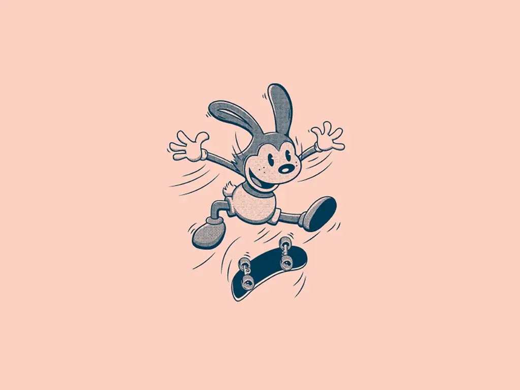
Source: Nelson Nokela, Nelson Nokela, Behance, https://dribbble.com/shots/4800757-Skate-Mascot
Source: Ty Fortune, Grom, Behance, https://dribbble.com/shots/6894774-Lingo-Type-Grom

Source: Tarik Raiss, Tarik Raiss, Behance, https://dribbble.com/shots/17689721-Skateboard-and-Rock-n-roll
Source: Alex Aperios, Globe Skateboards, Behance, https://dribbble.com/shots/6233693-Globe-Skateboards-Logo-Experiment
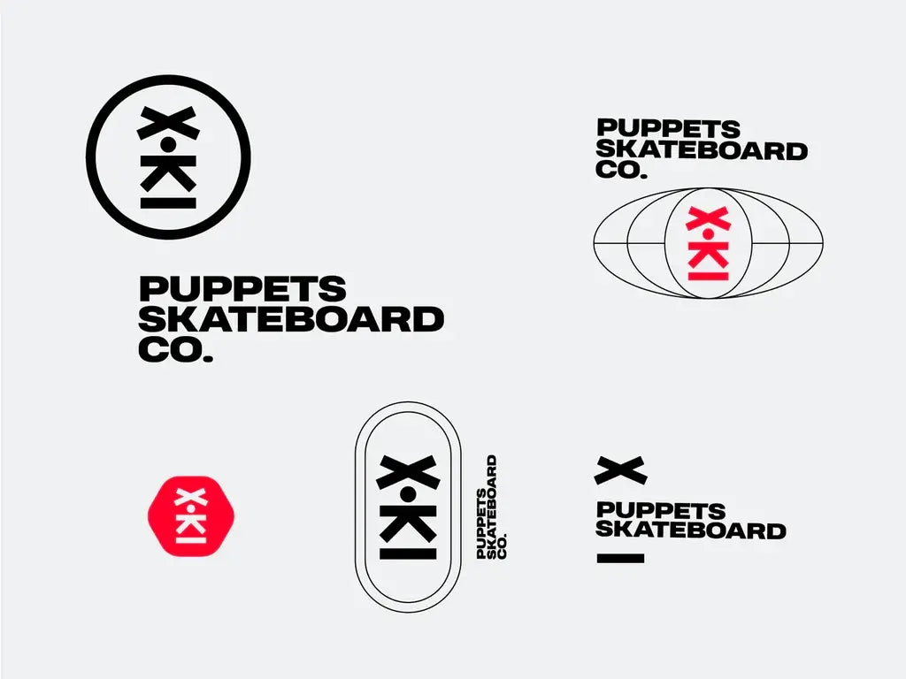
Source: Nick Zotov, Puppets Skateboard Co, Behance, https://dribbble.com/shots/15656065-Skateboard
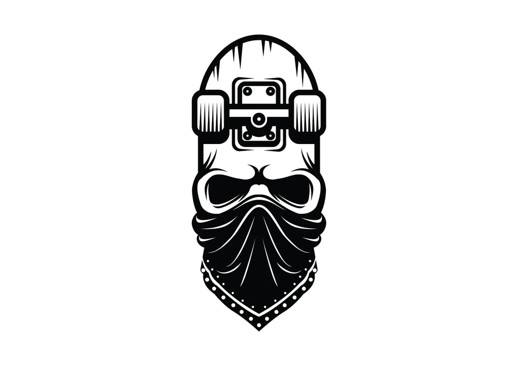
Source: Lethabo Nchabeleng, Skateboard Skullers, Behance, https://www.behance.net/gallery/76020481/Skateboard-Skullers
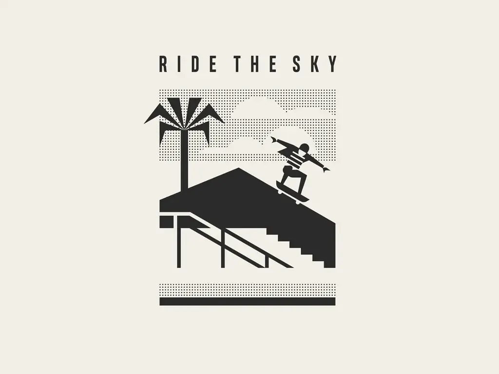
Source: Konstantin Reshetnikov, Ride the Sky, Behance, https://dribbble.com/shots/15677628-Ride-the-sky
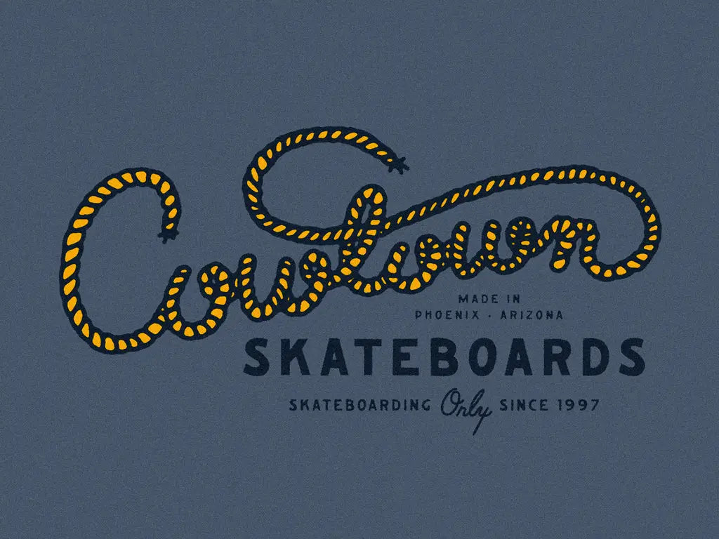
Source: Mark Johnston, Cowtown Skateboards, Behance, https://dribbble.com/shots/16774435-Cowtown-Skateboards-Merch
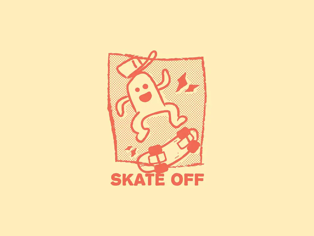
Source: David Ristevski, Skate Off, Behance, https://dribbble.com/shots/14210858-Skate-Of

Source: Patswerk, Patswerk, Behance, https://dribbble.com/shots/19863768-Stickers
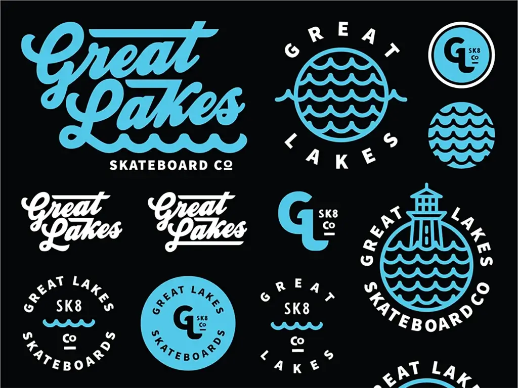
Source: Brethren Design Co, Great Lakes Skateboard Co, Behance, https://dribbble.com/shots/5700663-Great-Lakes-Skateboard-co-Flash-Sheet
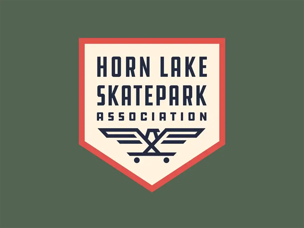
Source: Curt Crocker, Horn Lake Skatepark Association, Behance, https://dribbble.com/shots/20249766-Horn-Lake-Skatepark-Association
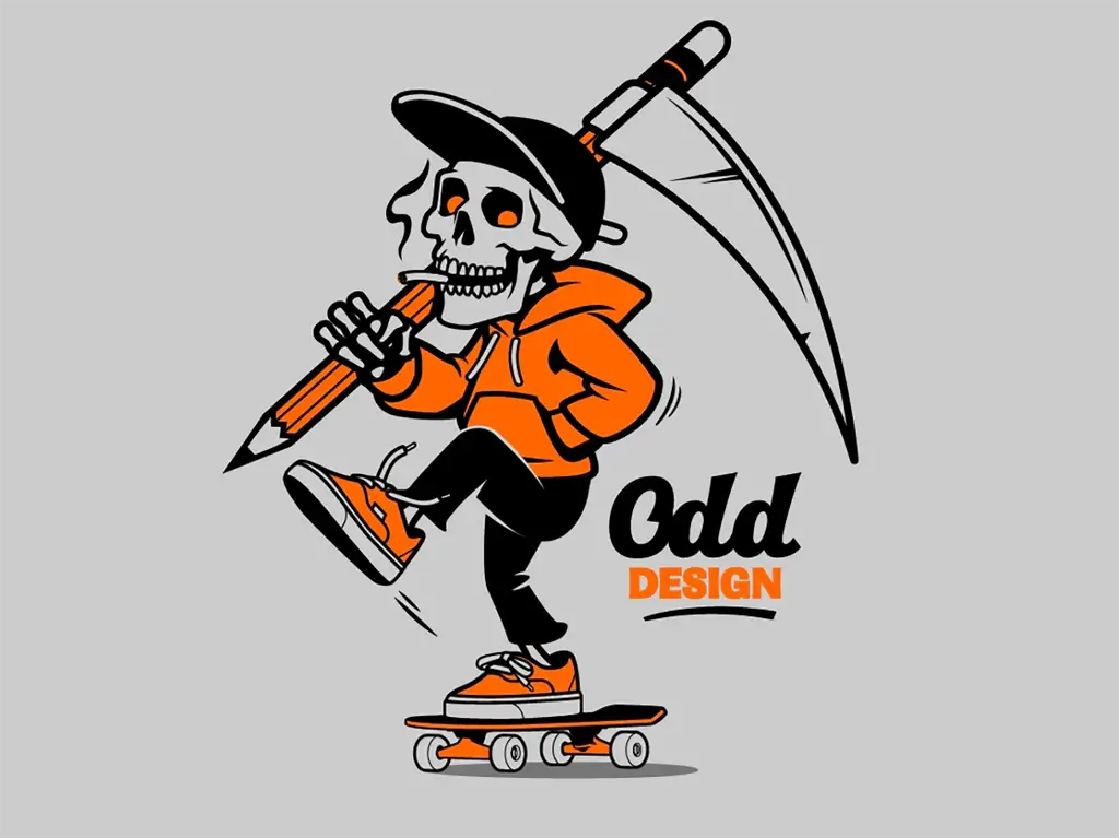
Source: Dermot Reddan, Dermot Reddan, Behance, https://dribbble.com/shots/5474047-Skate-design-mascot
Source: Jud Lively, Jud Lively, Behance, https://dribbble.com/shots/12004182-Skateboarding-Butterfly
Source: Mark Johnston, Cowtown Skateboard, Behance, https://dribbble.com/shots/19988890-Cowtown-Speed-Cow
Source: Tom Deja, Sk8school, Behance, https://dribbble.com/shots/12101500-Skateboarding-School-Logo-Concept
Source: Jay Master, Hesh Skating, Behance, https://dribbble.com/shots/9876244-Hesh-Skating
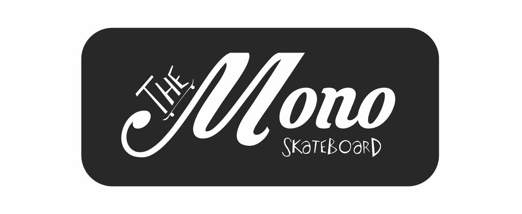
Source: Mariana Malta Pinheiro, The Mono Skateboard, Behance, https://www.behance.net/gallery/33415507/The-Mono-Skateboard
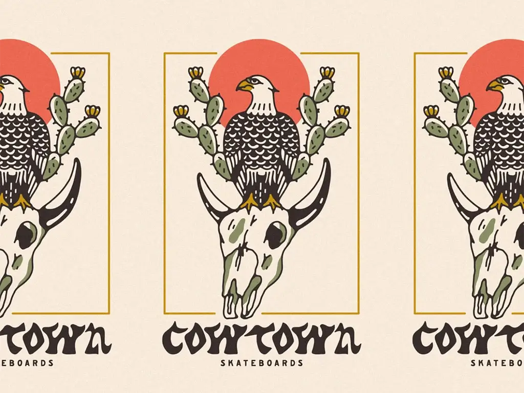
Source: Mark Johnston, Cowtown Skateboard, Behance, https://dribbble.com/shots/19788232-Cowtown-Eagle-Cow-Skull

Source: Tmpl Design Company, Bad Cat, Behance, https://dribbble.com/shots/15706283-Bad-Cat
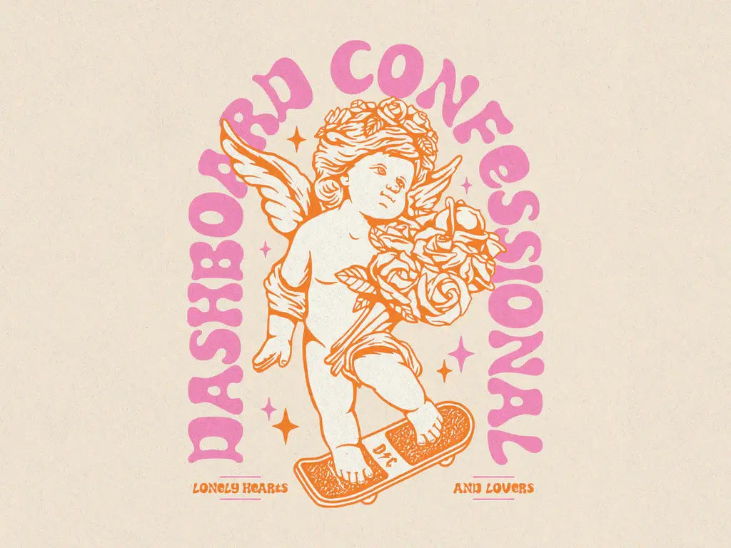
Source: Vinicius Gut, Dashboard Confessional, Behance, https://dribbble.com/shots/15071404-Dashboard-Confessional-Valentine-s-Day
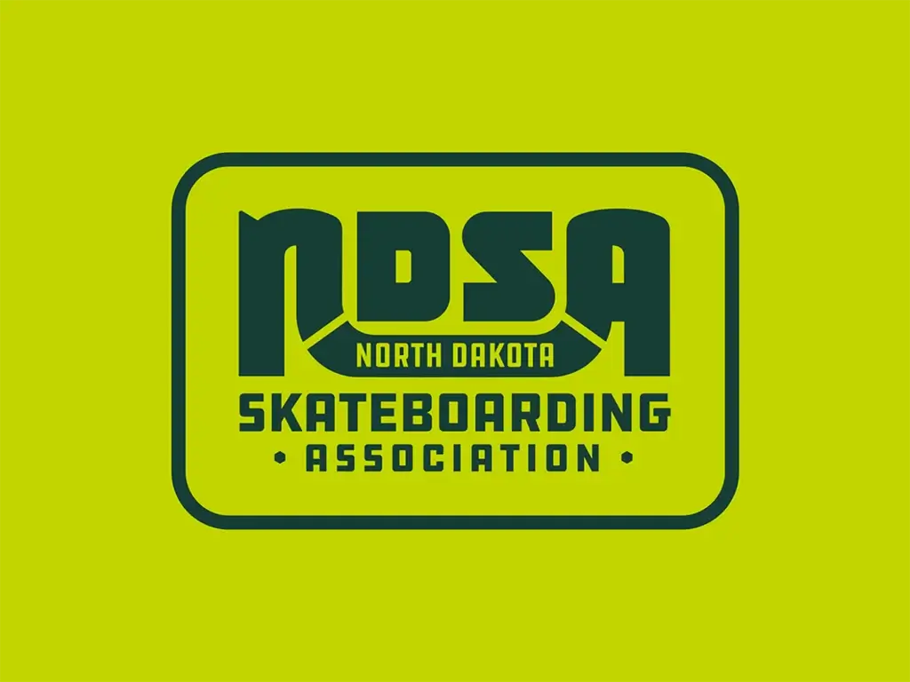
Source: Nathaniel Navratil, Ndsa, Behance, https://dribbble.com/shots/20181504-NDSA-Logo
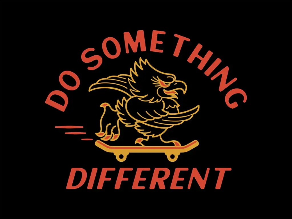
Source: Skilline, Do Something Different, Behance, https://dribbble.com/shots/20859732-Apparel-Graphic
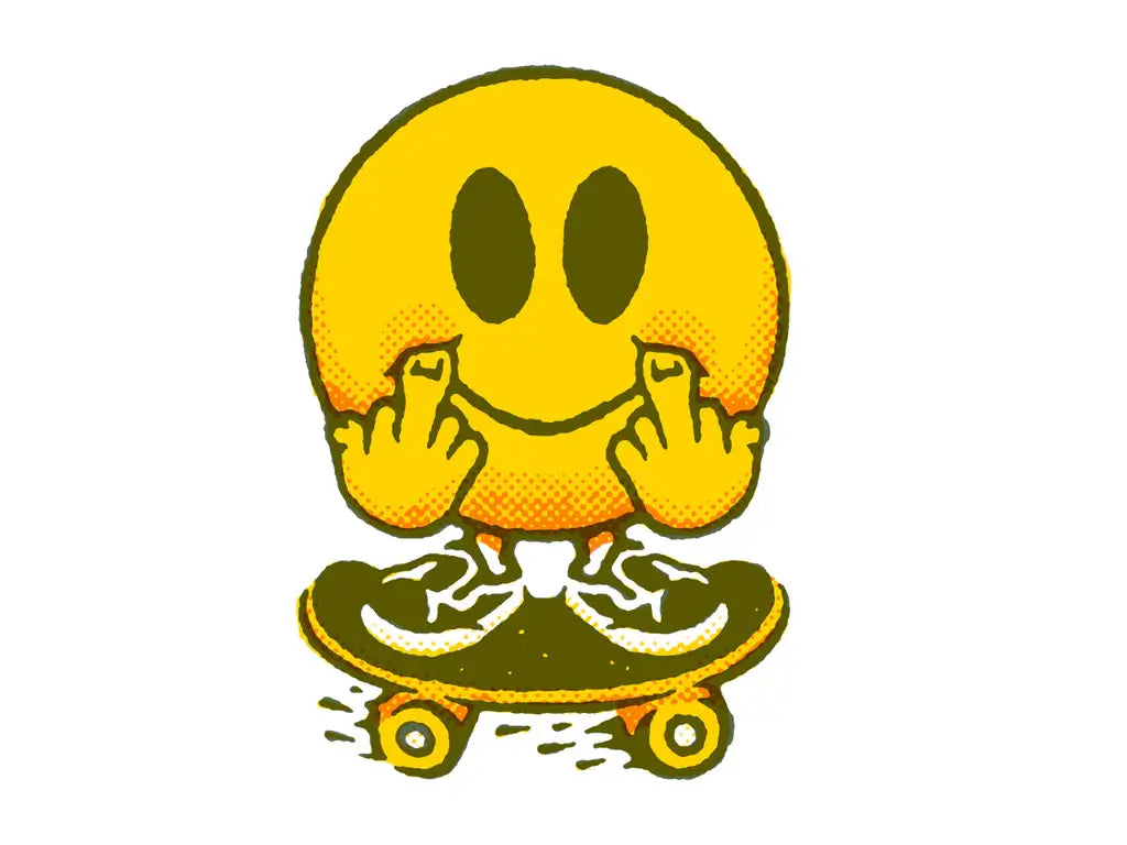
Source: Dan Lehman, Flippy, Behance, https://dribbble.com/shots/16910232-Flippy
What Are the Best Styles for Skateboard Logo Designs?
When it comes to skateboard logo designs, the style you choose can totally ramp up your brand’s cool factor! Skateboarding is not just a sport; it’s a lifestyle that thrives on creativity, freedom, and expression. That’s why the logo design should reflect the essence of skate culture. Here are five rad styles that will make sure your skateboard logo is ready to roll:
Vintage & Retro
There’s something irresistibly cool about vintage-inspired logos. Think of classic 70s and 80s skateboard designs with bold, groovy fonts and faded, earthy color schemes. These logos often carry a nostalgic appeal and stand out for their iconic and timeless look. Incorporating retro elements can give your brand an established feel, connecting today’s skaters with the roots of skateboarding culture.
Minimalist Modern
If you're aiming for a sleek, contemporary vibe, minimalist designs are the way to skate. Using clean lines, simple geometric shapes, and limited color palettes, these logos emphasize clarity and modernity. A minimalist skateboard logo not only looks professional but also works incredibly well on various merchandises like tees, caps, and of course, skateboards themselves.
Edgy & Abstract
For brands that want to make a bold statement, edgy and abstract designs can capture the rebellious spirit of skateboarding. Think unconventional shapes, sharp angles, and a mix of textures that pop. These logos often utilize contrasting colors to grab attention and evoke a sense of adventure and daring that resonates well with the skateboarding community.
Graffiti & Street Art
Embracing the street art style taps directly into the urban roots of skateboarding. Graffiti-inspired logos are vibrant, colorful, and full of energy. They often incorporate spray paint effects, handwritten typography, and illustrative elements that reflect the dynamic and artistic side of skate culture. This style is perfect for brands that want to showcase their connection to the street and creative expression.
Eco-Friendly & Organic
As sustainability becomes more important, eco-friendly logo designs are gaining traction in the skateboard industry. These designs typically feature earth tones, organic shapes, and natural imagery like leaves, waves, or mountains. An eco-friendly style communicates a brand’s commitment to environmental responsibility and appeals to skaters who value nature and sustainability.
Each of these styles has its unique flair and can help your skateboard logo stand out while staying true to the authentic, gritty, and artistic nature of skateboarding. Whether you go retro, minimal, or bold, remember that the best skateboard logo designs are those that truly reflect the brand's personality and resonate with the skate community.
What Colors Work Best for Skateboard Logo Designs?
Choosing the right colors for your skateboard logo design can be as crucial as landing a perfect kickflip! Color not only defines your brand’s aesthetic but also influences how your audience perceives and connects with your brand. When it comes to skateboarding, the vibe is all about boldness, rebellion, and fun. Here are five color schemes that can make your skateboard logo truly pop and resonate with the skating culture:
Vibrant Neons
Nothing screams "look at me!" quite like neon colors. Bright pinks, electric blues, and radioactive greens can give your skateboard logo a lively, energetic vibe that's hard to ignore. Neon colors are perfect for brands targeting a younger, more dynamic crowd and can make your logos stand out in any urban landscape or on any merchandise.
Classic Black and White
For a timeless appeal, you can never go wrong with black and white. This color combination is not only versatile but also provides a strong contrast that makes for highly readable and impactful designs. Whether you’re going for a minimalist look or a more complex graphic, black and white will ensure your logo looks great in both color and monochrome settings.
Earthy Tones
Browns, greens, and tans can convey a more grounded, organic feel, which is excellent for brands that want to emphasize eco-friendliness or a connection to nature. These colors work well for logos that blend the urban with the outdoor, appealing to skaters who are equally at home on city streets and backcountry trails.
Bold Primaries
Red, blue, and yellow are classic primary colors that exude confidence and energy. Using these colors in your skateboard logo can create a sense of excitement and adventure, qualities that are quintessential to skateboarding. These colors are also very flexible in terms of branding and can be adapted to a variety of design styles from vintage to modern.
Metallics
Incorporating metallic colors like gold, silver, or bronze can add a hint of sophistication and flair to your logo design. Metallics are great for creating a premium feel, perfect for high-end skateboard brands or special edition releases. They can also be used to highlight particular elements of the logo to make them stand out or to add a futuristic touch to the overall design.
When selecting colors for a skateboard logo, it’s crucial to consider the emotions and messages each hue conveys. The right colors will not only complement the design but also reinforce the brand’s personality and appeal to its target audience. So whether you go bright and bold or soft and subtle, remember that the best palette is one that truly reflects the spirit of skateboarding. Get creative, experiment with combinations, and watch how the right colors can take your logo to new heights!
Are There Popular Fonts Used in Skateboard Logo Designs?
Absolutely! When it comes to skateboard logo designs, fonts can be as expressive and bold as the tricks done on the board itself. The right typography can echo the dynamic, rebellious spirit of skateboarding culture, making your brand instantly recognizable and relatable to skaters. Here are five popular font styles that often grace the world of skateboard logos, each adding a unique flavor to the brand identity:
Graffiti-Inspired Fonts
Reflecting the urban roots of skateboarding, graffiti fonts are a natural fit for skateboard logos. These fonts are usually hand-drawn, offering an edgy, raw aesthetic that captures the free-spirited, artistic essence of street art. With their irregular lines and often colorful appearance, graffiti-inspired fonts can give your logo a youthful, vibrant vibe that resonates well with the skate community.
Bold, Heavy Fonts
To make a statement, bold and heavy fonts are the go-to choice for many skateboard logos. These fonts exude strength and impact, ensuring that the logo stands out on any deck or piece of apparel. Brands like Thrasher are known for their use of thick, impactful typography that communicates power and durability, qualities highly valued in the skateboarding world.
Vintage and Retro Fonts
Tapping into the nostalgia of skateboarding’s golden ages, vintage and retro fonts are incredibly popular. These fonts, reminiscent of the 70s and 80s skate scene, can convey a sense of tradition and authenticity. They work great for brands that want to celebrate the heritage of skateboarding or appeal to aficionados who appreciate the roots of their sport.
Handwritten and Script Fonts
For a more personalized touch, handwritten and script fonts offer a unique style that suggests individuality and originality. These fonts can range from smooth and flowing to rough and jagged, mirroring the personal style of the skater or the artisanal quality of the brand. Handwritten fonts are perfect for smaller, boutique skate brands that want to emphasize their handcrafted, custom-made ethos.
Modern Sans-Serifs
For brands looking to project a more contemporary, clean image, modern sans-serif fonts provide a crisp, legible option that works well in digital and print media. These fonts are straightforward yet stylish, offering excellent readability and a modern aesthetic that appeals to new generations of skaters who appreciate minimalism and simplicity in design.
When selecting a font for your skateboard logo design, consider the personality of your brand and the message you want to convey. The best skateboard logos are those that capture the spirit of skateboarding—adventurous, expressive, and always cool!
What Are Some Creative Ideas for Skateboard Logo Designs?
When it comes to carving out a unique identity in the skateboard world, the logo design you ride with can make all the difference. It’s not just about slapping some cool graphics on a deck; it’s about encapsulating the spirit of skateboarding—its freedom, its defiance, its artistry. If you're looking to kickflip your brand into the hearts of skaters everywhere, sparking creativity in your skateboard logo design is crucial. Let's pop-shuvit into five creative ideas that will ensure your logo is more than just a graphic; it's a statement.
Merge the Urban with the Natural
Skateboarding thrives in urban landscapes, but its soul is deeply connected to the natural world—the freedom of the ocean waves, the thrill of mountain slopes. Why not blend these elements into your logo design? Imagine a skyline silhouette seamlessly transitioning into mountain peaks, or wheels morphing into ocean waves. This fusion symbolizes the skateboarder's journey, navigating the concrete jungle with the spirit of a wild adventurer.
Play with Perspective
Skateboarding is all about seeing the world from a different angle. Take this philosophy to heart by crafting a logo that plays with perspective. Think of a design that might initially appear abstract, but upon closer inspection, reveals a skater executing a trick or a hidden element related to skateboarding culture. This approach encourages engagement, inviting viewers to take a second look and connect with the logo on a deeper level.
Incorporate Skateboarding Lingo
Skateboarding comes with its own vibrant lexicon—a mix of technical terms, slang, and iconic phrases. Incorporating this language into your logo can resonate deeply with the skate community. Visual puns or designs that visually represent phrases like “grind,” “ollie,” or “kickflip” can add a layer of insider knowledge and fun to your brand, making it instantly recognizable and relatable to skaters.
Use Dynamic Motion
The essence of skateboarding is motion, and your logo should reflect that. Create a design that captures the fluidity and dynamism of skateboarding. This could mean incorporating elements that suggest movement, such as streaks, blurs, or lines that trail behind a central figure or object, giving the impression of speed and agility. A logo that looks like it’s moving can convey the energy and excitement inherent to the sport.
Craft a Custom Typeface
While images and symbols are powerful, never underestimate the impact of a unique, custom typeface. Designing a font that mirrors the curves, lines, and edges of skateboarding infrastructure—like ramps, rails, and half-pipes—can set your logo apart. A typeface that embodies the essence of skateboarding not only makes your brand name stand out but also weaves the spirit of skate culture directly into the fabric of your logo.
Embarking on the journey of creating a skateboard logo design is an invitation to blend art with action, culture with creativity. By exploring these ideas, you're not just designing a logo; you're crafting a beacon for your brand, one that signals to skaters worldwide that you understand what drives them—both on and off the deck.
What Are Some Examples of Successful Skateboard Logo Designs?
Skateboard logos are more than just cool graphics; they are a symbol of the brand’s identity and a banner under which the skate community gathers. From classic icons to modern masterpieces, the most successful skateboard logo designs capture the essence of the sport while making a bold statement. Here are five standout examples that have left a significant mark on the skateboarding world:
Santa Cruz Skateboards
Known for the screaming hand, Santa Cruz’s logo is one of the most iconic in skateboarding history. Designed by Jim Phillips in the early '80s, the image of a hand with a wide-open mouth in the palm emits a raw, edgy vibe that perfectly captures the rebellious spirit of skate culture. The logo’s lasting appeal demonstrates the power of combining great art with strong brand identity.
Powell-Peralta
The Powell-Peralta "Ripper" graphic is another emblematic figure in the skateboarding industry. Featuring a skull breaking through the surface, this logo uses bold, impactful imagery to capture attention and convey a sense of strength and defiance. Its timeless design has been celebrated for decades and continues to be synonymous with skateboarding.
Thrasher Magazine
Thrasher’s logo, with its distinctive, fiery font, embodies the hardcore nature of skateboarding. The magazine itself is a staple of skate culture, and its logo has become a fashion icon in its own right. The simple yet powerful use of typography in this logo demonstrates how text alone can make a strong visual impact.
Girl Skateboard Co.
The Girl logo features a simple silhouette of a restroom figure of a girl, which plays cleverly with the brand name. This minimalistic and approachable design has made it one of the more recognizable logos in the skateboarding world. It’s a great example of how effective branding can be achieved with straightforward and clean imagery.
Element Skateboards
Element’s logo, which incorporates a tree encircling the sun, represents the brand’s commitment to nature and the environment. This logo stands out for its symbolic use of natural elements and has become a symbol of sustainability within the skateboarding community. The design is clean, memorable, and effectively communicates the brand’s core values.
These logos have not only defined the brands they represent but have also become cultural icons within the skateboarding community. They show how diverse design elements—from hand-drawn illustrations to simple geometric shapes—can effectively convey a brand’s message and resonate with its audience. When crafting your skateboard logo, consider what you want it to say about your brand and how it can connect emotionally with skaters around the world. Let these successful examples inspire you to create a design that’s all your own—bold, expressive, and undeniably skate.
Conclusion
In the dynamic world of skateboarding, a compelling skateboard logo design can significantly enhance a brand's visibility and appeal. Effective logos serve as a visual shorthand for the brand’s identity, encapsulating its ethos in a single, memorable image. Whether opting for bold, graphic styles or minimalistic designs, the key is to resonate with the skateboarding community while standing out in a crowded market. By drawing inspiration from successful examples and understanding the influence of different styles and colors, brands can craft a logo that not only looks great but also tells a compelling story to their audience.
Let Us Know What You Think!
Every information you read here are written and curated by Kreafolk's team, carefully pieced together with our creative community in mind. Did you enjoy our contents? Leave a comment below and share your thoughts. Cheers to more creative articles and inspirations!


Leave a Comment