30 Best Software Logo Design Ideas You Should Check
Source: Amit, Howel, Behance, https://dribbble.com/shots/20632207-H-letter-Howel-branding-modern-logo
In the fast-paced world of technology, a standout logo can be the difference between blending in and popping off the screen. Whether you’re a budding startup or a seasoned tech giant, the right logo encapsulates your brand's essence and broadcasts your innovative spirit to the world. That's where software logo design comes into play, crafting a visual identity that not only resonates with tech aficionados but also casts a memorable digital footprint.
As we dive into the pixel-perfect world of software logos, get ready for a blend of creativity and coding! From minimalist masterpieces to complex circuit-inspired artistry, each design we explore aims to spark inspiration and ignite your imagination. Let’s decode the pixels and find out what makes a software logo not just good, but great. Buckle up for a tour of the most innovative and compelling software logo designs out there—your next big idea might just be a scroll away!
Software Logo Design Ideas

Source: Dalius Stuoka, DevIntent, Behance, https://dribbble.com/shots/20492175-DevIntent-Logo-Design-Hexagon-Geometric-Negative-Space
Source: Vadim Carazan, Netrunner, Behance, https://dribbble.com/shots/20714646-Netrunner-logo-design
Source: Rahid Rehman, Detpro, Behance, https://dribbble.com/shots/20902024-D-e-t-p-r-o-Arrow-Logo
Source: Graftsman, Wumodogi, Behance, https://dribbble.com/shots/20743108-Tech-logo-technology-logo-tech-company-startup-logo-software
Source: Lucas Brands, Map, Behance, https://www.behance.net/gallery/217734265/Map
Source: Dmitry Lepisov, Neuralink, Behance, https://dribbble.com/shots/19998501-Neuralink-Logo-Redesign-Concept
Source: Rakibul Hasan, SaasNake, Behance, https://dribbble.com/shots/20955505-saas-tech-technology-software-SaasNake-Logo
Source: Imtiaz Hossain Naim, MindShift, Behance, https://dribbble.com/shots/20966934-MindShift-Logo-Design-for-a-Web-
Source: Sabir Ahmed, Edefix, Behance, https://dribbble.com/shots/20953850-Technology-logo-logo-design-branding-identity
Source: Brennan Burling, Sector, Behance, https://dribbble.com/shots/19643467-Sector-Brand-Ideation
Source: Dennis Pasyuk, Modartt, Behance, https://dribbble.com/shots/20924901-Modartt-Logo-Redesign
Source: Lucas Fields, Modular, Behance, https://dribbble.com/shots/19952774-Modular-Logotype-Design
Source: Dalius Stuoka, DataCity, Behance, https://dribbble.com/shots/20396468-DataCity-Logo-Design-Statistics-Chart-Buildings
Source: Wesley Marc Bancroft, Fount, Behance, https://dribbble.com/shots/17311329-Fount-More-Branding

Source: Designer Badhon, Naxfold, Behance, https://dribbble.com/shots/20991839-Brand-identity-letter-N-technology-logo-design
Source: Jahid Hasan, Pandora, Behance, https://dribbble.com/shots/18209208-Pandora-Artificial-Intelligence-Logo
Source: Masum Billah, Soulai, Behance, https://dribbble.com/shots/20591223-SoulAi-artificial-intelligence-Logo-Design
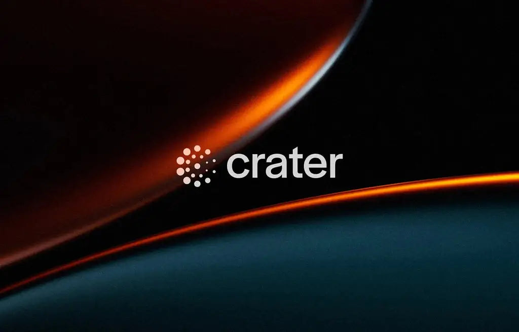
Source: Brennan Burling, Crater, Behance, https://dribbble.com/shots/20088685-Crater-Brand-Exploration
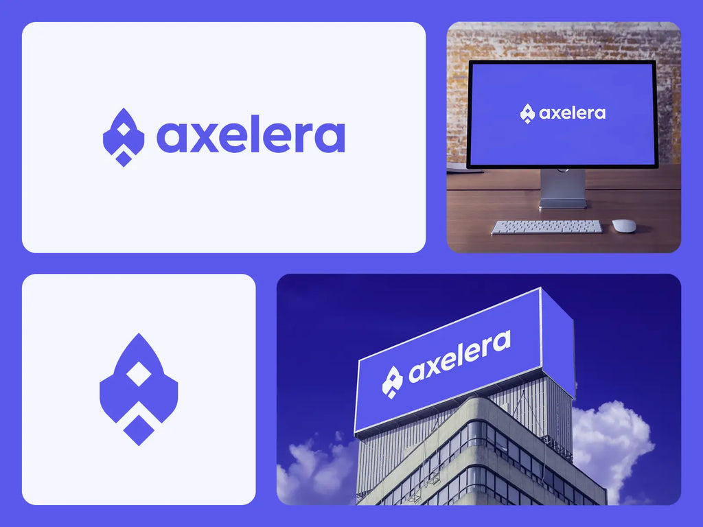
Source: Axelera, Axelera, Dribbble, https://dribbble.com/shots/25087528-Axelera-Logo-Design-Rocket-Spaceship
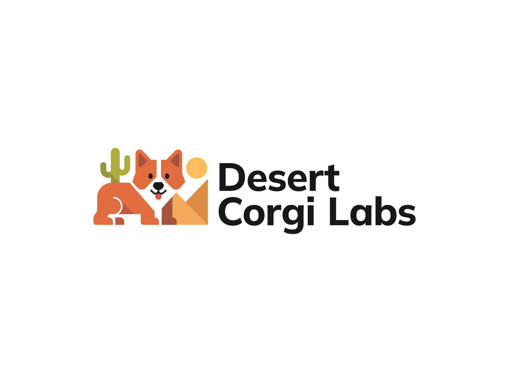
Source: Andrii Kovalchuk, Desert Corgi Labs, Dribbble, https://dribbble.com/shots/25203039-Software-development-logo
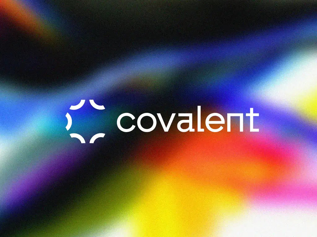
Source: Wesley Marc Bancroft, Covalent, Behance, https://dribbble.com/shots/18225415-Covalent-2-Brand
Source: Eugene MT, Bookplus, Behance, https://dribbble.com/shots/20150725-BookPlus-Logo-Design-Concept
Source: Tonic Studio, Nublex, Dribbble, https://dribbble.com/shots/24919126-Nublex-Logo
Source: Jahid Hasan, Myosis, Behance, https://dribbble.com/shots/18040407-Myosis-Blockchain-and-SAAS-focused-tech-company
Source: Dalius Stuoka, Adtree, Behance, https://dribbble.com/shots/20079384-Adtree-Logo-Design-Advertising-Analytics-Data-Intelligence
Source: Dalius Stuoka, Peak Security, Behance, https://dribbble.com/shots/19260468-Peak-Security-Logo-Design-Shield-Mountains-Sky-Star
Source: Mainul Hasan, Neopay, Behance, https://dribbble.com/shots/20382338-Neopay-payment-logo-design
Source: Khabib, Emprtynt, Behance, https://dribbble.com/shots/19454866-Emprtynt-Approved-logo-from-client
Source: Sabir Ahmed, Samtech, Behance, https://dribbble.com/shots/20892545-Tech-logo-technology-branding-
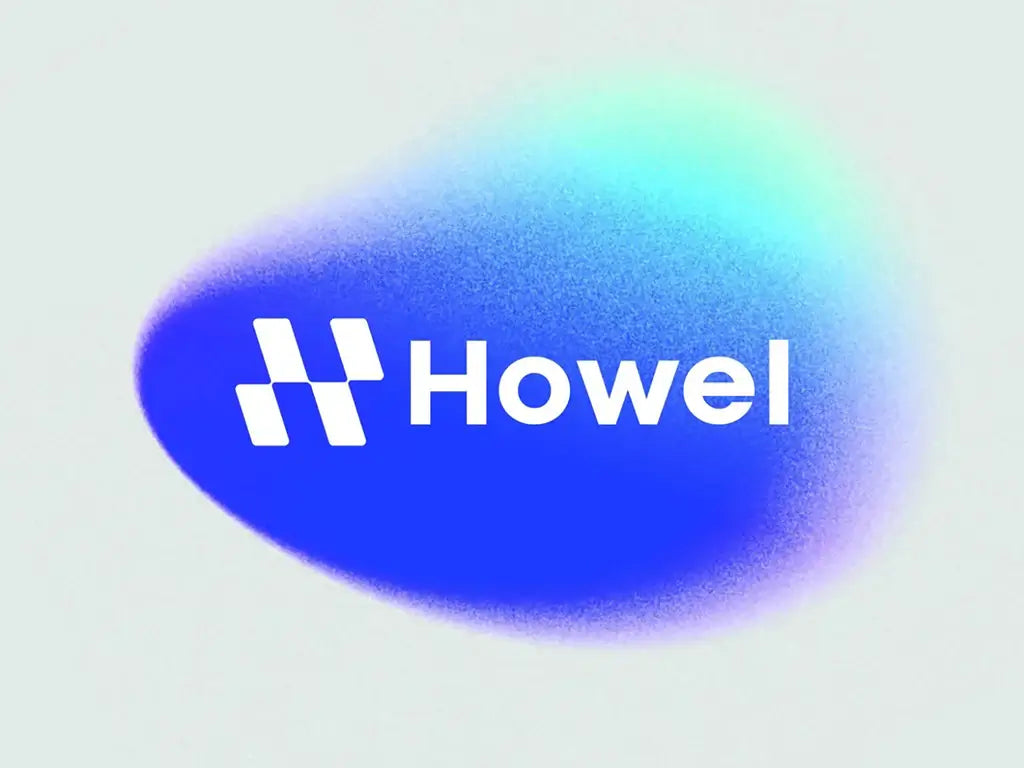
Source: Amit, Howel, Behance, https://dribbble.com/shots/20632207-H-letter-Howel-branding-modern-logo
What Items or Objects Can I Feature in Software Logo Designs?
Just like a chef selects the perfect ingredients to create a mouthwatering dish, a designer picks out items or objects that best represent the essence of the software. These visual elements are not just decorations; they are the silent ambassadors of your brand. Let’s embark on a culinary-like journey through the art of choosing the perfect ingredients for your software logo design feast.
The Classic Symbolism of Icons
Icons are the spices of the design world—used correctly, they can convey your brand's message succinctly and powerfully. Whether it's a lightning bolt symbolizing speed and power, or a cloud representing the intangible nature of cloud computing, icons can encapsulate complex ideas in a single graphic. Think of them as your logo’s shorthand, offering a universal language that speaks volumes. It’s about choosing an icon that not only resonates with your brand's identity but also stands out in the crowded marketplace.
Abstract Shapes: The Art of Ambiguity
Abstract shapes are like abstract art; they evoke emotions and ideas without relying on real-world references. They are the puzzle pieces of imagination, allowing viewers to form their own connections. Using abstract shapes in your software logo design invites interpretation, engagement, and a touch of mystery. It’s about crafting a visual intrigue that draws people in, making them curious to learn more about what your software does. The key here is balance—too obscure, and you risk alienation; too literal, and you lose the magic.
Typography as the Main Character
Sometimes, the name itself can be the star of the show. Creative use of typography turns letters into visual storytellers. Imagine the letters of your software’s name twisted into a shape that reflects its function, or perhaps choosing a font that embodies the software's personality—be it sleek and modern for cutting-edge tech or warm and rounded for user-friendly apps. Typography can be the protagonist of your logo design, telling the world who you are with style and substance.
Natural Elements for Organic Appeal
Incorporating natural elements into a software logo design can ground your tech brand with an organic touch. Trees, leaves, water droplets, or even the celestial bodies can symbolize growth, fluidity, and innovation. These elements remind your audience of the seamless integration of technology and nature, offering a refreshing contrast to the digital realm. It’s a nod to the natural world, suggesting that your software exists to enhance, not replace, the human experience.
The Human Touch: Silhouettes and Faces
Human figures, silhouettes, or even simplified face elements can add a personal touch to your logo, making your software feel more relatable and accessible. These elements can symbolize community, connectivity, or user-focused design. It’s about putting a human face on technology, making your software feel more like a friend than a tool. This approach can particularly shine in software aimed at social networking, education, or health and wellness.
In the creative kitchen of software logo design, the ingredients you choose to feature are crucial in concocting a logo that’s both appetizing and memorable. From the universality of icons and the intrigue of abstract shapes to the storytelling prowess of typography, the grounding force of natural elements, and the relatability of human touches, your logo can be a feast for the eyes and the mind.
What Are Some Effective Fonts for Software Logo Design?
In the vast and vibrant world of software development, where code meets creativity, your logo is your handshake, your first impression, and perhaps, your last. Selecting the perfect font for your software logo design isn't just about aesthetics; it's about making a statement in the digital arena. Here’s a fun dive into five fonts that can help your software logo make a bold, memorable mark!
Roboto – The Friendly Futurist
Ah, Roboto! It’s like the friendly neighbor of the font family. Developed by Google as the sans-serif sweetheart for Android, Roboto is modern, approachable, and versatile—just like a good app should be. Its geometric forms blended with friendly curves make it perfect for software logos that need to convey efficiency with a dash of warmth. Whether you’re building an app for social networking or a complex B2B solution, Roboto stands out while fitting in perfectly.
Consolas – The Code Whisperer
For those who breathe code, Consolas is your font soulmate. This monospaced marvel is not only fantastic for coding but its clear, crisp lines make it an excellent choice for software logo designs that aim to communicate precision and expertise. Ideal for development tools, programming environments, or any tech venture where accuracy is the game, Consolas tells your audience that you’re serious about the zeros and ones.
Montserrat – The Urban Explorer
Inspired by the old posters and signs in the traditional Montserrat neighborhood of Buenos Aires, this font brings a touch of urban drama to any design. Montserrat is the go-to for logos that need to blend vintage vibes with modern minimalism. Its versatility and range of weights make it suitable for high-impact headlines and can add a touch of sophistication to any software logo design, perfect for startups looking to make a robust and stylish statement.
Futura – The Geometric Genius
If your software is all about shaping the future, why not say it with Futura? This geometric sans-serif typeface exudes professionalism and forward-thinking. With its clean, efficient character forms, Futura is incredibly effective for technology-focused brands that pride themselves on innovation. From artificial intelligence startups to futuristic app developers, a Futura-based logo design is like stepping into a time machine set for success.
Courier New – The Nostalgic Networker
There’s something about Courier New that screams “old-school cool.” This slab serif typeface, originally designed to mimic the look of a typewriter and later adapted for use on digital screens, brings a touch of nostalgia to software logo designs. It’s particularly effective for software brands that want to highlight their long-standing expertise or vintage aesthetic. Courier New works wonders for those looking to blend the old with the new, offering a bridge between past technologies and future innovations.
Each of these fonts has its own character and charm, just like every software has its unique features. When choosing the right font for your software logo design, consider not just the visual appeal but also what the style communicates about your brand’s personality and values.
What Are the Best Styles for Software Logo Designs?
Navigating the digital landscape, your software logo is more than just a pretty symbol; it's the face of your brand in a pixel-packed world. With the right style, your logo can pop, sizzle, and dance its way into the hearts of tech enthusiasts everywhere. So, what styles should you consider to ensure your software logo design not only stands out but also stays relevant? Let’s dive into five stellar styles that are perfect for portraying power-packed performance and innovation.
Minimalist Mastery
In the realm of software, simplicity often reigns supreme. A minimalist logo design cuts through the digital noise, making a clear and memorable statement. This style uses clean lines, limited color palettes, and uncluttered layouts to convey your brand’s essence without any fuss. Think of it as the sleek, user-friendly interface of logo designs—easy to understand at a glance and impossible to forget.
Futuristic Flair
To the future and beyond! Futuristic logo designs often feature angular abstractions, gradient colors, and a sense of motion that seems to propel the logo forward. This style is ideal for software companies that specialize in cutting-edge technologies like AI, VR, or blockchain. It suggests innovation and forward-thinking, qualities that tech aficionados greatly appreciate.
Geometric Genius
There’s something profoundly satisfying about the symmetry and balance of geometric designs. In software logo design, geometric shapes can be used to create visual stability and represent structured innovation. Circles, triangles, and squares can transform into complex, captivating patterns that symbolize network connectivity and technological integration.
Typography-Driven Design
Sometimes, the right typeface is all you need. A typographic logo relies on unique lettering to make a mark. By tweaking the shapes of letters, incorporating elements of coding script, or using bold, tech-friendly fonts, you can convey both the functionality and creativity of your software. It’s a word-first approach that speaks volumes about your brand.
Organic Overlays
Who says tech has to be all hard edges and neon lights? Incorporating organic shapes and natural curves can soften a software logo, making it more accessible and user-friendly. This style is perfect for software companies that want to emphasize usability, customer service, and user experience. It’s about humanizing technology, making it relatable and appealing to everyday users.
Each of these styles brings something unique to the table, turning your logo into a beacon for your brand. Whether you lean towards the clarity of minimalism or the excitement of futuristic motifs, the goal is the same: to craft a software logo design that resonates with your audience and represents your brand's mission.
What Are Some Creative Ideas for Software Logo Designs?
Embarking on the creation of a software logo design is like opening a treasure chest of creative possibilities. Each logo holds the potential to tell a story, evoke emotions, and capture the essence of the software it represents. In the vast ocean of digital branding, standing out requires a blend of innovation, creativity, and a pinch of daring. So, let's dive into the treasure trove and unearth five sparkling gems of creative ideas for your software logo design adventure.
Merge the Digital with the Natural
In a world increasingly dominated by technology, bringing a touch of nature into your software logo design can set you apart. Imagine intertwining digital elements with natural forms—pixelated leaves, a circuit board forest, or a cloud made of code. This fusion not only highlights the harmony between technology and the natural world but also offers a visually striking contrast that captures the viewer's imagination. It's like telling a story where technology and nature are not adversaries but allies, crafting a future together.
Play with Negative Space
The art of negative space in logo design is like a magician’s best trick—visible only to those keen enough to spot it. By creatively using the background space to form a hidden image or message, your logo can engage viewers in a moment of discovery. For instance, imagine a computer mouse that also resembles a sleek, futuristic car, symbolizing speed and innovation in software development tools. This approach not only adds a layer of depth to your design but also invites viewers to take a second look, making your logo memorable.
Incorporate Dynamic Shapes and Lines
In the digital realm, movement is synonymous with life. Integrating dynamic shapes and lines that suggest motion can imbue your software logo design with a sense of activity and energy. Consider arrows morphing into code lines or a swirling vortex leading into a digital portal. These elements convey progress, speed, and the dynamic nature of your software, promising users an active and evolving experience. It's a visual whisper, suggesting, "This software will propel you forward."
Utilize Custom Typography
Sometimes, the most striking element of a software logo design is not a symbol but the name itself, styled in unique, custom typography. Crafting letters that double as design elements—think letters that look like digital circuits, sleek software interfaces, or even binary code—can make your logo stand out. This technique not only ensures your brand name is front and center but also makes it intrinsically linked to the visual identity of your software. It's like your brand's signature, instantly recognizable and utterly unique.
Symbolize Transformation and Growth
Software, at its core, is about transformation—turning ideas into reality, data into insights, or challenges into solutions. Capturing this essence in your logo through symbols of transformation and growth can resonate deeply with your audience. Consider a caterpillar-to-butterfly metamorphosis depicted in digital pixels or a phoenix arising from the ashes in vibrant code patterns. This imagery not only reflects the transformative power of your software but also embodies the idea of constant evolution and improvement.
Crafting a software logo design is an art form where creativity knows no bounds. By exploring these ideas and infusing your designs with originality, you can create a logo that not only stands out in the digital landscape but also tells a compelling story about your brand.
What Are Some Iconic Software Logo Designs to Inspire You?
Ready to spark your creative synapses with some iconic software logo designs? In the dynamic world of tech, where innovation meets interaction, the right logo can make your software stand out in a saturated market. Let’s zoom into five unforgettable software logo designs that have not only captured eyes but also hearts and minds across the digital landscape.
Adobe – The Timeless Triangle
Adobe’s logo is a masterclass in geometric perfection. The stylized "A," shaped from a simple red triangle, speaks volumes about the brand’s foundation in graphic design, creativity, and its suite of professional-grade software. This logo has stood the test of time, maintaining relevance in a fast-evolving industry by embodying the essence of creativity and innovation in its clean, sharp lines. It's a testament to how simplicity often leads to iconicity in software logo design.
GitHub – The Octocat Adventure
Who says software logos can’t have a bit of whimsy? GitHub’s Octocat is not just a logo; it’s a mascot that has become synonymous with the brand’s community-driven platform for code management. The playful, octopus-like cat with five tentacles holding a laptop is both memorable and a vivid portrayal of GitHub’s collaborative, open-source nature. It’s a fun, approachable image that makes coding more relatable and less intimidating.
Python – The Serpent of Simplicity
Python’s logo, featuring two overlapping, stylized snake heads forming a heart, reflects the essence of the programming language: simplicity, elegance, and readability. The blue and yellow color scheme is visually appealing and accessible, symbolizing logic and optimism. This logo perfectly communicates Python’s core philosophy of straightforward, approachable programming, making it an excellent inspiration for software logo designs aiming for clarity and friendliness.
Slack – The Hashtag Symphony
In a world where communication is key, Slack’s logo uses a hashtag as a clever nod to its functionality—streamlining team communication. The new design simplifies the original plaid hashtag into a more geometric, streamlined form, using a vibrant color palette that stands out. It’s modern, it’s fun, and it perfectly captures the software’s purpose of bringing teams together, showcasing how logo evolution can help maintain relevance in tech’s rapid pace.
Atlassian – The Mountain of Innovation
Atlassian, the powerhouse behind tools like Jira and Trello, uses a logo that features a stylized mountain peak, signifying the challenges and triumphs in project management and team collaboration. The logo’s sharp angles and bold blue color convey strength and reliability, key traits for software designed to help teams scale the heights of their projects. It’s an emblem of resilience and innovation, encouraging designers to think symbolically when crafting their software logo designs.
Drawing inspiration from these iconic logos can provide valuable lessons in balancing simplicity with symbolism, modernity with functionality, and playfulness with professionalism. Each of these designs not only represents the software itself but also tells a story of the brand’s mission, vision, and user community. Whether you’re designing a logo for a cutting-edge startup or looking to refresh an existing brand, these examples illustrate the power of visual identity in the tech world.
Conclusion
An impactful software logo design is more than just an artistic symbol; it's a pivotal element of your brand's identity in the tech industry. These logos not only foster brand recognition but also encapsulate the essence of the software they represent, enhancing user connection and loyalty. Whether you opt for simplicity, like Adobe, or playful creativity, like GitHub, your logo should resonate with your target audience while standing out in a crowded market. As you embark on your software logo design journey, consider these examples as benchmarks of success that blend functionality with aesthetic appeal.
Let Us Know What You Think!
Every information you read here are written and curated by Kreafolk's team, carefully pieced together with our creative community in mind. Did you enjoy our contents? Leave a comment below and share your thoughts. Cheers to more creative articles and inspirations!


Leave a Comment