Logo Variations Every Businesses Must Have

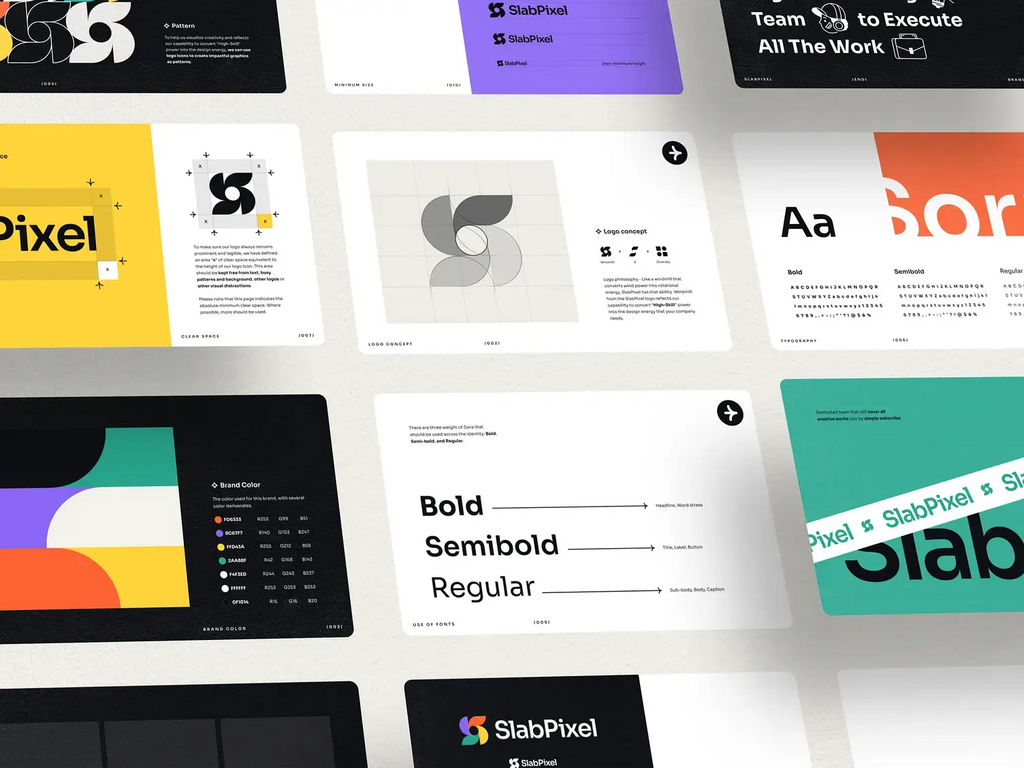
Source: SlabPixel Designer, Slab Pixel - Brand Guideline, Dribbble, https://dribbble.com/shots/18345455-SlabPixel-Brand-Guideline
In today’s competitive marketplace, businesses need more than just a single logo to represent their brand. While a primary logo is important, relying on only one version can limit how effectively a brand appears across different platforms and marketing materials. This is where logo variations become essential. By creating multiple versions of a logo, businesses can maintain consistent branding while adapting their visual identity to various formats, sizes, and design environments.
Logo variations allow businesses to remain flexible without losing brand recognition. For example, a detailed horizontal logo may work perfectly on a website header, but it may not display well on social media icons, mobile screens, packaging, or promotional merchandise. Having alternative logo variations such as stacked logos, icon-only versions, or simplified marks ensures that the brand stays clear and recognizable in every situation.
Another key benefit of logo variations is improved visual balance. Different layouts allow businesses to fit their logo naturally within different design spaces without stretching, shrinking, or distorting the original design. This flexibility helps maintain professionalism and strengthens brand identity across both digital and physical platforms.
Ultimately, logo variations help businesses build a cohesive and adaptable brand presence. By planning multiple logo versions from the start, businesses can ensure that their brand remains strong, recognizable, and visually appealing across all marketing channels.
The Primary Logo As The Foundation Of Brand Identity
Every brand identity begins with a primary logo, which serves as the central visual representation of a company. For businesses developing a strong brand presence, the primary logo is the most recognizable version of the brand mark. It usually contains the full logo design, including the brand name, symbol, and sometimes a tagline. Among all logo variations, the primary logo acts as the foundation that guides how the rest of the visual identity is structured.
Businesses typically use the primary logo in major brand touchpoints such as websites, advertisements, business cards, and official marketing materials. Because it carries the most complete version of the brand identity, this logo variation is designed with careful attention to typography, spacing, color palette, and visual balance. A well-designed primary logo helps businesses communicate professionalism and build strong brand recognition over time.
However, while the primary logo is essential, it does not always fit every layout or design environment. For example, wide horizontal logos may look excellent on a website header but may become difficult to read when scaled down for mobile screens or social media icons. This is why businesses should treat the primary logo as the anchor point from which other logo variations are created.
By establishing a strong primary logo first, businesses can develop additional logo variations that maintain the same visual identity while adapting to different formats. This approach ensures that the brand remains consistent and recognizable no matter where the logo appears.
The Secondary Logo For Flexible Brand Applications
While the primary logo is the main representation of a brand, many businesses also rely on a secondary logo to provide greater flexibility in different design situations. Secondary logo variations are alternative layouts of the main logo that maintain the same visual identity but adapt to spaces where the primary logo may not fit well. For businesses that use their branding across multiple platforms, having a secondary logo is an important part of a well-rounded brand system.
Secondary logos often rearrange the elements of the primary logo into a different structure. For example, if the main logo is designed horizontally, the secondary version may be stacked vertically. This type of layout allows businesses to use their branding in square or narrow spaces without compromising readability or design balance. These logo variations help businesses keep their brand identity consistent even when design constraints change.
Businesses frequently use secondary logo variations on packaging, website sections, promotional graphics, and branded merchandise. Because these formats often require different proportions, the secondary logo allows the brand to remain visually appealing while still following the same design rules as the primary logo.
When created carefully, secondary logo variations support the overall branding strategy. They give businesses the ability to adapt their logo to multiple environments while still maintaining a cohesive visual identity. By using both primary and secondary logo variations, businesses can ensure their branding looks professional and consistent across every platform.
The Icon Or Symbol Logo For Compact Branding
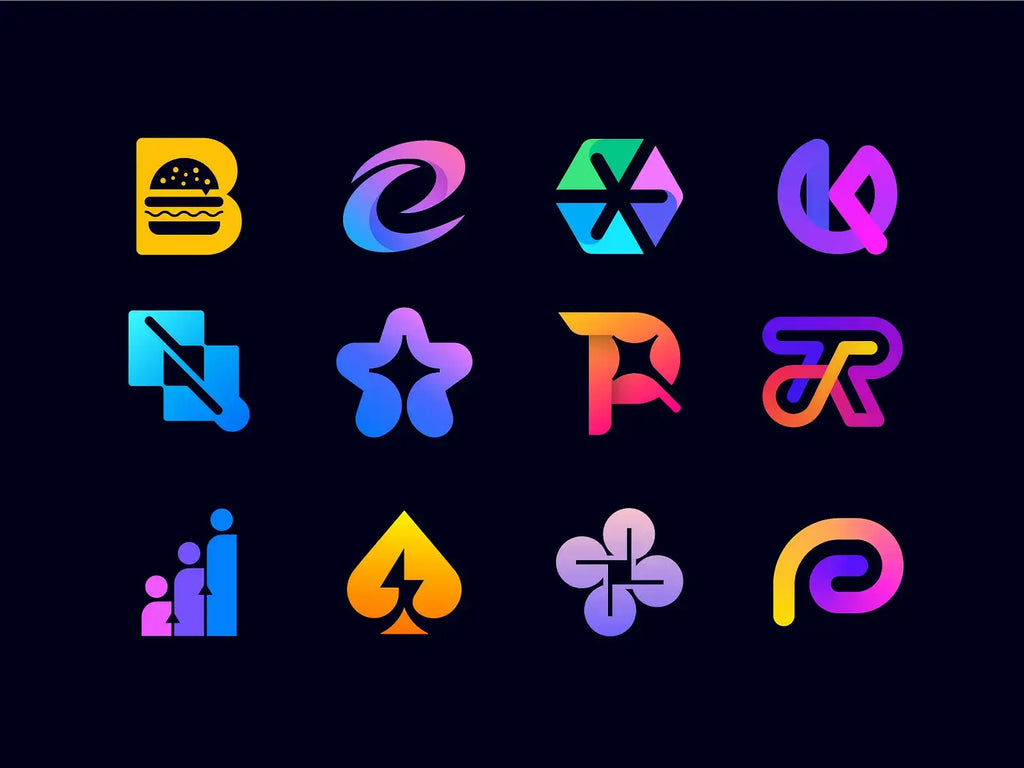
Among the most practical logo variations that businesses should develop is the icon or symbol logo. This version focuses on a simplified graphic mark taken from the main logo design. Instead of displaying the full brand name, the icon version highlights a recognizable symbol that represents the business. Because it is minimal and compact, this type of logo variation works especially well in small spaces.
Many businesses use icon logo variations on social media profiles, mobile applications, website favicons, and digital interfaces. In these environments, space is limited, and a detailed primary logo may appear too small or cluttered. A simplified icon helps maintain brand recognition while keeping the design clear and readable.
To make this variation effective, businesses should ensure that the symbol remains strongly connected to the primary logo. The shapes, colors, and design style should match the overall brand identity. When the icon is designed properly, customers can instantly associate it with the brand even without seeing the full company name.
Icon logo variations also support modern branding strategies where visual simplicity plays an important role. Many successful businesses rely on strong symbols that can stand alone across digital platforms. By developing an icon version as part of their logo variations, businesses create a flexible brand asset that can adapt easily to modern design environments.
Overall, an icon logo strengthens brand recognition while allowing businesses to maintain a clean and professional appearance across compact digital spaces.

Source: Graphthoery, Modern Logo Design, Symbol, Icon, Logos Collection, Dribbble, https://dribbble.com/shots/24709082-Modern-logo-design-symbol-icon-Logos-Collection
The Submark Logo For Small And Decorative Spaces
Another valuable addition to a brand identity system is the submark logo. This is one of the most useful logo variations that businesses can create for smaller or decorative design spaces. A submark is typically a compact arrangement of key elements from the primary logo, often combining initials, symbols, or simplified typography into a balanced shape.
Businesses frequently use submark logo variations on packaging labels, product tags, website footers, stamps, and branded merchandise. Because these spaces may be too small for a full logo layout, the submark offers a simplified version that still communicates the brand identity. This allows businesses to maintain visual consistency without overcrowding the design.
Submarks are usually designed in circular, square, or badge-style layouts. These shapes make the logo easier to place on various surfaces while keeping the design visually balanced. When integrated with other logo variations, the submark acts as a supporting element that enhances the brand system.
For businesses that produce physical products, submarks are especially useful. They can be applied to packaging seals, stickers, embossed labels, or fabric tags without requiring large design space. This makes the brand appear polished and professional across every customer touchpoint.
By including a submark in their logo variations, businesses gain an additional branding tool that works beautifully in small areas while still reinforcing the overall visual identity.
The One-Color Logo For Maximum Versatility
One of the most practical logo variations that businesses should prepare is the one-color logo. While many brands rely on full-color designs, there are many situations where a simplified version becomes necessary. Printing limitations, engraving techniques, and certain digital applications often require a logo that works effectively using only one color. For this reason, businesses benefit greatly from creating a one-color version as part of their complete set of logo variations.
A one-color logo removes complex color combinations and focuses on the core shapes and structure of the design. This version usually appears in solid black, white, or a single brand color. By simplifying the logo in this way, businesses ensure that their branding remains clear and recognizable even when color printing is not available.
Businesses commonly use one-color logo variations for merchandise, packaging stamps, embroidery, engraving, or promotional materials. These production methods often cannot reproduce gradients or multiple colors accurately. A well-designed single-color logo guarantees that the brand still looks professional in these situations.
Another advantage is improved flexibility in different backgrounds. A one-color logo can easily be inverted or adjusted to maintain visibility on both light and dark surfaces. This adaptability helps businesses maintain consistent branding across many platforms.
Including a one-color version within logo variations allows businesses to maintain strong brand recognition regardless of printing method, material, or display environment.
The Responsive Logo For Digital Platforms
As digital platforms continue to dominate modern marketing, responsive logo variations have become increasingly important for businesses. A responsive logo system adapts the complexity of the logo depending on screen size and viewing context. This approach allows businesses to maintain clear and effective branding across desktops, tablets, mobile devices, and wearable technology.
Responsive logo variations typically involve gradually simplifying the logo as the display size becomes smaller. For example, a full primary logo may appear on a large desktop website, while a simplified stacked version may appear on tablets. On smaller mobile screens, the design might transition into an icon or symbol version.
For businesses with active online presences, responsive logo variations improve readability and user experience. Small screens often struggle to display detailed typography or complex logo structures. By simplifying the design while maintaining brand elements, businesses ensure that their logo remains recognizable across every device.
Responsive logos also help businesses maintain consistent branding within digital interfaces such as mobile apps, navigation bars, social media platforms, and email templates. Instead of forcing one logo to fit every space, responsive variations allow the design to adapt naturally.
By developing responsive logo variations, businesses create a flexible branding system that supports modern digital environments. This strategy ensures that the brand remains visually strong and recognizable no matter how or where customers encounter it online.
The Inverted Logo For Dark Backgrounds
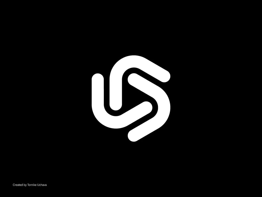
Another important type of logo variations that businesses should develop is the inverted logo. While many logos are originally designed for light backgrounds, real-world applications often require them to appear on dark surfaces. An inverted logo solves this challenge by adjusting the colors so the design remains clear, visible, and visually balanced on darker backgrounds.
Businesses frequently encounter dark design environments across many branding materials. These include website banners, video content, dark-mode user interfaces, product packaging, event signage, and promotional merchandise. Without proper logo variations, the primary logo may lose visibility or appear distorted when placed on these darker backgrounds. An inverted version ensures that the brand maintains strong contrast and readability.
Typically, an inverted logo replaces darker elements with lighter ones while keeping the core design intact. For example, black text may become white, and darker graphic shapes may shift to lighter tones. This careful adjustment allows businesses to preserve the overall structure of the logo while improving visual clarity.
For businesses focused on professional branding, preparing an inverted logo is a simple but essential step. It prevents designers from improvising color adjustments that might compromise the brand identity. Instead, the brand maintains a controlled and consistent appearance across different design environments.
By including an inverted version in their logo variations, businesses ensure that their logo performs well on both light and dark surfaces. This flexibility helps maintain strong brand recognition while supporting a wider range of creative applications.

Source: Tornike Uchava, Minimalist Abstract Logo, Dribbble, https://dribbble.com/shots/25599651-Minimalist-Abstract-Logo-Modern-Geometric-Symbol-Design
The Horizontal And Vertical Layout Variations
Layout flexibility is one of the most valuable aspects of effective logo variations. Businesses often need to place their logos in spaces that differ significantly in shape and orientation. Some layouts are wide and horizontal, while others are tall and narrow. To accommodate these different formats, businesses should develop both horizontal and vertical logo variations.
A horizontal logo layout usually places the symbol beside the brand name. This version works particularly well for website headers, email signatures, presentation slides, and advertising banners. The horizontal arrangement fits naturally into wide spaces and allows the brand name to remain clearly readable.
In contrast, a vertical logo variation stacks the design elements, typically placing the symbol above the brand name. This layout is useful when businesses need to fit the logo into square or narrow areas such as social media graphics, posters, product labels, or mobile layouts. By reorganizing the same elements, the vertical version maintains the brand identity while adapting to different design proportions.
Businesses that only rely on a single logo layout often struggle when adapting their branding to multiple platforms. By preparing both horizontal and vertical logo variations, they create a flexible branding system that works across digital and physical environments.
These layout-based logo variations allow businesses to maintain consistent branding without forcing the logo into spaces where it does not naturally fit. The result is a more balanced, professional, and adaptable visual identity.
The Seasonal And Campaign Logo Variations
Many modern businesses expand their branding strategy by creating seasonal or campaign-based logo variations. These special versions allow businesses to temporarily adjust their logo design to match holidays, marketing campaigns, or special events while still maintaining brand recognition. When used carefully, these logo variations help businesses stay relevant, creative, and engaging with their audience.
Seasonal logo variations often incorporate subtle design elements that reflect specific occasions. For example, businesses might add festive colors, seasonal icons, or decorative accents during holidays such as Christmas, Halloween, or New Year. These small adjustments make the brand feel more connected to current events without changing the core identity of the logo.
Campaign-based logo variations work similarly but focus on specific promotions or brand initiatives. Businesses launching new products, celebrating anniversaries, or supporting social causes may temporarily modify their logo to reflect the campaign message. These variations help reinforce marketing themes while keeping the brand visually consistent.
It is important for businesses to treat seasonal logo variations as temporary adaptations rather than permanent replacements. The main logo should always remain the central brand symbol. When seasonal elements are applied carefully, the brand identity stays recognizable while still allowing room for creative expression.
By including seasonal or campaign-based logo variations in their branding strategy, businesses can maintain a fresh and dynamic presence while still protecting the integrity of their core logo design.
The Brand Guideline System For Managing Logo Variations
Creating multiple logo variations is only effective when businesses organize and manage them properly. This is why a clear brand guideline system is essential. Brand guidelines act as a rulebook that explains how each logo variation should be used across different platforms, ensuring consistency and professionalism in every design application.
For businesses that work with designers, marketers, and external partners, brand guidelines help prevent misuse of the logo. The document typically outlines when to use each version, such as the primary logo, secondary logo, icon version, or simplified logo variations. It also explains spacing rules, color usage, minimum size requirements, and correct background applications.
Without clear guidelines, businesses may accidentally create inconsistent branding. Designers might stretch the logo, change colors, or place it on backgrounds that reduce visibility. Over time, these inconsistencies can weaken brand recognition and reduce the overall professionalism of the business.
A well-structured brand guideline system ensures that every logo variation serves a clear purpose. It helps businesses maintain visual consistency across websites, social media platforms, packaging, advertising materials, and printed products. This structured approach allows the brand identity to remain strong even when used across many different environments.
By developing brand guidelines that organize all logo variations, businesses protect the integrity of their branding while making it easier for teams to apply the logo correctly in every situation.
Conclusion
Strong branding requires more than a single logo design. By developing multiple logo variations, businesses can ensure their brand remains clear, adaptable, and professional across different platforms and materials. From primary and secondary logos to icons, submarks, and responsive designs, each variation serves a unique purpose within a complete branding system. These carefully planned logo variations help businesses maintain visual consistency while adapting to digital interfaces, packaging, marketing materials, and merchandise. When used correctly, logo variations strengthen brand recognition and create a flexible identity that supports long-term growth and effective communication.
Let Us Know What You Think!
Every information you read here are written and curated by Kreafolk's team, carefully pieced together with our creative community in mind. Did you enjoy our contents? Leave a comment below and share your thoughts. Cheers to more creative articles and inspirations!


Leave a Comment