Tips on How To Create A Logo Design with Procreate

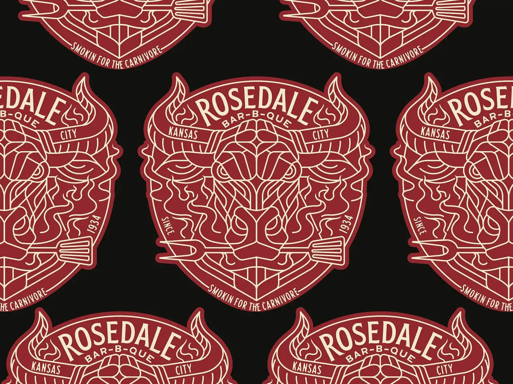
Source: Muhammad Bagus Prasetyo, Label Design, Dribbble, https://dribbble.com/shots/19398640-Label-Design
Creating a strong logo design is one of the most important steps in building a memorable brand identity. With the rise of digital tools, designers now have more flexibility than ever, and Procreate has become a popular choice for both beginners and professionals. Its intuitive interface, powerful brush engine, and portability on the iPad make it an excellent platform for developing creative ideas anytime and anywhere.
When working on a logo design in Procreate, the process becomes more fluid and experimental. Designers can quickly sketch concepts, test different styles, and refine shapes without being restricted by traditional tools. This freedom encourages creativity while maintaining precision, which is essential in producing a clean and effective logo.
Whether you are just starting out or looking to improve your workflow, understanding how to use Procreate effectively can elevate your logo design process. From sketching and layering to refining details and exporting final files, each step plays a crucial role in achieving professional results. In this article, you will discover practical tips that help you create a polished logo design using Procreate, while keeping your workflow efficient and your creativity flowing.
Getting Started With Procreate For Logo Design
Starting your logo design process in Procreate begins with understanding the workspace and tools available. Procreate offers a clean and intuitive interface, making it easy to focus on creativity without distractions. Before diving into your design, take a few minutes to explore the gallery, brush library, layers panel, and gesture controls. These features are essential for building an efficient workflow.
When creating a logo design in Procreate, it is important to set up your canvas correctly from the beginning. Choose a canvas size that allows flexibility, such as a square format with high resolution. This ensures your logo can be adapted for different uses, from social media icons to print materials. A well-prepared canvas prevents quality loss and saves time during later stages.
Another key step is customizing your workspace to suit your style. Organize your brushes, create shortcuts using gestures, and adjust settings like pressure sensitivity if you are using an Apple Pencil. These small adjustments can significantly improve your comfort and speed while working on your logo design.
By becoming familiar with Procreate’s tools and settings, you create a solid foundation for your logo design process. This preparation allows you to focus more on creativity and less on technical limitations, resulting in a smoother and more enjoyable design experience.
Choosing The Right Canvas And Color Profile
Setting up the right canvas and color profile is a crucial step in any logo design created in Procreate. A properly configured canvas ensures that your work remains sharp, scalable, and adaptable across different platforms. Start by selecting a high-resolution canvas, ideally 300 DPI, which is suitable for both digital and print applications.
For logo design, a square canvas is often recommended because it provides balance and flexibility. This format allows you to experiment with different layouts while keeping your composition centered. In Procreate, you can easily customize canvas dimensions based on your project needs, giving you full control over your workspace.
Color profile is another important consideration. Most designers begin their logo design in RGB mode when working in Procreate, as it is optimized for digital screens. However, if your logo will be used for print, you should be mindful of how colors will translate to CMYK. Testing your colors early helps avoid unexpected shifts later in the process.
By carefully choosing your canvas size and color profile, you ensure that your logo design maintains its quality and consistency. This step may seem technical, but it plays a vital role in achieving a professional and versatile final result.
Sketching Initial Logo Design Concepts
Every successful logo design begins with strong ideas, and Procreate is an excellent tool for exploring them through sketching. At this stage, the goal is not perfection but creativity. Use simple pencil brushes in Procreate to quickly visualize multiple concepts without overthinking details. This approach allows you to experiment freely and discover unique directions for your logo design.
Start by brainstorming keywords or visual themes related to the brand. Translate those ideas into rough sketches, focusing on shapes, symbols, and composition. Procreate’s responsive drawing experience makes it easy to capture ideas as they come, helping you stay in a creative flow. You can also duplicate layers to try variations without losing your original concept.
It is important to create several options instead of settling on the first idea. By sketching multiple versions, you increase your chances of finding a more effective and memorable logo design. Keep your sketches loose and avoid spending too much time refining at this stage.
Using Procreate for sketching also allows you to zoom in and out easily, helping you evaluate how your logo design looks at different sizes. This is especially important for ensuring clarity and scalability. A strong concept at the sketch stage will make the rest of the design process much smoother and more efficient.

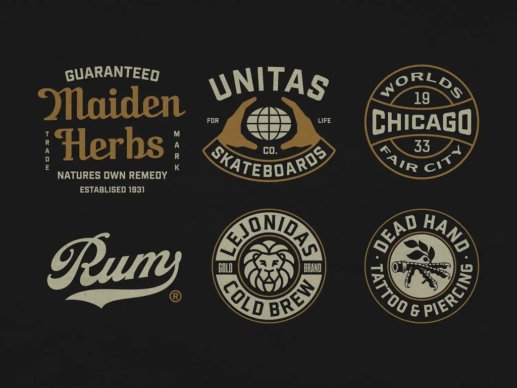
Source: Ilham Herry, Logo Collection, Dribbble, https://dribbble.com/shots/17431673-Logo-Collection
Using Layers For Better Organization
Layers are one of the most powerful features in Procreate, especially when working on a detailed logo design. Proper layer management helps you stay organized, make edits efficiently, and maintain full control over each element of your design. By separating different components, you can work more precisely without affecting other parts of your composition.
Start by placing your initial sketches on one layer and reducing its opacity. Then, create new layers for clean line work, shapes, and colors. This structured approach makes it easier to refine your logo design step by step. In Procreate, you can also group layers, rename them, and rearrange their order, which keeps your workflow clean and easy to navigate.
Another advantage of using layers in Procreate is the ability to experiment without risk. You can duplicate layers to try different variations or hide layers to compare changes. This flexibility encourages creativity while maintaining control over your logo design process.
By mastering layers, you improve both efficiency and precision in your work. A well-organized file not only saves time but also makes it easier to revisit and update your logo design in the future, ensuring a smooth and professional workflow from start to finish.
Selecting The Best Brushes For Clean Lines
Choosing the right brushes is an important step in creating a professional logo design in Procreate. Since logos rely heavily on clean, precise lines, using the appropriate brush can make a noticeable difference in the final result. Procreate offers a wide range of brushes, but not all of them are suitable for logo design.
For best results, focus on monoline or technical brushes that provide consistent stroke width. These brushes help maintain smooth edges and sharp details, which are essential for a polished logo design. Avoid overly textured or painterly brushes, as they can make your design look less refined and harder to scale.
Another useful feature in Procreate is the streamline setting. By adjusting this setting, you can reduce hand jitter and create smoother curves and lines. This is especially helpful when working on circular shapes or intricate details in your logo design.
Take time to test different brushes and customize their settings to match your drawing style. You can adjust opacity, pressure sensitivity, and stabilization to improve control. By selecting and refining the right brushes, you ensure that your logo design looks clean, consistent, and professional across all applications.
Refining Shapes And Geometry
Refining shapes and geometry is a crucial stage in developing a strong logo design in Procreate. Once your initial sketch is complete, it is time to focus on precision and balance. Clean shapes help communicate your message clearly and make your logo more visually appealing.
Procreate provides several tools that can assist in refining your design. Use the selection tool to isolate specific elements and adjust their size or position. The transform tool allows you to scale, rotate, and align components, helping you achieve better proportions within your logo design.
QuickShape is another valuable feature in Procreate. By holding your stroke at the end, the app automatically smooths it into perfect shapes like circles, squares, or straight lines. This feature is extremely useful for creating geometric logos that require accuracy and consistency.
Pay attention to spacing, alignment, and symmetry as you refine your shapes. Small adjustments can significantly improve the overall look of your logo design. By carefully refining geometry in Procreate, you create a clean and balanced design that feels intentional, professional, and ready for real-world use.
Applying Color Thoughtfully In Logo Design
Color plays a significant role in shaping how people perceive a logo design, and Procreate offers powerful tools to experiment with color effectively. When applying color, it is important to keep your palette simple and intentional. A limited color scheme helps maintain clarity and ensures your logo design remains recognizable across different platforms.
Start by selecting colors that reflect the brand’s identity and message. In Procreate, you can use the color panel to create and save palettes, making it easier to stay consistent throughout your logo design process. Test different combinations and observe how they interact with each other, especially in terms of contrast and readability.
It is also essential to check how your logo design performs in black and white. A strong logo should remain effective even without color, ensuring versatility in various applications such as printing or embossing. Procreate allows you to quickly toggle colors or duplicate layers to test monochrome versions.
By applying color thoughtfully, you enhance both the visual appeal and functionality of your logo design. Procreate makes it easy to experiment, but keeping your choices strategic will result in a more professional and adaptable final outcome.

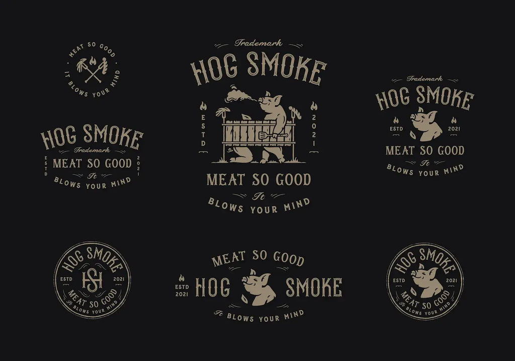
Source: Dusan Sol, Hog Smoke BBQ, Dribbble, https://dribbble.com/shots/16560373-Hog-Smoke-BBQ
Adding Typography With Precision
Typography is a key element in many logo design projects, and Procreate provides useful tools to integrate text effectively. Choosing the right typeface is essential, as it should align with the brand’s personality and complement the visual elements of your design.
In Procreate, you can import custom fonts and adjust text directly on your canvas. Pay close attention to spacing, alignment, and proportions when working with typography. Proper kerning and letter spacing can significantly improve the readability and overall balance of your logo design.
It is often helpful to convert text into shapes or outlines once you finalize your typography. This allows you to make precise adjustments and ensure consistency across your logo design. You can also combine text with shapes to create a more integrated and unique visual identity.
Keep your typography simple and clear. Avoid overly decorative fonts that may reduce legibility, especially at smaller sizes. By focusing on precision and clarity, you can create a logo design in Procreate that communicates effectively and looks professional in any context.
Testing Your Logo Design On Different Backgrounds
One of the most important steps in finalizing a logo design in Procreate is testing how it performs across different backgrounds. A well-designed logo should remain clear, readable, and visually strong no matter where it is placed. This ensures your design is versatile and ready for real-world applications.
In Procreate, you can easily create multiple background layers to simulate different environments. Try placing your logo design on light, dark, and textured backgrounds to see how it reacts. Pay attention to contrast, as low contrast can make your logo difficult to read, especially at smaller sizes.
It is also helpful to test your logo design in both full color and monochrome versions. This allows you to identify any weaknesses in visibility or clarity. A strong logo should work effectively even when reduced to a single color, which is often required for printing or branding materials.
Additionally, zoom in and out within Procreate to evaluate how your logo looks at different scales. This helps ensure that fine details do not get lost when the logo is resized. By thoroughly testing your logo design on various backgrounds, you can confidently create a design that is flexible, professional, and ready for multiple uses.
Exporting And Preparing Files For Final Use
Once your logo design is complete, the final step is exporting and preparing your files properly in Procreate. This stage is crucial to ensure your logo is ready for both digital and print applications. Choosing the correct file format and resolution will help maintain the quality of your work.
Procreate allows you to export your logo design in several formats, including PNG, JPEG, and PSD. PNG is ideal for transparent backgrounds, while PSD files are useful if you plan to continue editing in other software. Always export a high-resolution version to preserve sharpness and detail.
It is also recommended to keep an organized file structure. Save your original Procreate file with all layers intact so you can make future adjustments if needed. Additionally, create different versions of your logo design, such as color, black, and white variations, to suit different use cases.
For professional results, consider converting your design into a vector format using external software. While Procreate is excellent for creating concepts, vector files ensure scalability without losing quality. By properly exporting and preparing your logo design, you ensure it remains consistent, adaptable, and ready for any branding need.
Conclusion On Logo Design With Procreate
Creating a successful logo design with Procreate combines creativity, strategy, and the right workflow. From sketching ideas to refining shapes and exporting files, each step plays an important role in achieving professional results. Procreate offers flexibility and powerful tools that make the logo design process more intuitive and efficient. By understanding its features and applying thoughtful design principles, you can create logos that are both visually appealing and versatile. With practice and consistency, Procreate can become a reliable tool for producing high-quality logo design work for any brand or project.
Let Us Know What You Think!
Every information you read here are written and curated by Kreafolk's team, carefully pieced together with our creative community in mind. Did you enjoy our contents? Leave a comment below and share your thoughts. Cheers to more creative articles and inspirations!


Leave a Comment