Perfect Guide To Create A Good Combination Marks Logo Design

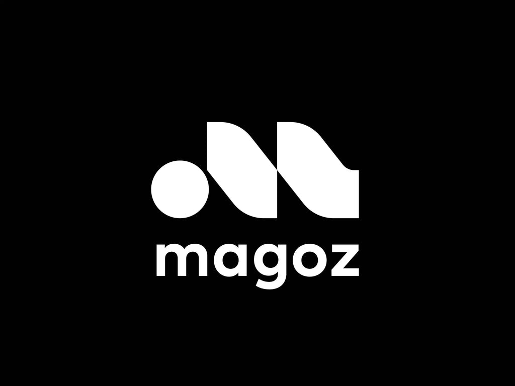
Source: George Bokhua, Magoz Logo, Dribbble, https://dribbble.com/shots/21420015-Magoz-logo
In brand identity, a logo serves as the cornerstone, encapsulating the essence of a brand in a single, memorable visual. Among the various logo types, combination marks stand out for their versatility and effectiveness. A combination marks logo design merges a symbol with a wordmark, offering dual cues for brand recognition—visual imagery and textual representation. This synergy not only enhances brand recall but also provides flexibility across various marketing materials.
When crafting a combination marks logo, designers face the challenge of balancing creativity with clarity, ensuring the logo is impactful yet straightforward. The design process involves a thoughtful selection of elements that represent the brand's values and appeal to its target audience. Whether you are a seasoned designer or a business owner looking to develop a unique logo, this guide will provide essential strategies for creating a compelling combination marks logo design that resonates with customers and stands the test of time.
Understand the Basics of Combination Marks
Combination marks logo design ingeniously merges iconography with typography, creating a versatile and memorable branding element. This type of logo combines a symbol and a wordmark, enabling brands to use them together or separately, enhancing brand recognition across various platforms. The symbol often illustrates the industry or nature of the business, while the accompanying text reinforces brand identity with the company name or initials.
Designing an effective combination marks logo requires a nuanced understanding of how visual elements and text can coexist harmoniously without overshadowing each other. The symbol should be distinct yet simple enough to be recognizable at a glance, and the text should be readable in all sizes. This duality allows the logo to function well in both detailed presentations and minimalistic applications.
A successful combination marks logo design not only captures the brand’s essence but also remains adaptable. It should convey the brand's message effectively, regardless of whether the components are used together or separately. By mastering the basics of combining imagery with text, designers can create logos that are not only aesthetically pleasing but also fundamentally sound in their branding strategy.
Select a Cohesive Color Scheme
Choosing the right color scheme is crucial in creating an effective marks logo design, as colors play a pivotal role in conveying a brand's identity and emotional appeal. A cohesive color scheme can enhance the visual impact of a logo and ensure it is adaptable across various media. When selecting colors for a combination marks logo, consider the psychology behind each color and how it aligns with the brand's values and industry norms.
For instance, blue often evokes trust and professionalism, making it a popular choice in corporate and financial sectors, while green can represent growth and sustainability, ideal for environmental or wellness brands. The key is to choose a palette that offers contrast between the symbol and the text, ensuring both elements are distinguishable yet unified.
It's also essential to test the colors in different environments to ensure consistency across digital and print formats. This might involve adjusting shades to avoid issues with visibility or reproduction. A well-thought-out color scheme not only strengthens brand recognition but also fosters a strong emotional connection with the audience, making the logo more memorable and effective in its communication goals.
Design a Memorable Icon
The creation of a memorable icon is a fundamental step in crafting a marks logo design. An effective icon should be simple yet distinctive, encapsulating the brand's essence in a visual form that is immediately recognizable. To achieve this, focus on clarity and uniqueness. The icon should stand out even in a crowded marketplace and be identifiable across various media and sizes, from tiny app icons to large billboards.
When designing the icon, consider the brand’s core values and the message it wants to convey. Symbols that are too complex can become unrecognizable when scaled down, so simplicity is key. Additionally, the icon should be versatile enough to be effective in both color and black and white, ensuring it maintains its integrity in any setting.
The process often involves sketching multiple concepts and refining them based on aesthetic appeal and functionality. It's crucial to test these designs in different contexts to see how they perform in real-world applications. Feedback from these tests can guide further refinements, ensuring the icon not only looks good but also resonates with the target audience and enhances the overall brand strategy.

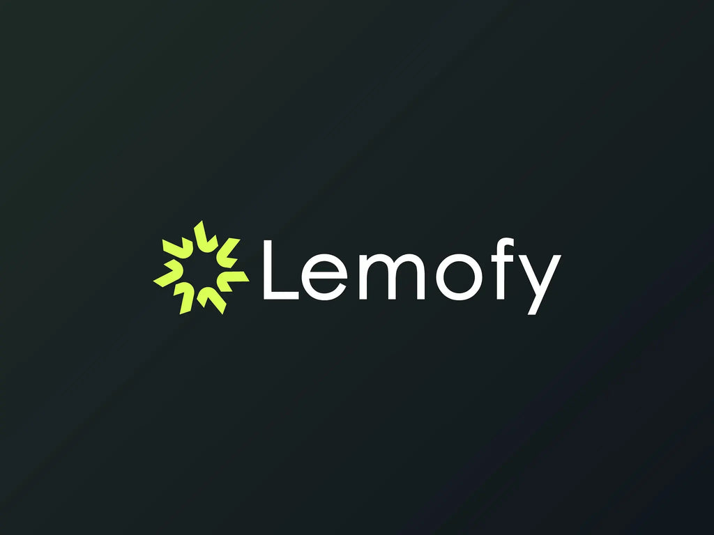
Source: Burn Studio, Letter L, Dribbble, https://dribbble.com/shots/20774227-Letter-L-logo-design-abstract
Choose the Right Typography
Choosing the right typography is essential in enhancing the effectiveness of a marks logo design. The typeface you select should complement the visual style of the icon and reinforce the brand’s personality. A well-chosen font can convey professionalism, creativity, or reliability, depending on the characteristics of the typeface.
When selecting typography for a combination marks logo, consider readability and versatility. The font should be legible in various sizes and formats to ensure that the logo remains effective on different platforms, from digital displays to printed materials. Avoid overly decorative fonts that might detract from the logo’s clarity, especially at smaller sizes.
Additionally, the typography should harmonize with the icon, creating a cohesive and balanced look. This might mean matching a bold icon with a sturdy, bold font, or pairing a more delicate icon with a light, refined typeface. The alignment of style and tone between the icon and typography is crucial for a unified brand identity.
Experiment with different typefaces to see which best supports the brand message and complements the icon. Sometimes, custom typography is necessary to achieve a perfect fit with the logo’s visual elements, offering a unique and tailored solution that enhances brand differentiation.
Maintain a Balanced Composition
Achieving a balanced composition is critical in marks logo design, ensuring that both the icon and wordmark coexist harmoniously without overpowering each other. A balanced logo design not only looks aesthetically pleasing but also promotes brand recognition and recall. To maintain balance, consider the visual weight of each component. The size, color, and placement of the icon relative to the text must feel cohesive and aligned.
Start by scaling the icon and text to ensure neither element dominates unnecessarily. Symmetry or asymmetry can be used effectively depending on the brand's personality. For instance, a symmetrical design might convey stability and formality, while an asymmetrical layout can suggest dynamism and innovation.
The positioning of the text and icon should also be strategic. Common configurations include placing the icon above, beside, or integrated within the text. Each arrangement has different impacts and suits different contexts, so consider the overall brand strategy when deciding on the layout.
Additionally, negative space should be used thoughtfully to separate and yet bind the elements together, enhancing the overall readability and impact of the logo. Effective use of space can also add a level of sophistication and meaning, making the logo not just a brand identifier but a piece of strategic design.
Ensure Scalability
Scalability is a cornerstone of effective marks logo design, ensuring that the logo maintains its integrity and impact across all sizes and mediums. A scalable logo functions well whether it's displayed on a giant billboard or as a tiny icon on a smartphone screen. This adaptability is crucial for consistent brand representation across diverse applications.
To ensure scalability, start with a simple, clean design. Avoid overly complex details that might get lost or look cluttered when reduced. Test the logo at various sizes during the design process to confirm that it remains legible and effective when scaled down or up.
Vector graphics are essential for scalability. Unlike raster images, vector files allow logos to be resized without losing quality. Ensure your logo is designed using appropriate software that supports vector output, such as Adobe Illustrator.
Consider also the different mediums in which the logo will appear. From digital screens to textured fabrics, each medium can affect how a logo looks. Adjustments might be necessary to accommodate different printing processes or digital displays, ensuring the logo always looks its best.
Consider the future uses of the logo and design with flexibility in mind. A logo that is scalable not only meets current needs but also adapts to future marketing strategies and media developments, providing lasting value for the brand.
Use Negative Space Creatively
In the world of marks logo design, negative space is not merely a background; it is a powerful tool that can transform a simple logo into a captivating visual puzzle. Creative use of negative space involves integrating the background space into the design to form part of the message or to create a secondary image. This technique not only adds a layer of sophistication but also engages the viewer, inviting them to take a closer look.
To effectively use negative space, start by identifying the key elements of your logo. Consider how the shapes of these elements can be used to suggest other forms or symbols relevant to the brand. For example, the negative space within a letter or between two elements might outline an industry-related icon or reflect a brand attribute.
The use of negative space should enhance, not detract from, the readability and impact of the logo. It requires a delicate balance; too subtle, and the effect may go unnoticed, too obvious, and it might overshadow the primary message of the logo. Successful negative space design is subtle yet surprising, offering a visual twist that reinforces the brand's message and identity.
This design approach not only makes the logo more memorable but also reinforces brand storytelling, providing depth and a narrative element that can resonate more profoundly with the audience. When done well, negative space can turn a simple logo into an enduring brand symbol.

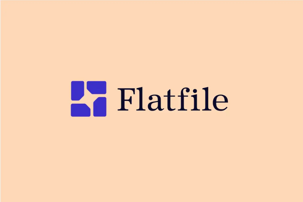
Source: Ramotion, Flatfile Branding, Dribbble, https://dribbble.com/shots/20119924-Flatfile-Branding-business-logo-design-brand-sign-logotype
Keep It Simple and Flexible
Simplicity and flexibility are paramount in creating an effective marks logo design. A simple logo is not only easier for potential customers to remember but also more versatile across various applications. When designing a logo, it's important to focus on the essentials and avoid unnecessary complexity that could detract from the logo's effectiveness.
To achieve simplicity, use clean lines and limit the color palette to a few cohesive colors. This reduces visual clutter and ensures that the logo is legible in different sizes and mediums. A simple design allows for more flexibility in where and how the logo can be used, from digital media to physical products, without losing its impact.
Flexibility in logo design means the logo can adapt to different contexts without compromising its identity. This might involve having different logo variations for different uses, such as a full logo with a symbol and text, and a simplified icon-only version for smaller spaces. Each variation should be consistent with the overall brand identity but tailored to its specific application.
Moreover, a simple and flexible logo design can withstand the test of time. It avoids trendy elements that may become dated, ensuring the logo remains effective and relevant as the brand evolves. By prioritizing simplicity and flexibility, you ensure that the logo serves as a long-term asset for the brand, adaptable to future needs and changes in the market.
Test Different Layouts
When developing a marks logo design, experimenting with various layouts is crucial to determining the most effective configuration for brand communication. The layout refers to how the symbol and text are arranged in relation to each other, and changing this arrangement can significantly impact the logo's perception and effectiveness.
Common layouts include horizontal, vertical, and integrated arrangements. In a horizontal layout, the icon and text are aligned on the same axis, which is beneficial for clarity and balance. A vertical layout stacks the icon and text, saving space and often making the logo more compact, which is ideal for mobile applications and social media profiles. Integrated layouts blend the icon and text more seamlessly, creating a cohesive and unique design that can stand out in a crowded marketplace.
Testing different layouts helps identify which configuration enhances legibility, brand recall, and aesthetic appeal. This process involves creating variations of the logo and applying them in various mock contexts such as business cards, websites, and merchandise. Observing how each layout performs in real-world applications informs decisions about the final design, ensuring that the logo not only looks good on paper but also works effectively across all branding touchpoints.
Prototype with Mockups
Prototyping with mockups is an essential step in the marks logo design process, allowing designers to visualize how the logo will appear in real-world applications before finalizing the design. Mockups provide a realistic preview of the logo on various substrates and contexts, from digital screens and print materials to three-dimensional surfaces like signage and apparel.
Using mockups can highlight potential issues with color, size, and legibility that might not be apparent in a standard design environment. For example, a logo might look great on a computer screen but lose clarity when printed on a small promotional item. Prototyping helps identify such discrepancies early in the design process, allowing adjustments to be made before the logo is widely deployed.
Creating prototypes is also beneficial for gathering feedback from stakeholders. Presenting the logo in a range of mock scenarios can facilitate discussions about its effectiveness and appeal, ensuring that the final design meets the needs and expectations of both the brand and its target audience. This collaborative approach can lead to a more robust and universally accepted logo that effectively represents the brand across all intended platforms.
By investing time in prototyping with mockups, designers ensure that the marks logo design is not only aesthetically pleasing but also functional and adaptable to the varied demands of modern branding.
Conclusion
Crafting a marks logo design that effectively represents a brand requires a deep understanding of the interplay between iconography and typography. By following the principles outlined—balancing composition, ensuring scalability, creatively utilizing negative space, and testing various layouts—designers can create a logo that not only captures the essence of the brand but also stands out in a competitive market. Remember, a successful logo is more than just an aesthetic choice; it's a strategic tool that communicates a brand's identity and values to its audience, making a lasting impression.
Let Us Know What You Think!
Every information you read here are written and curated by Kreafolk's team, carefully pieced together with our creative community in mind. Did you enjoy our contents? Leave a comment below and share your thoughts. Cheers to more creative articles and inspirations!


Leave a Comment